Movies That Were Ruined By Bad Editing
While editing might sound like the simplest part of a movie's production, that couldn't be further from the truth. It's not just putting footage in a timeline, it's determining everything about how that movie will be perceived. In the editing room, a movie's entire tone can change on a whim. Bad shots can be re-purposed as good ones while great shots, the entire pace of a chase scene or even a conversation can change; a film's palette might go from grey and grim to bright and brimming with color at the press of a button. In short, the editor—often working side by side with the director—has the ability to reshape the film as they see fit. However, as we all know, with great power comes great responsibility—a maxim the editors of the movies on this list couldn't live up to. Read on to find out about 11 films that earned unsavory reputations thanks to classic cases of bad editing.
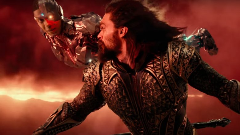
Justice League
The Justice League movie didn't swing the DCEU around, much as Warner Bros. had hoped it would. Instead, the league sank into rotten territory on Rotten Tomatoes, with slipshod editing being among critics' top complaints with the film.
Due to Zack Snyder leaving midway through the film's development and Joss Whedon subsequently taking over, there are two distinct tones in Justice League: Snyder's grim realism and Whedon's campy optimism. While that's not an easily remediable tonal disparity, it is something the film's final cut should've done a much better job of rectifying. In its theatrical release, the movie was panned for coming off as an inferior Avengers-wannabe due to its meshing of past DCEU tones and lighter Marvel-esque elements, neither of which played well together thanks to cuts that awkwardly inserted jokes and serious moments without any rhythm.
Worse yet, the haphazard editing led to important exposition being cut from the film in order for the studio to achieve its desired two-hour runtime. As such, entire scenes were rendered borderline pointless due to being incomprehensible. A perfect example of this is the entire Atlantis sequence, which is edited in such a way that no character besides Steppenwolf receives even a shred of clear character motivation.
These are some of the biggest reasons fans were (and are) petitioning for a purely Zack Snyder cut of the film. Sadly, even that rumored version likely wouldn't be able to remedy Justice League's largest editing flaw—namely, mustachioed Superman. The solution to remove actor Henry Cavill's mustache, which only existed when he returned for re-shoots, was ham-fisted. The options it seems were to edit all previously filmed appearances out of the final or to add a beard to make him look weathered upon his return—options which were apparently untenable. Perhaps the editing isn't the only thing to blame for this debacle.
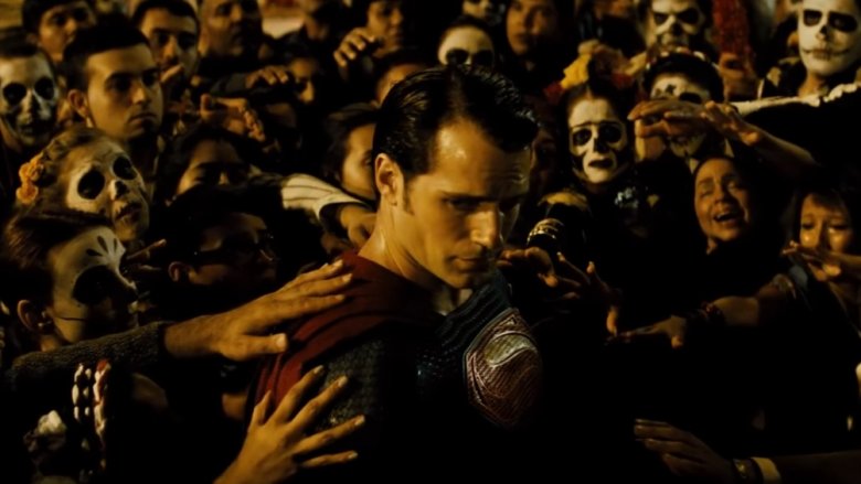
Batman v Superman: Dawn of Justice
Batman v Superman: Dawn of Justice remains one of the most high-profile cases of bad editing dooming a film's reception, with its biggest issues boiling down to a handful of major editing decisions.
The first problem was its color palette. In editing, films go through the color-grading process, wherein footage can be made as colorful and bright or as dark and monochrome as the director desires. This was red flag number one for a lot of fans: yet another colorless, sad, desaturated look for a Superman film. As a Man of Steel sequel, it certainly didn't aesthetically project the character's iconic embodiment of hope.
The second major point of contention most people had with the film was its running time. Clocking in at two-and-a-half hours long, the film was simultaneously lengthy and too short. It was too short in the sense that a lot of important exposition was left on the cutting room floor, leaving audiences to feel that certain characters' motivations were underdeveloped. At the same time, most agreed that the film had a lot of fat that could've been trimmed down.
While Warner Bros. released an even lengthier director's cut that did alleviate some of the plot hole and character motivation issues found in the theatrical version of the film, the movie remains a gritty affair that widely failed to please the masses, in no small part due to its editing.
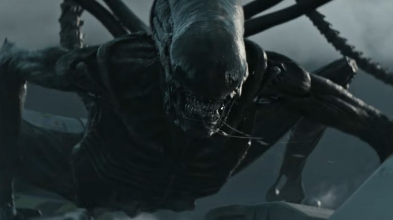
Alien: Covenant
Alien: Covenant could've been a good horror film, if it weren't for its misguided editing. The film inserts lengthy sequences of exposition, seemingly at random, so that scenes built to provide context ironically end up further muddling the narrative. Worse still, in the movie's horror moments, so much unnecessary foreshadowing was left in that, by the time anything actually scary does crop up, the audience is aware aware of what's going to happen three minutes too early.
Covenant's editing woes don't stop there. In-between every pair of decent scenes there are either two minutes of landscape shots or some character interactions that flatten the tone of the entire film. For example, there's a lengthy conversation between two androids where one teaches the other how to play a recorder, with the instructing android saying "I'll do the fingering." Snickering aside, who thought a music lesson in the middle of an Alien movie deserved to make the final cut? The dialogue and silly nature of a homoerotic android bonding session are what make the scene so ruinous to a film that could've been a lot scarier if not for its weak editing.
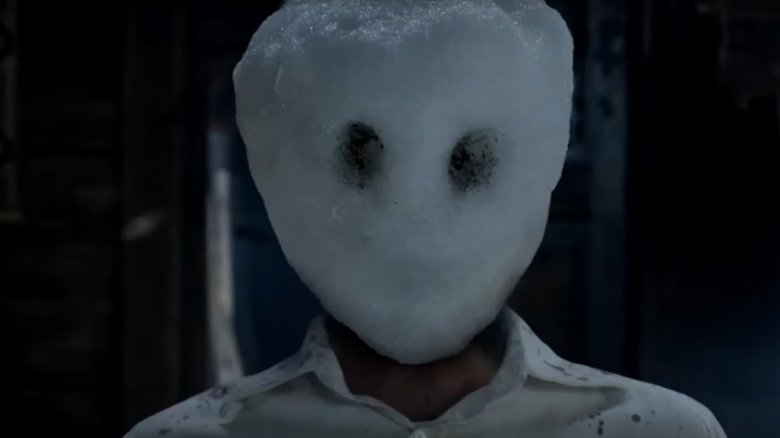
The Snowman
The Snowman was a movie caught in an unfortunate position right out of the gate since, according to director Tomas Alfredson, he and his production team weren't even able to shoot the whole thing before moving into post-production. It's troublesome projects like these where editing becomes the defining aspect of the film, often becoming the the only way to fix a problem movie—especially once the shooting budget is gone and the crew is out of time. The editors of The Snowman needed to gloss over the missing chunks in the cutting room and assemble a coherent, flowing narrative with what they had on hand—something that evidently didn't happen given the movie's reception.
If you didn't guess it already, The Snowman's editing is a bit of a mess. Beyond creating tonal inconsistencies throughout, the shoddy cutting openly exposes the film's nightmarish production history, smashing from shot to shot so sporadically that one can practically tell that there wasn't enough footage to work with. And yet it still had a runtime that put some critics to sleep.
Suicide Squad
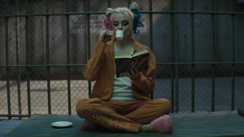
Sorry DC (and DCEU) fans, but here we go again: Suicide Squad is the rare example of a studio publicly advertising a movie as one thing, panicking, then completely reshaping the same film all inside of one marketing blitz. This can be evidenced by the insane differences between the movie's first trailer and second trailer. It's this complete overhaul of the movie's tone that contributed to a lot of the negative reviews, with the general consensus being that in Warner Bros.' haste to reshape the movie in a more electric, upbeat style, the company created a muddled product that spat on director David Ayer's original vision.
Warner Bros. did more than just confuse the tone of the movie by usurping editing power from Ayer and his team, the execs also cut out a lot of Jared Leto's Joker, as can be seen in the multitude of trailer shots that never made it into the full movie, such as the infamous burnt-face/smoke-grenade clip.
All of this makes one wonder what could've been had Ayer gotten to release his original edit.
Dog Eat Dog
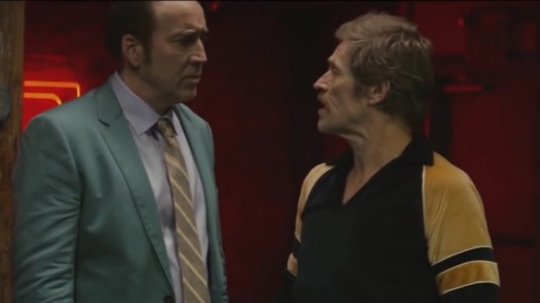
Dog Eat Dog is a movie about three sociopaths' joint quest to kidnap a baby, earn some ransom money and pay off a mob boss. Sounds crazy, right? Well, it would be if it weren't for the movie's obsession with straying from its premise. Starring A-listers like Nic Cage and Willem Dafoe, the movie could've been a knockout if it kept a tight, plot-driven pace that complemented its actors' performances. Sadly, the film's lackadaisical editing never aims its talent toward the central narrative, leaving Dog Eat Dog to feel particularly tedious and drawn-out.
For example, the film's opening sequence is just one big cocaine-fueled tangent for Dafoe, continuing well after it's served its function of introducing his character. Is it kind of entertaining? Sure. In no way, however, does it help forward the main plot. Then, not five minutes after that, Cage's character is introduced via a club scene that functions primarily as an homage to film noir. Again, there's barely any plot relevance to this scene; it's just an excuse for the director to paint the screen monochrome and play smooth crime-jazz. While the direction and cinematography of both those scenes, and others, is impressive, pointless inclusions like those are what produce an unwarranted one-hour thirty-three minute runtime, and it's a testament to bad editing that the movie feels far longer than that.
Transformers: Age of Extinction
In a movie titled Transformers, a franchise widely known to be about giant transforming robots punching each other, there is absolutely no reason for the majority of screen time to go to a human cast. This fact is doubly true when two of said human performers earn Razzie nominations.
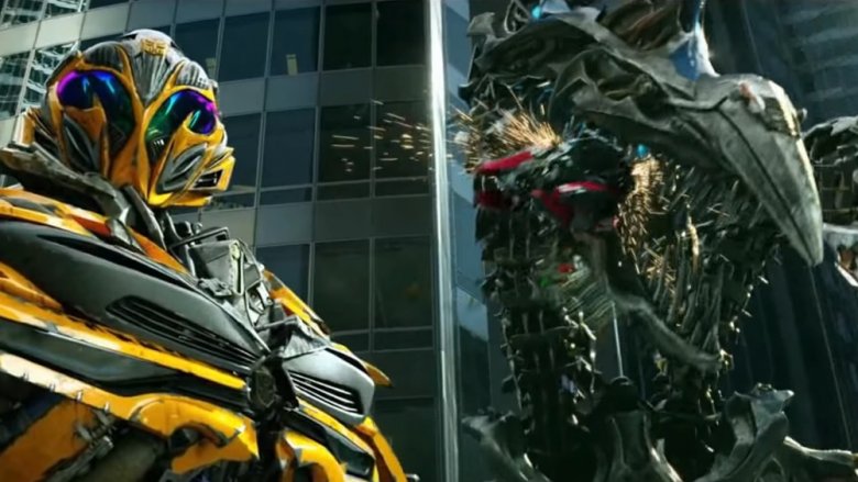
You'd be forgiven for forgetting that Optimus Prime is even in Transformers: Age of Extinction; the film's editing completely drops the ball and treats its titular aliens as a subplot. Clocking in at an exhausting two hours and forty-five minutes, this film chooses to prioritize downright embarrassing sequences, such as the Romeo and Juliet law gag. In the scene, Mark Wahlberg's character grills the boyfriend of his daughter; the beau spends a whole minute trying to explain the underage relationship with the apparently 17-year-old daughter, justifying it via Texas consent laws. The aforementioned sequence has absolutely no place in this film. Yet it remains in the final cut, along with other awkward bonding dialogue between the live-action cast, with not nearly enough time focusing on the Transformers nor pushing the plot forward.
One can only hope there's an alternate reality where this movie's editors decided the heavily advertised dinobots received more screen time than a father and daughter discussing the suitability of short-shorts.
Gods of Egypt
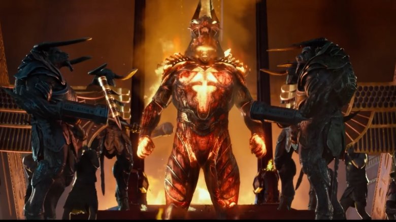
Gods of Egypt seemed to have all the makings of a great popcorn flick: top-tier actors, a fun historical setting and plenty of over-the-top action. Yet, when the movie came out, it got utterly decimated. Don't think this was an instance of unworthy scorn, the movie deserved its abysmal reception, if for nothing else than its mind-boggling editing.
Here's a prime example: early on in the movie, the two leads need to escape from a dangerous area via chariot. So they hop in, and—bam—they're suddenly well outside of the area's boundaries, safe and sound. There's build-up and a resolution, but the actual entrée—some level of exciting conflict—in what should be a three-course cinematic meal is missing entirely. This happens throughout the movie. If the production team didn't have the money or time to shoot some action scenes, why leave in their setups and resolutions? Or if they did have the scenes shot, why cut them? Either way, some very poor editing decisions completely crippled Gods of Egypt.
Fantastic 4 (2015)
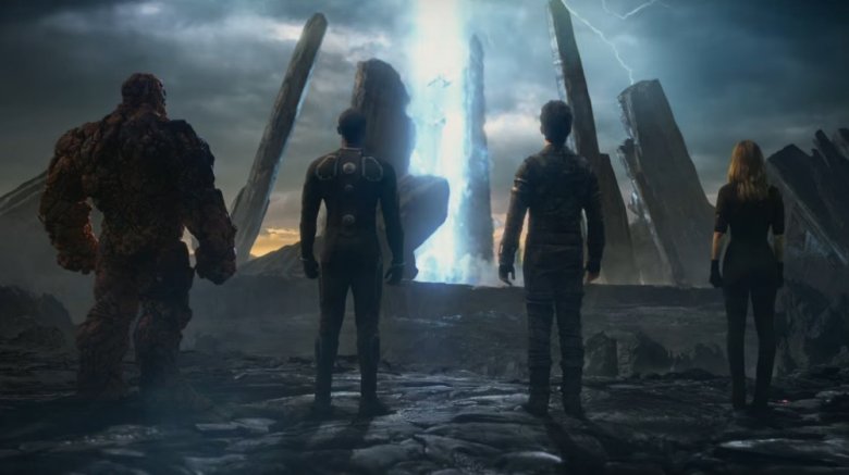
There's no easy way to say it: Fantastic 4's 2015 iteration was a failure, both critically and financially. While the movie had a lot of bright spots and sported entertaining, experimental ideas, its overall execution was slaughtered by a plodding editing ideology that bestowed superpowers upon the titular superheroes over halfway through the film. That late-bloomer mentality resulted in the movie having only one major superhero throw-down: a close-quarters brawl masquerading as a "finale," which is more than a little underwhelming for a movie centered around a group of superheroes with outrageous powers who are known for battling other-worldly enemies.
If that massive editing faux pas sounds like a deal-breaker to you, just know that the director himself agrees. Josh Trank, said director, bad-mouthed the studio's cut on Twitter before the movie had even released. In the now-deleted tweet, he said "A year ago I had a fantastic version of this. And it would've received great reviews. You'll probably never see it. That's reality though."
After factoring in the rumors that Fox locked Trank out of the editing room, as well as perusing all the footage from the trailers that never reached the theatrical release, one can only assume the studio executives pretty heavily tampered with the director's vision. Given what we got, it sounds like these substantial editing changes ended up being for the worse.
Taken 3
Taken 3 is a severe case of death by a thousand cinematic cuts. It plays out at the speed any other movie would run if you accidentally hit the fast-forward button several times in a row. If you blink, there's an outstanding chance the film will have already barreled into another scene entirely. Unfortunately, while some films choose this speed as part of a broader stylistic choice, Taken 3 uses it because whoever was responsible for the theatrical cut's editing just didn't do a very good job.
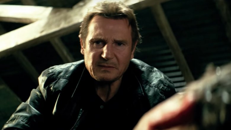
Case in point: there's a six-second sequence where Liam Neeson hops a fence. Within those six seconds, Taken 3 employs fifteen unique shots to show Neeson making the jump. Just to reiterate, that's more than a dozen cuts in about the same time that it probably took you to read this sentence. That's the pace of the whole movie. At worst, it's a recipe for motion sickness and migraines. At best, it's an intensely discombobulating style of editing that makes it hard to keep track of virtually any of the on-screen information.
Star Wars: Episode 2 - Attack of the Clones
As a wise jedi once said, "I hate bad editing. It's coarse and rough and irritating and it gets everywhere." That wisdom was nowhere to be found during the editing of Attack of the Clones, the second Star Wars prequel movie. While the movie itself sported plenty of noteworthy elements, such as an imaginative story, impressive world design and some (at the time) cutting-edge special effects, the one thing it sorely lacked was sharp editing.
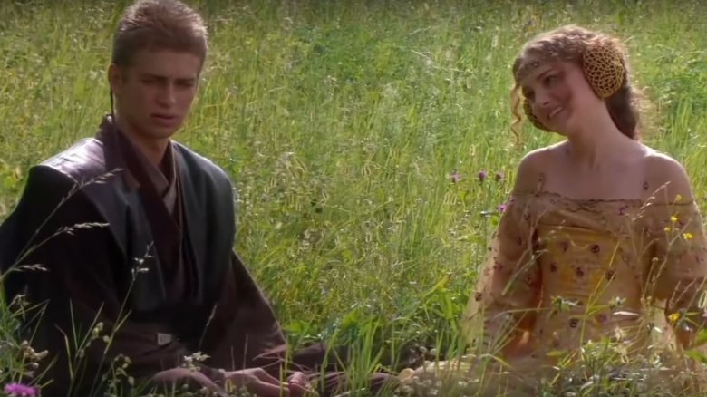
Far too much of Attack of the Clones' two-hour twenty-two minute runtime focuses on undercooked romantic and political subplots—side narratives that could've been cut down without affecting the film's overall story whatsoever. For example, main characters Anakin and Padme have entire scenes comprised of rolling around in meadows and flirting with each other, spouting lines of dialogue back and forth that are not only unnecessary but actually cringe-inducing. The quality of the movie could only have gone up if these lengthy sequences had been cut down to their core essentials, giving the happy couple enough screen time to resonate with audiences but not so much that they overstayed their welcome. The same sentiment can be applied to the political diversions of this movie.
Thankfully, a fan saw that this movie was ruined by its editing and produced his own leaner, meaner edit of the second prequel, proving that a good movie was hidden within Attack of the Clones the whole time.
