What These Horror Movies Really Look Like Before Special Effects Are Added
Traditionally, horror isn't a genre that depends on digital trickery. Taking a practical approach is often not only cheaper, but more effective when it comes to unnerving an audience—and horror movies rarely enjoy the freedom of a big budget, especially when the big studios aren't involved. Advances in technology in recent years have made convincing visual effects far more accessible, however, to the point that even low-budget productions can take advantage. Green screens are now commonplace on horror sets—and if you strip away all the special effects, what you're left with isn't very scary at all.
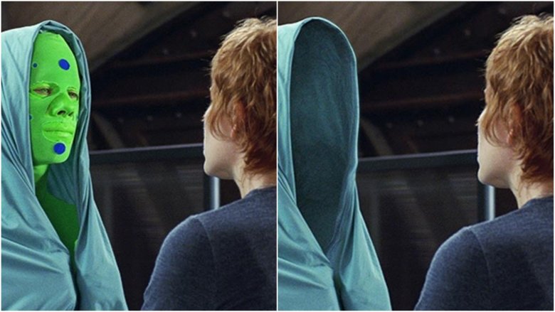
Hollow Man (2000)
Paul Verhoeven's Hollow Man fell well short of recouping its $95 million production budget at the domestic box office and it took a hammering in the media, with only 27 percent of Rotten Tomatoes critics reviewing it positively. The general consensus was that the film didn't live up to previous offerings from the Dutch director, though even the harshest critics of Hollow Man admitted that the special effects were impressive, something Verhoeven was particularly proud of.
"We really tried to link the special effect shots with the actors as much as possible," he told DVD Talk. "That's why we were constantly sliding, panning and moving the camera, so the audience would feel that the actor was in the special effect shot or that the special effect shot was tied to the actor. We wanted coherence between the special effects and the actors so people would accept the effects as part of the actor's scene rather than as a special effect."
Jerome Chen, Senior VFX Supervisor at Sony Pictures Imageworks, talked about the "relentless effort" put in by Verhoeven alongside visual effects gurus Scott Stokdyk and Scott E. Anderson during an interview with FX Guide. "That film was all done with Rotomation off the performance of Kevin Bacon," he explained. "No motion capture, just hard thousands of hours of labor."
The Ring (2002)
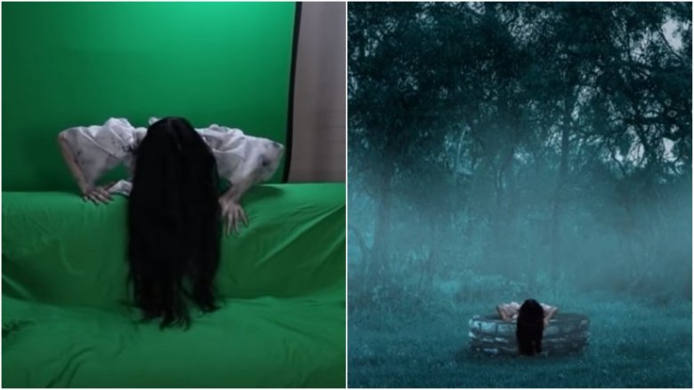
A remake of Hideo Nakata's haunting classic Ringu, Gore Verbinski's box office smash The Ring kick-started Hollywood's obsession with Japanese horror during the mid-2000s, though unlike most of them, this remake actually stood up to the original. Naomi Watts stars as Rachel Keller, a Seattle journalist who finds herself investigating an urban legend about a videotape that kills anyone who watches it in seven days. When her son unwittingly pops said tape into their VHS player, the pair are haunted by Samara, the terrifying, black-haired child who crawls out of a well and straight through the television.
This iconic moment was achieved using green screen, with actress Daveigh Chase (who actually grew up to be gorgeous) clambering over a sofa that was later turned into a well in the middle of a spooky field by the VFX team. The look of the vengeful ghost wasn't created digitally, however, it was the work of special effects makeup artist Rick Baker. "I liked doing Samara, doing a horrifying image that sticks with you," he said. "I think the scariest thing about Samara, for me anyway, is not knowing what's under that hair." Baker revealed that several different wigs were created for the movie, all of which were made from real human hair.
Crimson Peak (2015)
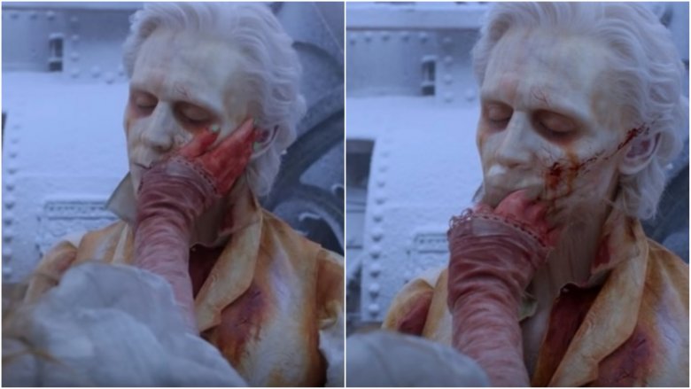
Guillermo del Toro became well-known for his imaginative use of practical effects after his Spanish language fantasy epic Pan's Labyrinth took home three Oscars in 2007; a decade later, his The Shape of the Water also generated strong awards buzz, leading the 2018 Golden Globes nominees with nods in seven categories. This marks a return to form for del Toro, whose 2015 gothic romance Crimson Peak tanked hard at the box office. Crimson Peak relied on what VFX supervisor Chris MacLean called "practical hybrids" for the most part, mixing green screen with creature builds.
One example of VFX house Mr. X blending practical and digital techniques can be seen towards the end of the movie when Edith (Mia Wasikowska) has a farewell moment with Thomas (Tom Hiddleston) and her fingers go right through his face. "They shot that practically and we had to take over her hand completely in CG," MacLean told FX Guide. "Then on the B side sync up to the plate again, which was a very strange way to do a shot, but nonetheless it was one of the most rewarding ones. We did a volume sim of the fingers going through, which then connected with the ectoplasm that she pulls out of his face and swirled around her fingers."
The Conjuring 2 (2016)
James Wan's The Conjuring was the first film in what would later evolve into a shared movie universe encompassing the Annabelle series as well as The Nun and The Crooked Man. Visual effects artist David Ridlen worked on a few shots for the first Conjuring movie, rendering some everyday items that you probably didn't realize were CGI; as he later pointed out, "I created the sheet, birds, necklace, rope and specter."
VFX artist Didier Konings (who recently worked on DC smash Wonder Woman) was hired to take care of the little details in The Conjuring 2, removing security cameras and altering buildings to make the 1970s setting look authentic. There was nothing retro about the camera setup Wan used, however, opting to shoot in digital over film. "I used the Alexa on this one, the same camera that I used on the first Conjuring and also the same camera I used on Fast and Furious 7," the director told Collider. "I'm a big fan of the Alexa camera because I think it just creates really beautiful blacks and I don't know, I'm just a big fan of this particular camera. I'm a big fan of digital."
The Thing (2011)
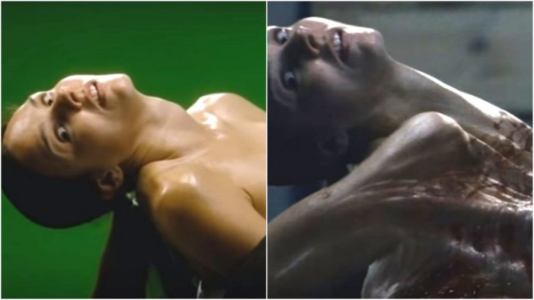
A prequel to John Carpenter's 1982 horror classic of the same name, Matthijs van Heijningen Jr.'s The Thing follows the plight of a doomed group of scientists who discover a living alien buried deep in a block of Antarctic ice. Visual effects had come a long way in the years between the two movies, and Heijningen was eager to take advantage of the new technology. According to the film's VFX supervisor Jesper Kjolsrud, the director was particularly concerned about how the transformation of French geologist Juliette (Kim Bubbs) would turn out.
"Matthijs constantly asked what we would see, how much of her human-ness remained, how much alien is pushing through the skin?" Kjolsrud told Art of VFX. "Since tentacles are a big part of the alien look, this gave us the idea of 'ball of snakes trying to push through the skin', which is what you see in the first shot. Then, as the teeth of the alien mouth rip the skin, we see the inside tentacles push through while Juliette's head is forced towards her back." The Image Engine man revealed that animating this scene was a huge challenge, but, like most things in the world of VFX, it was achieved through trial and error.
Godzilla (2014)
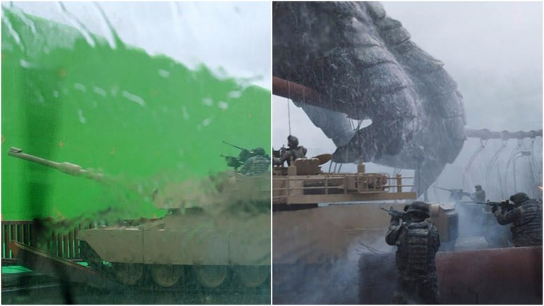
Director Gareth Edwards used to work as a visual effects artist on BBC and Discovery Channel TV shows, but today he's a genuine A-list helmer. He put himself on Hollywood's radar with his visually impressive low-budget breakout Monsters in 2010, and the following year he was offered the job of rebooting Godzilla. Edwards was concerned that signing on for a Hollywood blockbuster meant he would have to relinquish control to a certain extent, but the studio's reaction to the first teaser trailer he cut put his mind at ease.
"I just wanted to do what I thought would give me goosebumps," he told FX Guide about the teaser, which became one of the major talking points at San Diego Comic Con 2012. MPC were the VFX house Edwards brought in to make the trailer, and they went on to help render a number of the big set pieces in the final film, including Godzilla causing havoc in San Francisco Bay. "Godzilla," supervisor Guillaume Rocheron told Art of VFX, "is amongst the most complex CG creatures we have ever created."
The Shallows (2016)
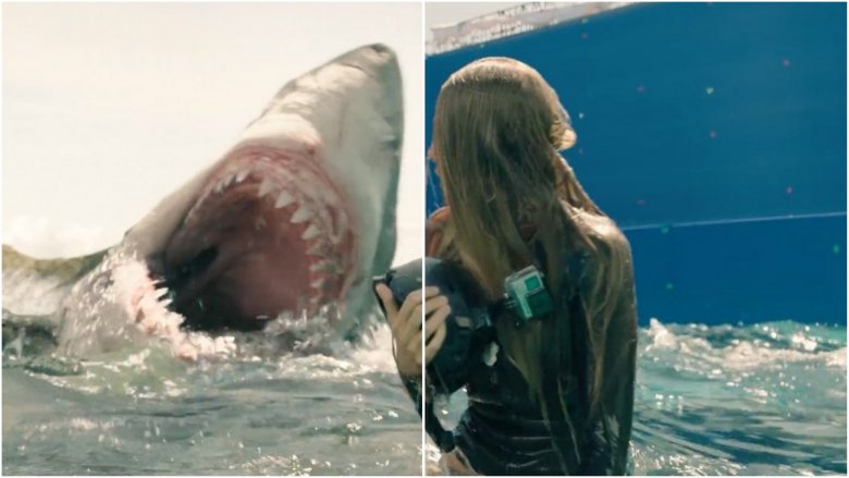
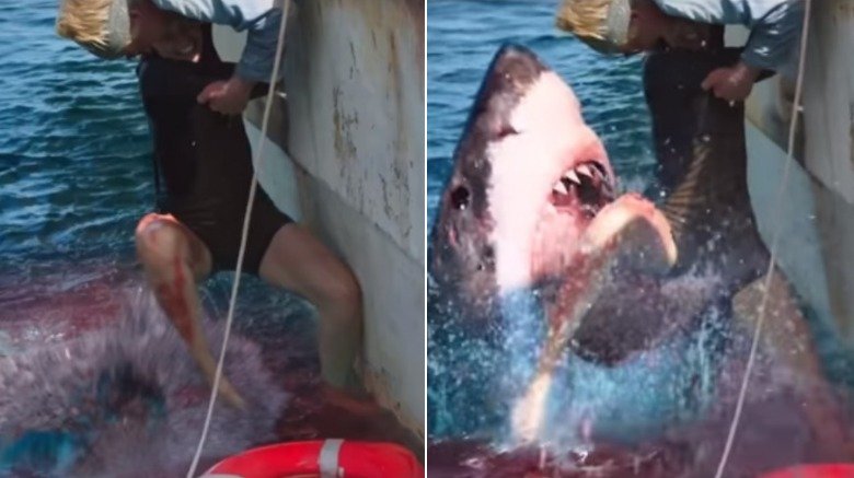
Jaume Collet-Serra's survival horror thriller The Shallows seemed to come out of nowhere in 2016, going Certified Fresh on Rotten Tomatoes as critics praised star Blake Lively for delivering a "powerful performance" as stranded surfer Nancy Adams. The predator stalking her throughout was created by the brilliantly named Important Looking Pirates, a Swedish VFX house that specialize in sharks. Visual effects supervisor Scott E. Anderson revealed that the company had the expertise to make subtle changes to the great white's design based on the environment.
"The underwater look of the shark had a particular aesthetic that was really driven by Jaume and his scene by scene mood of the film," Anderson told FSR. "We started with very realistic looks and actions, culled from a large amount of shark reference footage, that drove both the look development and character development at ILP." The VFX team were able to add a shine to the shark's skin that made it more visible beneath the surface, though in reality you would barely see it coming. "Most animals, sharks included, are designed to blend into the environment," Anderson added. "Our job is to use visibility selectively to meet the needs of the film and direct the audience and eye when we want or need to."
The Purge: Election Year (2016)
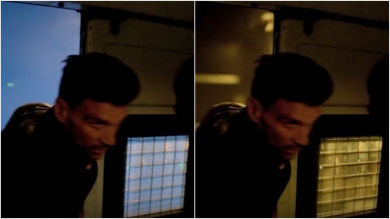
Visual effects veteran David Hattin has worked on countless horror franchises over the years, from Final Destination and Scary Movie to Sinister and Insidious. But of all the horror films on his résumé, none have been quite as timely as The Purge: Election Year, released in 2016 at a time of heightened political tension across the United States. Thanks to Hattin's company VFX Legion, viewers were able to experience another frightening night on the lawless streets of a bleak near-future America, though for the actors involved, many of those streets were actually green screen. According to Hattin, his priority on a project like this one is delivering value for money.
"Horror movies do not have huge budgets, and so the idea that CG's going to be in your horror movie, it's really hard to do because they're not funded to do that," he told FrightFind. "I mean, to do a CG creature in a movie is going to cost you $1 million. A horror movie might be done for $3 million or $2 million." Hattin went on to explain that it's his "personal policy" to make sure that any shots his company are responsible for don't look cheap, even if they are cheap by blockbuster standards, adding, "My goal in delivering shots out of VFX Legion to the world is they should not bump in the cut."
Prometheus (2012)
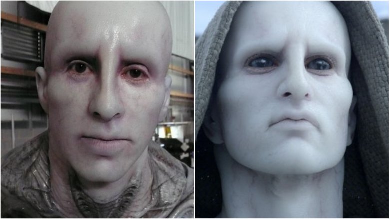
A number of top VFX houses worked on Ridley Scott's long-awaited return to the Alien franchise, including MPC, Fuel VFX, Luma Pictures and Weta Digital. The New Zealand-based company were tasked with rendering the film's new race of giant humanoid extraterrestrials, which involved digitally enhancing the on-set performance of a costumed actor. "The engineer had unique challenges," Weta's VFX supervisor Martin Hill said. "Usually we would strive to make a digi character as anatomically accurate as possible in terms of its musculature, articulation, and the thickness and pliability of the fat under the skin ... We had to make some compromises to match an actor in silicone prosthetics."
Designing the look of the engineers was a job that fell to concept artist Neville Page, probably best known for his creature work on the J.J. Abrams Star Trek reboot trilogy as well as the new Star Trek: Discovery TV series. Page told Wired that when Scott first approached him, the director envisioned the engineers as a mixture between some well-known statues and one legendary musician. "When Ridley first asked me to be involved with the engineer, he was very specific about what he wanted it to look like in terms of metaphors," Page said. "I was looking at references of the Statue of Liberty, the Michelangelo sculptures—specifically David—and, oddly, Elvis Presley."
World War Z (2013)
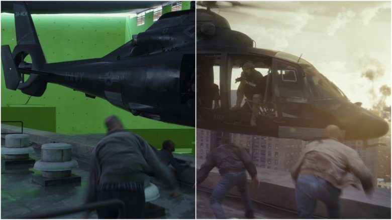
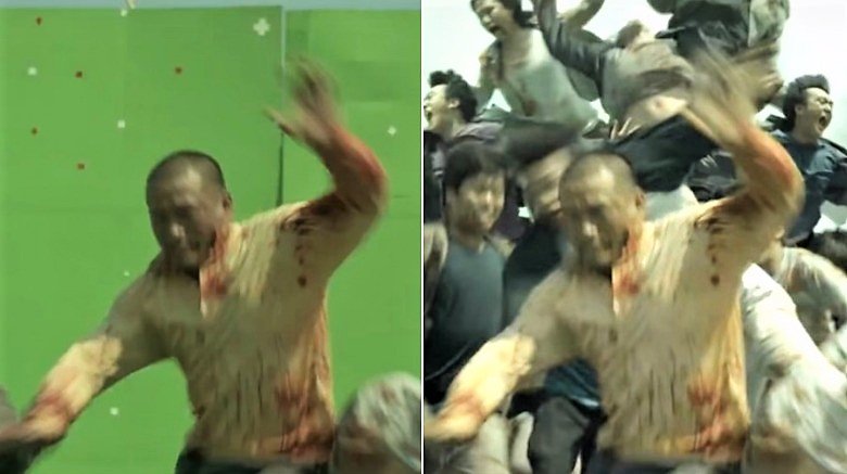
When he sat down to discuss his team's achievements with Wired, World War Z visual effects supervisor Scott Farrar explained it was always their intention to break from the traditional zombie mold with this movie. They went with a scientific approach, reckoning that a real virus of this nature would make humans fast, vicious and relentless. The biggest example is the epic moment when 8,500 zombies (every single one of them computer animated) pile on top of each other to breach the walls of Israel.
"The single hardest thing about that was just making those piles look right without something going wrong," Farrar said. "You're always battling with what looks good and cool in a movie and still feels real. You can look at these shots every day for months and then all of the sudden you're almost ready to go to final and somebody will spot something that's wrong in the shot. It's like Where's Waldo?" While CGI clearly played a massive part in bringing this adaptation of Max Brooks' 2006 novel to life, animation director Andrew Jones favored a mixture of computer graphics and practical performances, hiring talented contortionists who could mimic the semi-possessed look they were going for.
Krampus (2015)
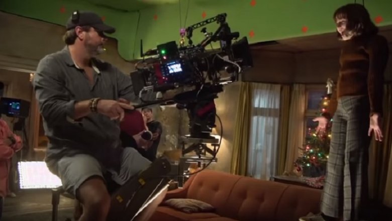
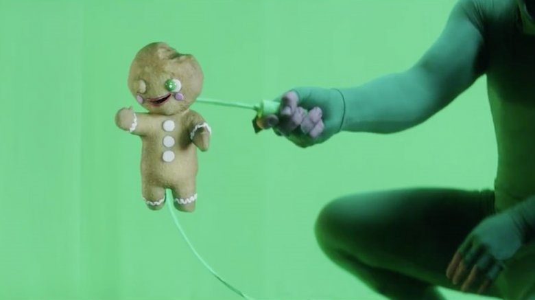
To promote their work on the 2015 Christmas horror movie Krampus, Weta released a mock interview with the film's "Chief Gingerbread Handler," who claimed that working with the mischievous little gingerbread men on set was a bit of a nightmare. In reality, they were one of the smaller challenges Weta faced on the project, which was approached in a largely practical fashion for the sake of nostalgia. "This is a classic '80s monster movie," Weta Workshop co-founder Richard Taylor said. "This is fantastic stuff, this is what we live for, this is what gets us up in the morning." Leading man Adam Scott compared Krampus to cult favorites The Dark Crystal and Gremlins in the same featurette, though the creatures on display here were a lot scarier.
From the animatronic Cherub that attacks Toni Collette in the attic to the terrifying Jack in the box operated from the inside by three puppeteers, Krampus' minions were as ingenious as they were unnerving—none more so than the Anti-Claus himself. The titular demon was portrayed by Luke Hawker, who wore a custom made costume complete with hoof-stilts and prosthetic finger extensions. There were no eyeholes in his mask; instead, a tiny camera was hidden inside an open wound so Hawker could see where he was going using a screen inches from his face.
I Am Legend (2007)
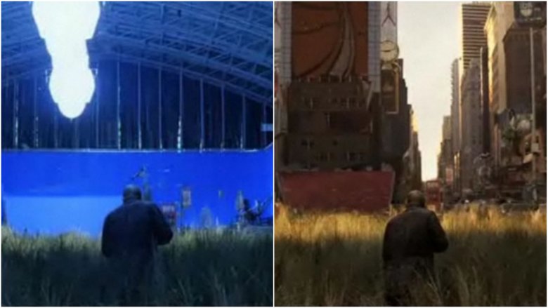
The Will Smith-led adaptation of Richard Matheson's seminal zombie novel I Am Legend did pretty well with the critics and didn't disappoint at the box office, but it's widely accepted that the CGI sucked. The film was fast-tracked into production before a script had even been completed, and the schedule started to get backed up when the practical creature effects they'd chosen to go with turned out to look terrible on camera. The decision was made to render the undead digitally, though in reality there was never enough time to make them look convincing—and that ultimately killed the movie, according to the director.
"It was better than doing the live versions at that time, because it didn't work, but we needed six more months on the post end to get all the visual effects right," Francis Lawrence told Den of Geek. "Because there were some close-ups that were stunning, and then you get some shots that I never got right, and ... it just kills it. One of the big downfalls for me with that movie, personally, was with the visual effects." VFX supervisor Janek Sirrs (who went on to work on several Marvel movies) told AWN that the animators were still redesigning creatures during post-production to match the "continually evolving nature of the film."
Deadly Honeymoon (2010)
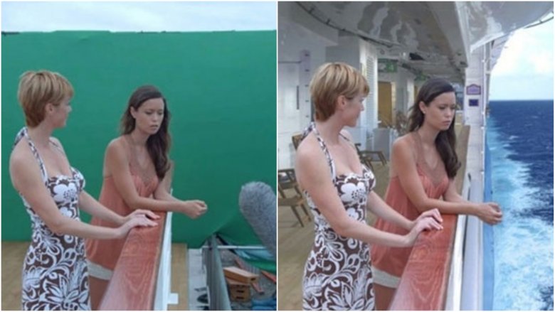
Even if you consider yourself a true gorehound, chances are you've never heard of Deadly Honeymoon. This low-budget TV movie from 2010 probably would have flown under the radar altogether had it not been based on true events that took place five years earlier—a story that grabbed news headlines and became the subject of a Dateline report. In 2005, newlywed George Smith and his bride Jennifer set sail on their dream honeymoon cruise, though only one of them would survive. The groom simply vanished one night, and the mystery of his disappearance has never been solved.
Lifetime decided to adapt the story into a television feature, changing the names and creating their own explanation. They cast Summer Glau (Arrow) in the role of wife-turned-widow Lindsey, which was a dream come true according to the actress. "I've wanted to do a Lifetime movie since I was a little girl," she told My San Antonio. "It's a really good way for girls to get challenging dramatic roles." Her faith in the network was rewarded when they hired an experienced VFX crew to turn the set into the open ocean. Tyler Foell (Hellboy, The Walking Dead) came on board as visual effects producer with Kent Johnson (Stargate, Con-Air) supervising.
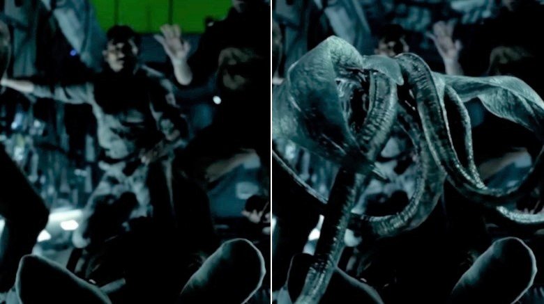
Resident Evil: Retribution (2012)
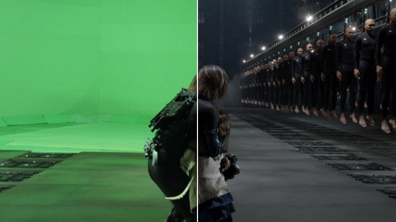
Milla Jovovich brought her tenure as butt-kicking zombie slayer Alice to an end in 2016 with Resident Evil: The Final Chapter, a movie that did only marginally better with the critics than its predecessor. 2012's Resident Evil: Retribution was said to offer "very little beyond stylishly hollow CGI-enhanced set pieces" and it only generated $42 million domestically, despite costing $65 million to make. After sitting through this "haphazard" sequel (the fifth Resident Evil installment in all), Variety's Joe Leydon suggested that nobody involved with the franchise seemed to care anymore, but one man who would dispute that is Trey Harrell.
As lighting supervisor for VFX house Mr. X (who have worked on the majority of Resident Evil movies to date), Harrell was able to confirm that he and his colleagues worked harder than ever before on Retribution, particularly on those big set pieces that ultimately dominated the movie. An example of that is the chamber scene, in which Alice and her daughter stumble across a conveyor belt carrying thousands of Umbrella Corporation clones.
"It's an enormous underground manufacturing room where hundreds of clones are floating in this enormous environment of which we shot very, very little practically," Harrell told FX Guide. "I think we had 9,000 hero clones on rails simultaneously." According to digital effects supervisor Eric Robinson, they used a dry cleaners as a reference point, explaining, "We had to sell the idea that this was a deep freeze for clones, but at the same time it had to be in motion."
The Meg (2018)
Steven Spielberg laid the blueprint for the summer blockbuster with 1975's Jaws, and in doing so he turned the shark into the slasher of the seas. Critics argue that sharks have been unfairly demonized by Hollywood in the decades since, especially the great white, which in reality rarely attacks humans. Great whites have been overused as a plot device at this point, but The Meg was on hand to up the ante considerably in 2018.
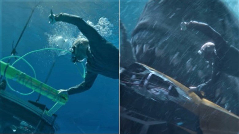
Led by British action star Jason Statham, this ocean-set survival horror revolves around the discovery of a Megalodon, the largest known predator in history. This prehistoric nightmare is thought to have weighed as much as 60 tons and could apparently reach lengths of up to 70 feet. A shark this size is almost unimaginable, but imaging it was exactly what Scanline was hired to do. Speaking to Art of VFX, visual effects supervisor Mohsen Mousavi revealed that the company had been involved with The Meg for ten years.
"It's been a long haul, but it's great to see it get made," Mousavi said. "In addition to creating almost 500 shots — including big action moments with the shark — as the main vendor, we were also tasked to lead the development of the Megalodon itself." Scanline went out of its way to design a shark that didn't resemble a great white, taking inspiration from other members of the family. "The overall palette of the Meg was based on different shark species and in particular the nurse shark."
The Wolfman (2010)
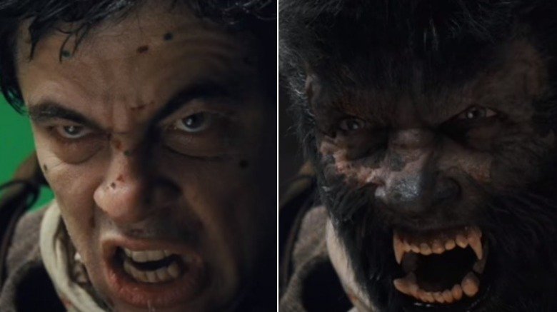
It utilized two of the industry's leading VFX houses in MPC and Double Negative, but Joe Johnston's The Wolfman failed to dazzle critics, picked apart for a lack of suspense and any real scares. This reimagining of the critically acclaimed Universal Monsters classic was produced by its leading man Benicio del Toro, whose "beefcake-gone-bad magnetism" wasn't enough to justify the price of admission, according to L.A. Weekly. The California publication called the reboot "unintentionally camp," but it could have been a whole lot camper.
Speaking to AWN about the troubled production, overall VFX supervisor Steve Begg revealed that the original plan was to have del Toro wear makeup, but that was soon abandoned in favor of a full CGI approach. The timeframe that the VFX crew had to work with was already on the short side, however, so animators were under real pressure to create the title character from scratch. "There wasn't a lot of planning in the visual effects work," Begg admitted. "I think that was courtesy of the fact that Joe had only three or four weeks before we actually started filming, so everything was ultimately biased toward a post-production approach. So the designing really occurred later."
Despite the time constraints, all the vendors involved took on complex work that often required "detail down to every pore of skin," according to Begg. "Skin lighting and shading were pushed to the next level for this project, including new efficient methods for sub-surface scattering and fine specular modeling."
Dark Shadows (2012)
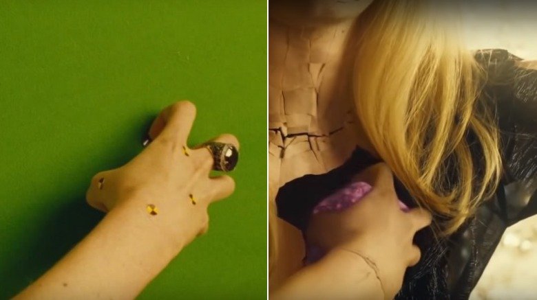
Tim Burton had already collaborated with MPC on Corpse Bride, Sweeney Todd and Charlie and the Chocolate Factory prior to Dark Shadows, so he trusted the vendor to do his longtime passion project justice. "Tim is [a] very VFX savvy director," MPC's Arundi Asregadoo told Art of VFX. "He is very aware of what is capable within visual effects." Asregadoo revealed that numerous elaborate sets were constructed to keep the use of green screen to a minimum, but some sequences simply couldn't be achieved without it. One such sequence involved Eva Green's Angelique Bouchard (a vengeful witch with a creepy smile and a porcelain exterior) reaching into her hollow chest and removing her own heart.
"The look and design of the heart was an on going process," Asregadoo said. "Tim wanted something magical. We went through a series of different concepts at MPC, from a heart made of feathers, to metal and even the possibility of it being a bug. The reference we went with in the end was actually closer to a real heart, but with the luminescence of a jellyfish."
Dark Shadows (based on the campy soap opera of the same name) cost $150 million to make, but only managed a domestic return of $80 million, relying on overseas markets to lessen the blow. IndieWire called the horror-comedy "another lazy, incoherent disappointment from Tim Burton," and most reviews shared that sentiment. Some critics did single out the visuals as a plus point, but Dark Shadows simply failed to find its rhythm.
Train to Busan (2016)
Korean VFX house Technical Art Studio Cell started out in special effects makeup, but founder Kwak Tae-yong decided to start incorporating computer graphics after he realized that blending the two created exciting new opportunities. "Collaboration with computer graphics has expanded the range of expression," he told the Korean Film Council. "We're able to extend the length of a sequence without any interruption."
Kwak has plied his trade on around 130 films in his career to date, but not many have been as challenging as 2016's Train to Busan. The Korean zombie apocalypse flick set multiple box office records domestically and it proved a hit with critics overseas, earning an impressive 96 percent rating on Rotten Tomatoes. The film takes place almost entirely on a train hurtling towards the city of Busan during a zombie outbreak — not an entirely unique premise, but director Yeon Sang-ho employs a variety of "creative solutions" to keep the momentum going, according to Bloody Disgusting.
The horror website praised the "adrenaline spiking" set-pieces on display throughout Train to Busan, which Kwak and his team of VFX artists apparently had limited time to render. "It's difficult to prepare large-scaled films in a short time span," the visual effects veteran said. "Our company's strong points lie in the fact that we always have 15 full time employees on standby. We are equipped with such infrastructure. And when we have the time, we add additional dummies to our collection of several dozen in our storage."
Priest (2011)
Very loosely based on the popular manhwa (the Korean equivalent of a comic) of the same name, Priest takes place in an alternate reality in which mankind has been at war with vampires for centuries. Paul Bettany stars as a vampire hunter out to rescue his kidnapped niece in this bizarre mashup of horror, sci-fi and western themes. "Even with hives of cool-looking vampires, cowboys on motorcycles and ninja priests, there are some stories that are just too dumb to live," io9 said when they revisited Priest in 2018.
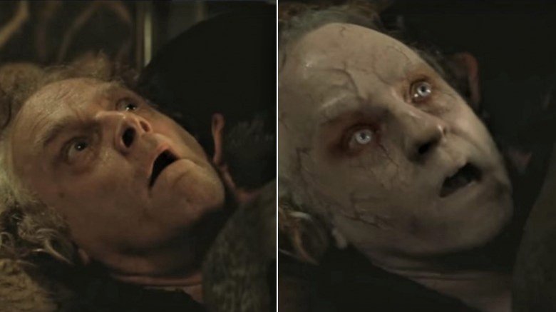
Most critics were quick to point out the many things wrong with this movie (it only managed a sorry 15 percent rating on Rotten Tomatoes), but the visuals earned some praise. VFX supervisor Jeff Campbell revealed that one of the most difficult shots involved layering a CGI face on Brad Dourif. The Lord of the Rings actor transforms into a slave after he's bitten by Black Hat (Karl Urban), and Campbell's job was to make it look convincing.
"I do like to fit in some challenging shots while I'm supervising and this was one of them," he told Art of VFX. "We had a head scan of Brad that I match moved and used to receive animated texture projections. The projected textures involved veins creeping around his face and eyes that were animated by paint reveals and bump mapped for depth. His pasty skin and dark sallow eyes were added using animated garbage masks over the duration of the shot."
47 Meters Down (2017)
Based in Bournemouth, England, Outpost VFX was one of the many visual effects companies tasked with making Jurassic World: Fallen Kingdom a reality, but before it joined the blockbuster dinosaur sequel, its artists were cutting their teeth designing a prehistoric beast of a different kind. Outpost was the sole vendor on 47 Meters Down, a survival horror that pits two cage divers against (you guessed it) great white sharks. Claire Holt and Mandy Moore play the hapless American tourists, but the photoreal CG sharks were the true stars of the show.
"47 Meters Down was a real breakthrough opportunity for Outpost VFX to show what we are capable of producing," owner Duncan McWilliam told AWN. "Being the sole VFX vendor on the show across such a broad range of VFX disciplines was fantastic for our team to really flex their creative and technical muscle. This show really accelerated the development of our in-house proprietary tools and pipeline, and now gives us a great calling card for creature and environment work across VFX-heavy shows."
While the movie did act as a Hollywood calling card for Outpost, it split critical opinion. The Hollywood Reporter's Frank Scheck said that it worked just fine "on its own B-movie terms," making good use of a "quick set-up, rapid pacing and brief running time." It was still way too long for the Globe and Mail's Dave McGinn, who argued, "Even at 89 minutes, you can feel the oxygen running out of this movie."
Life (2017)
One of the Hollywood pictures that Outpost got a job on thanks to 47 Meters Down was Life, the Sony sci-fi horror that some still believe is a secret prequel to Venom. Despite the draw of an A-list cast, Life was a big letdown at the domestic box office, making just $30 million against a production budget almost double that figure. Writing for The New Yorker, critic Richard Brody suggested that director Daniel Espinosa wasn't right for the job.
"Espinosa shrinks from the unmitigated bodily horror that, say, David Cronenberg might have brought to the project," Brody said. Part of the problem, he argued, was that Calvin (the Martian alien that wreaks havoc on the crew of the International Space Station) peaked too early. The design of the creature was also a sticking point for many critics — Jordan Calhoun found the "Pokemon-like evolution" stages Calvin went through to be "hilarious" rather than menacing. As it turns out, the studio and the director were actually at odds over the design.
"It was a hugely fluid and evolving process as Daniel had some specific ideas about what he wanted and the studio also had ideas about what they wanted, which didn't always match up," Double Negative VFX supervisor Huw Evans told Art of VFX. According to Evans, concept art had Calvin as "ethereal and amorphous" throughout, but Sony execs (worried that the climax wouldn't be scary enough) pushed for the creature to evolve into something more "solid and animal based" by the end of the movie.
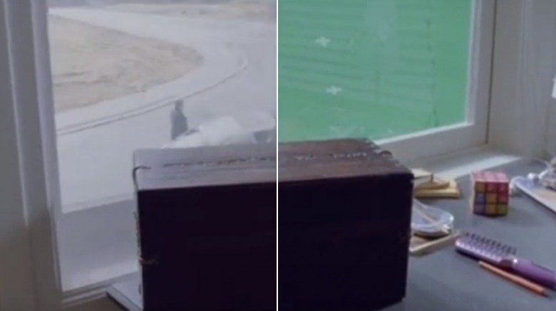
The Possession (2012)
From classics like Poltergeist and Child's Play to more recent releases like Veronica and Deliver Us from Evil, the horror genre is rich in "based on a true story" movies, which is often the hook for audiences. These kind of movies add another dimension to the viewer's fear, which is exactly what producer Robert Tapert wanted to achieve with The Possession.
"We want audiences to leave the theater with the feeling that — since the horror you just witnessed is based in fact — it could come calling for you," he told CGRamp. "The idea of the Dibbuk Box is something we think will scare audiences not just in the theater, but after they leave." The real Dibbuk Box is a wine cabinet that was brought to America by a Polish Holocaust survivor named Havela. She claims to have trapped a dibbuk (a malicious spirit in Hebrew tradition) inside it during a séance, a popular pastime between the two World Wars.
In The Possession, the box gets a complete overhaul, made to resemble an actual box as opposed to a far less practical wine cabinet. "It was less important for us to recreate the actual box as to create a box you believe might contain something that was locked away to never be let out in the world," J.R. Young, another producer on The Possession, said. "[We] went back to the original story for the contents, including the bird skeleton, the locks of hair and the strange wooden carvings."
American Horror Story: Freak Show (2014-2015)
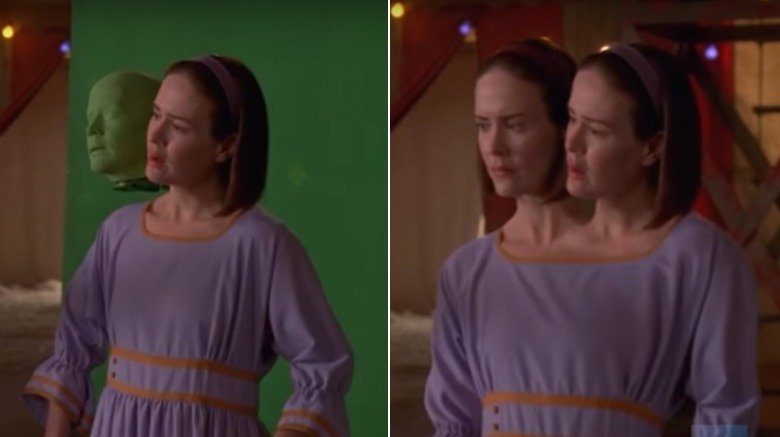
It isn't a movie, but FX's hit show American Horror Story has displayed some of the best visual effects in the genre in recent years, particularly in season 4. Freak Show is based around a small traveling circus searching for new and exciting acts to help it compete with the advent of television, and the job of bringing the so-called freaks to life fell to FuseFX. The Los Angeles-based VFX vendor had been working on American Horror Story from the first season, though Freak Show presented some unique challenges, including giving Sarah Paulson a second head.
"Most of [the] time, both of her sides are shot on green screen," VFX supervisor Jason Piccioni told Post magazine. "We've got a couple of rigs of prosthesis that she can wear for doing a wide shot with a prosthetic head, or where we are in an 'over' and we want to see the two heads." Piccioni revealed that he had a guy from his team on set every single day to make sure everything was as it should be from a VFX perspective. "He and Sarah are quite close," he said. "That's all very carefully choreographed, and he sits with the director and DP and walks Sarah through it all. It's a well-oiled machine by now."
Paulson had portrayed a medium, a reporter targeted by a serial killer, and a witch blinded by acid on American Horror Story by this point, but she called the dual role of conjoined twins Bette and Dot her "craziest" part yet.
