Spider-Man: Across The Spider-Verse's Chaotic Animation Distracted Some Fans
Animation has a unique way of bringing life to still images. As opposed to live action endeavors, animation allows for tremendous artistic freedom, as many events in cartoons may be impractical or unfeasible in the real world — at least when it comes to the budgetary concerns of major motion picture studios. One of the best examples in recent memory of phenomenal animation and art direction is 2018's "Spider-Man: Into the Spider-Verse," and the freshly minted sequel "Spider-Man: Across the Spider-Verse" continues the trend of mind-blowing scenes. Unfortunately, it looks as if some viewers have been completely overwhelmed by the style of "Spider-Man: Across the Spider-Verse," and have taken to social media to lament this fact.
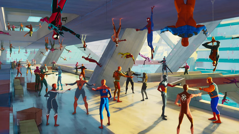
Over on Reddit, several users gathered to discuss the exceptionally well received "Spider-Man: Across the Spider-Verse," though one complaint seemed to pop up in many conversations. One such internet denizen, u/takenpassword, shared that they loved how the Spot character in "Spider-Man: Across the Spider-Verse" was the bagel guy from the first movie, but then added, "Also unpopular opinion but I thought the animation got a little too frantic and made the movie feel unnecessary [sic] chaotic at certain points. Like some parts of the opening battle there is just a lot going on."
Some viewers had a hard time following the animation of Spider-Man: Across the Spider-Verse
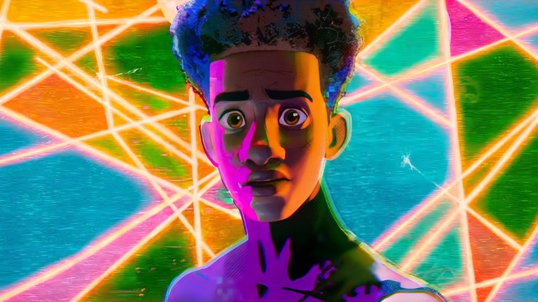
Others shared the above sentiment, like u/kristin137, who said that they also struggled to keep up with what was going on during some scenes in "Spider-Man: Across the Spider-Verse." Commenter u/HandsomeHawc noted one scene that they hard a hard time following, and wrote, "It's easy to get lost in the sauce, there is consistently so much happening on the screen. It works most of the time but there are definitely a few scenes where there is just so much to look at. The heart to heart between Gwen and her dad was probably the worst offender of this. It's supposed to be this intimate moment between them and the backgrounds are just popping off with constantly changing colours and designs. It was a bit distracting."
Meanwhile, u/BedsAreSoft also empathized with those that couldn't quite follow all of the action in "Spider-Man: Across the Spider-Verse, saying that there is truly a lot going on in almost every scene. They added that the early fight involving multiple Spider-Men was hard to keep track of because of opposing animation styles, but they feel like that it doesn't deter much from the incredible look and feel of the movie.
Elsewhere, u/Linubidix pins the general chaos of "Spider-Man: Across the Spider-Verse" to an over abundance of style, which they felt like the first movie got just right, where this new sequel goes a little overboard at points. Additionally, u/JAMellot23 heaped praise on the new film as a visual achievement, but stated that the movie could have used a little restraint. All of these comments highlight one thing — that "Spider-Man: Across the Spider-Verse" is a great movie, though a tad overwhelming for some in the animation department.

