The Worst Special Effects Fails In Popular Movies
No matter how big a budget or talented a team, sometimes good special effects aren't in the cards for a movie. That sums up the blockbusters we've assembled here: most had loads of money and a bunch of experienced professionals guiding their development — and yet, either because of time constraints, bad artistic visions, or some brutal blend of both, their visuals ended up looking pretty darn bad. From comic book superheroes with CGI Jell-O for supersuits to transforming robots made out of poorly animated Rubik's Cubes, we've hand-picked the pinnacles of VFX and CGI failure in popular cinema.
Keep in mind that some of these flicks are still a blast, and more than a few feature plenty of good instances of CGI and special effects throughout. Others, of course, are just all-around not very good movies. What unifies these diverse films is that at some point, they all dropped the ball and foisted a historically bad visual atrocity upon viewers' eyes. Get ready to read up on the worst special effects fails in popular movies.
The Matrix 2: CGI Boogaloo
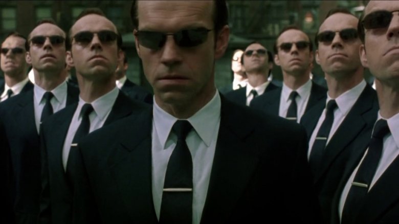
Though The Matrix trilogy pioneered a lot of the crazy CGI bombast we've become accustomed to as blockbuster cinema fans, that doesn't mean it's safe from criticism. Case in point: the clone showdown in The Matrix Reloaded. While the first Matrix movie's CGI tried to keep itself relatively contained (even when it upped the insanity ante towards the end of the movie), Reloaded's reliance on effects is exponentially greater and, to the movie's disservice, far more noticeable.
This point is most apparent during Neo's fight with hundreds of Agent Smith clones, who attack him like kung-fu zombies. In order to fight so many at once, Neo essentially turns his own movie on fast-forward and attacks with an incredibly unrealistic amount of speed and precision, to the point where he's kicking twenty Smiths a second, and they all go soaring through the air as though they were attached to invisible, malfunctioning jet packs. The weightless, impact-less physics of the digital ragdolls, coupled with the absurd speed at which everything happens, takes all the grit and tension out of the series' traditionally hefty martial arts madness. This scene, and a lot of The Matrix Reloaded as a whole, replaces the power of practical fighting with an even greater emphasis on impractical CGI.
Rubber zombies
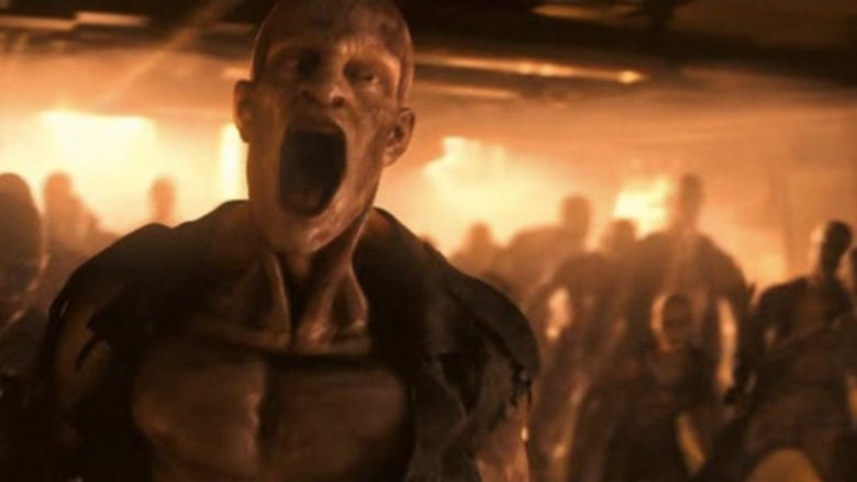
I Am Legend has a lot in common with bad horror movies, in that a sloppy CGI monster appears halfway through to ruin most of the suspense and fear that had been building up to that point. That's not to say I Am Legend is a bad movie overall, but we are saying that it drops the ball in the CGI department when it matters most. The film is more or less a zombie survival flick, though the zombies on display in this movie go by the name "Darkseekers."
The reveal of the Darkseekers is a big deal in I Am Legend, and the movie goes to great lengths to hype them up as a very real threat grounded in an authentic world we can all believe. Unfortunately, that illusion of authenticity is destroyed when we actually meet the Darkseekers. While it's clear that their design had lots of promise, the CGI used to bring them to life definitely needed a few more months to settle. Their skin is rubbery, their facial expressions are cartoony, and everything about them feels a little undercooked. Little details, like more stretch lines around their mouths when they yell, or creases above their eyes while emoting, could've gone a long way towards turning these CGI puppets into genuine nightmare fuel.
Mustache of steel
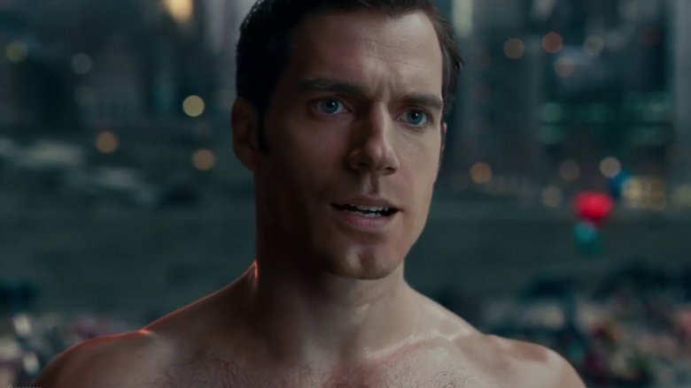
If there are three things Superman stands for, they are truth, justice, and clean faces. Thanks to Henry Cavill's busy schedule, reshoots for Justice League ended up clashing with Cavill's commitments to Mission: Impossible — Fallout. This created quite a hairy situation: could Warner Bros. convince Paramount to let Cavill raze the mustache for JL reshoots, or was fuzzy Superman going to need CGI work done in post-production?
Warner Bros. ended up going with the latter option after they lost their little face-off with Paramount, which refused to let Cavill cause a close shave for the M:I—F team. While we're glad nothing impeded Fallout's development (since that movie had enough logistical challenges on its hands without a facial hair fracas being thrown into the mix), it's unfortunate that Justice League got the short end of the handlebar mustache. Even with razor's-edge CGI technology, no amount of special effects could fix Henry Cavill's upper lip in the time Justice League's VFX artists had between reshoots and the movie's release date. That's why we ended up receiving Shrek Superman, whose squeaky-clean face ended up looking oddly inhuman thanks to some imperfect CGI that will haunt the DCEU (or Worlds of DC, as it's now being called) forever.
The Scorpion King
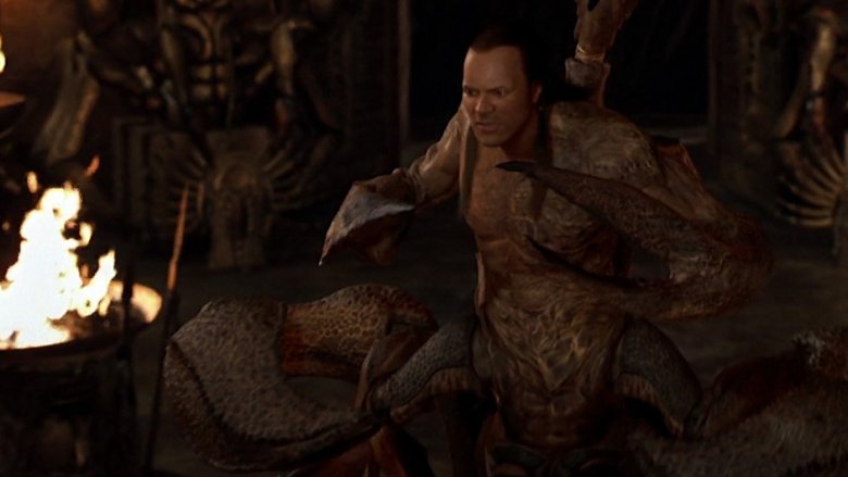
If you've ever investigated the topic of "bad CGI in major motion pictures" before, no doubt you've come across The Mummy Returns' Scorpion King countless times. And there's a reason for that: he's some of the worst CGI ever put to the big screen. Mind you, the Scorpion King's body itself, while not all that polished and definitely a little flat on textures, isn't terrible. It's the face that tends to be the deal-breaker for most people.
For whatever reason, the film's creators opted to go with a weird digital recreation of Dwayne Johnson's face rather than the real thing. Had they done some motion-capture trickery and gotten his real face into the sequence, or gone with some made-up monster mug that kept with the rest of the CGI body's quality, this character likely wouldn't be nearly as infamous. However, thanks to the weird discrepancy in special effects quality between the body and the head, as well as digital Dwayne Johnson's waxy (and spooky!) uncanny valley face, the Scorpion King will be remembered — and laughed at — by moviegoers and cinema historians forever.
Age of Extinction's particle transformations
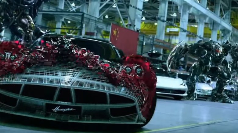
A lot of bad decisions were made with Transformers: Age of Extinction, with no shortage of them being found in the special effects department -specifically. Are we referencing the poorly-executed falling sequence that makes RoboCop's 30-year-old version of the same effect look like documentary footage? No, we're talking about the movie's obsession with particle transformations, otherwise known as the visual gimmick that defeats the point of Transformers entirely.
Age of Extinction introduced a type of transformation that could turn robots into cars and vise versa by morphing them into legions of airborne cubes. These cubes, aside from undermining the titular gimmick of the Transformers series and toy line, aren't even pretty to look at. They look cheap and blatantly artificial, in such a way that it's impossible to believe they transform into steely, 40-ton Transformers. As they swirl through the movie's many CGI sequences, it's hard not to equate them with the animations of a Windows 3.1 screensaver. Worse, when the cubes stop swirling and get around to actually forming the Transformer, they attach in such a way that it looks like the CGI image is still being rendered atop the digital mesh. Regardless of whether this effect is intentional, the point remains: the cubes look like unfinished, sloppy CGI, and are, both in concept and execution, an eyesore to watch.
Ra, god of VHS tapes
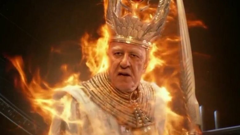
Gods of Egypt is bogged down by a lot more than bad special effects, but its lackluster CGI certainly doesn't help the movie's case. While there are a few good sequences here and there (such as the film's snake chase, which features impressive CGI, lighting, choreography, and framing), that success is the exception rather than the rule. The rest of Gods of Egypt is filled with gods who look like they're made out of plastic and a world that seems to be rendering its visuals in realtime on a PlayStation 4.
What sets Gods of Egypt apart from the other movies with bad CGI is in its uniquely bad approach to visually differentiating Ra, the sun god. For whatever reason, Alex Proyas and his crew decided to have the CGI lazily entrap Geoffrey Rush's face in a way that left his head feeling like the only real part of his body, resulting in an effect eerily reminiscent of The Adventures of Shark Boy and Lava Girl's CGI-encased George Lopez. Worse yet, the lighting effect that covers Ra's face flickers on and off in a manner so unrealistic that it looks like the unintentional shadows that scan lines produced back on VHS tapes. While this problem was a lot more pronounced when blown up on a theater screen, it still won't look anywhere close to good on your TV.
Everything in Green Lantern
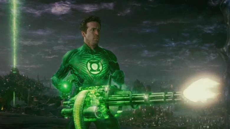
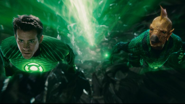
Green Lantern's special effects are just...unfortunate. While it's plain to see that a lot of effort went into the CGI in each and every scene of this movie, the results are not up to snuff with what's expected from a superhero blockbuster with a budget of $200 million. The final product has all sorts of problems, but the effects might be the most inescapable.
Where did the visual direction go wrong? Was it the idea to make Hal Jordan's suit entirely CGI? Or was it in the actual development of the suit itself? We may never know the gritty details, but whatever the reason, Green Lantern's iconic costume looks like it's made out of skin-tight, moderately moist Jell-O. That sentiment applies two-fold for Hal's mask, which always looks a little too glossy for its own good.
Of course, Hal's suit isn't the worst offender. In fact, it's probably one of the movie's visual highlights. That's because it's often sharing the screen with the likes of Kilowog and Parallax, characters whose CGI is unbelievable at best, atrocious at worst. Kilowog looks like a video game pig, and Parallax...well, he's a big poop cloud. It'd be nice if there was a more elegant way to put that, but there isn't. Given that it's a well-rendered poop cloud, though, it's likely that some of this flick's underwhelming CGI might just be faithfully recreating some bad ideas and designs that should've been ironed out early in Green Lantern's development.
The desolation of Velveeta
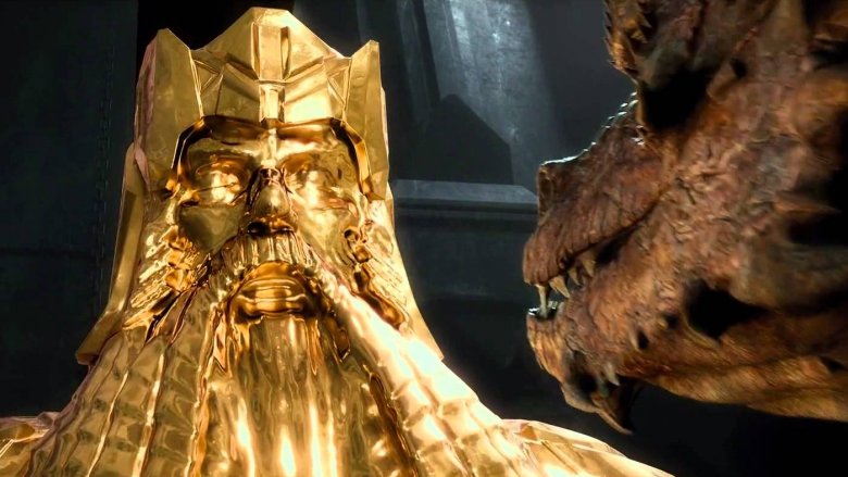
Though there's a lot of not-so-hot CGI to go after in Peter Jackson's Hobbit trilogy, including the movies' rather flat backgrounds and stiffly-animated armies, none of that stuff earns a spot on this list when compared to The Desolation of Smaug's CGI melted gold sequences.
During Bilbo and the dwarves' big showdown with the dragon Smaug, they use melted gold as part of a plan to trap the dragon. However, when the gold goes from solid to liquid, so does the audience's suspension of disbelief. Seriously, it looks like CGI nacho cheese. If said nacho cheese only showed up for a few shots, that'd be one thing, but it appears again and again during the final fight, constantly distracting you from any good visuals on display. It's weirdly smooth, devoid of reflections, and is generally just too soft and gooey for its own good.
On the whole, though, for every visual misstep Weta Digital makes with its CGI, more successes are achieved. Just look at Smaug himself, one of the most impressive CGI villains in history. This trilogy, and The Desolation of Smaug specifically, have plenty of visual wonders to be ogled, if you're willing to overlook some dodgy effects here and there.
007's CGI surfing
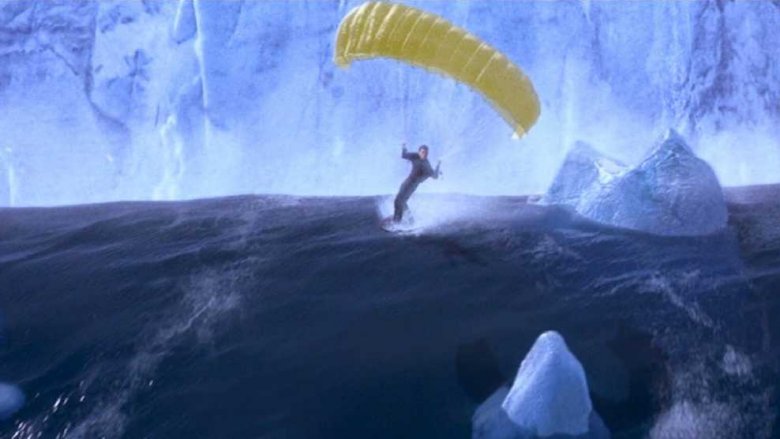
Given that the Daniel Craig era of Bond movies brought about an end (well, almost an end) to the absolutely preposterous, over-the-top stunts and campy excess of earlier Bond films, it may surprise some younger fans that there was indeed a time that these flicks made themselves out to be cheesy laughing stocks. Don't believe us? Go watch Die Another Day and try to argue that the infamous surfing finale doesn't take all the wind out of the movie's sails.
Nothing quite as poorly executed as DAD's surfing scene hit the Bond franchise before or since. Not only is the sequence's core premise embarrassingly excessive, the execution is beyond rough, especially for a 2002 movie. With CGI that makes Star Wars Episode II: Attack of the Clones' visuals look like modern-day Oscar material, Die Another Day's surfing plops Pierce Brosnan's Bond atop some PlayStation 2-looking waves and forces viewers to imagine better visuals for themselves. Seriously, if someone used a bit of crafty editing to plop Brosnan's Bond over a scene from Happy Feet, it'd look more believable. All of this is made worse by the fact that there's a separate surfing sequence in this movie that's shot practically and is genuinely engaging.
Logan's butter knives
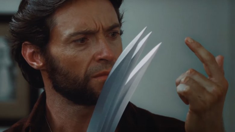
The X-Men movies have, by and large, been pretty darn good about making Wolverine's claws look as weighty, sharp, and deadly when they're digital effects as they do when they're practical. However, one movie to really miss the mark on visualizing Logan's weapon of choice was X-Men Origins: Wolverine. Though bits and pieces of the movie use lighting trickery and smart angles to make the titular character's claws look menacing and sharp, the movie's CGI issues are front and center whenever there's a pronounced emphasis put on Wolverine's knuckle-stabbers.
Take this mirror scene, for example, which sums up just how unconvincing the movie's effects were. We find Wolverine inspecting his own claws up close, and they look duller than a butter knife and flatter than a stick figure modeled in Blender. As if that's not distracting enough, they're practically floating off the tips of Hugh Jackman's knuckles. Though X-Men Origins: Wolverine has some good special effects scattered across its two-hour runtime, its many undercooked CGI shots erode a lot of the movie's charm.
