What Ultron Almost Looked Like - Exclusive
The Avengers have fought a lot of bad guys over the course of their existence in the comic books. But despite having a rogues' gallery as long as your arm, only a handful of villains who routinely vex the Earth's Mightiest Heroes have actually made their way to the big screen. And only one of them can even be said to truly be an Avengers villain first and foremost: Ultron.
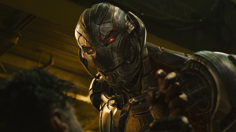
First appearing in 1968, Ultron has been destroyed, resurrected, re-destroyed, and re-resurrected so many times that you'd need a master's degree in Marvelology to catalogue them all. As a result, the character's design has changed in big and small ways with every new incarnation, meaning that the talented people in charge of adapting him for 2015's Avengers: Age of Ultron had their work cut out for them in terms of coming up with a great cinematic design.
Fortunately, Charlie Wen — former head of visual development at Marvel Studios — was up to the challenge. Wen sat for an exclusive interview to go over all the ins and outs of designing the movie version of the homicidal robot that Marvel fans love to hate.
Meet Ultron: generic evil robot
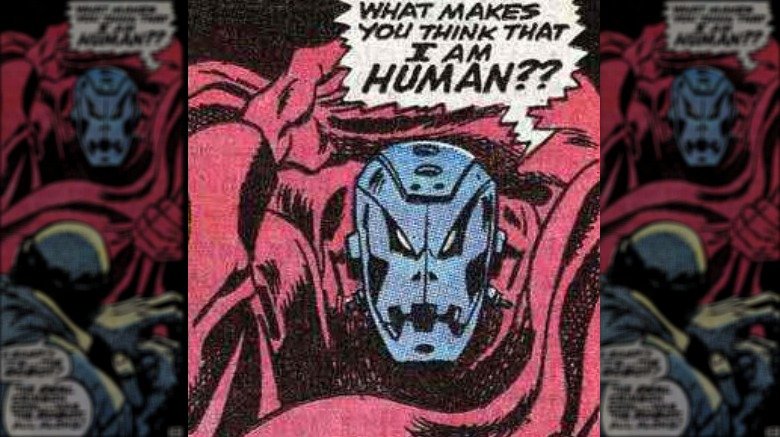
When he first appeared in 1968's Avengers #54, Ultron didn't have a name, much less any distinct design. In fact, you have to wonder if writer Roy Thomas and artist John Buscema really had much of a plan for Ultron at all. The issue's story concerns the Masters of Evil teaming up to capture the Avengers with the help of secrets provided by the team's butler, Jarvis.
By the story's end, one of the Masters of Evil's newest members, the Crimson Cowl, is revealed to be an unnamed robot decoy, covering for the Cowl's true alter ego: Jarvis the butler. Then, by the next issue, Thomas and Buscema apparently realized that suddenly making Jarvis evil for no actual reason wasn't the best move, and instead made the random robot — now apparently named Ultron 5, the Living Automaton — the true villain all along, who hypnotized the Avengers' faithful butler into temporary betrayal.
Meet Ultron again: evil hot-water heater
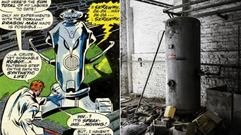
Even with the revelation of this new villain named Ultron 5, readers still wouldn't learn much about his actual origins for several issues, specifically Avengers #58. There, it's revealed that Hank "Giant Man" Pym was experimenting with creating "synthetic life," and built a goofy robot that looked more like the clanking boiler you might have in your basement than the mechanical menace he'd become.
After his initial fight with Giant Man, Ultron erased his science-daddy's memory (somehow) and just jumped through a concrete wall like the Kool-Aid man, but with more lasers and inexplicable memory-erasing technology. And thus, we wouldn't meet Ultron again until model number 5 debuted as the aforementioned random robot decoy.
Among these first appearances, only a few design elements managed to stick: some swooping angled lines on Ultron's face that resemble angry eyebrows, some extraneous metal bits that kind of look like robot ears, and a mouth full of chunky robo-teeth.
Terrifying robot, goofy teeth
Memorable comic book characters have defining details that help readers identify them at a glance. Spidey's got his webs, Wolverine's got his claws, and Captain America without his shield is just some guy in blue pajamas. Ultron, meanwhile, has those weird teeth.
Artist John Buscema's initial Ultron design works well for a generic robot baddie. But over time, Ultron's defining chompers somehow morphed into a weird, toothy grin. As a result, Ultron looks pretty... well, he looks pretty dumb, right?
Marvel Studios' former head of visual development Charlie Wen, who led the team responsible for adapting Ultron to the big screen, more or less agreed: "If you look at the comic book Ultron, he looks very simple in the head. That's always the feel of it."
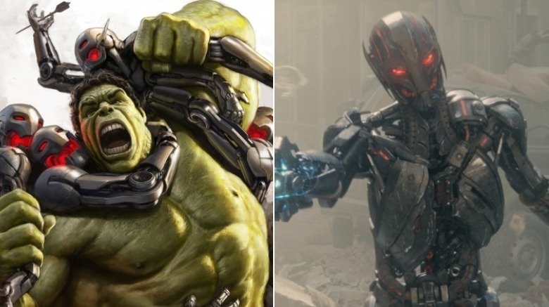
Interestingly, Wen tapped into that idea while creating concept art for a sequence in the film when Ultron coats himself in vibranium, which you can see on the left image above. The reason? Because even though Ultron looks "simple," he also looks deranged — not a quality you want to shy away from if you want to make your villain as menacing as possible.
"We knew that Ultron, from Joss Whedon's script, at that moment he was sort of going nuttier. Even the way he talks. Joss really wanted to get an Ultron that just felt like he wasn't right in the head. That [image] was trying to come up with a look for it."
Tooth and consequences
Diehard comic book fans may have been upset that the classic look didn't make it into the film on Ultron Prime. However, because "simple" and "menacing" are two of the adjectives we've associated with the original look of the character, Wen and his team brought the old school comic book robo-grin to the villain's henchmen instead. The Ultron Sentries — as they're known in the world of action figure merchandising, at least — are the villain's mechanical representatives who plague the Avengers while they try to save Sokovia from complete annihilation.
Another reason Wen saved the classic Ultron face for the sentries was simple practicality. When discussing the classic Buscema-designed look for Ultron's face, Wen pointed out the difficulties that would come from trying to put it on your main bad guy:
"You're getting many design challenges here. One is: how are you going to animate that face?" Wen asked. "You're not going to get a lot of expression from it . He needs to talk. He needs to express."
So it's not surprising that the sentries got the grin, rather than Ultron Prime. The Ultron Sentries are basically canon fodder, disposable bad guys the heroes can chew through while trying to get to the real villain. They didn't need to do much beyond fight and die, meaning that they were the perfect vehicle for the classic look.
No strings attached
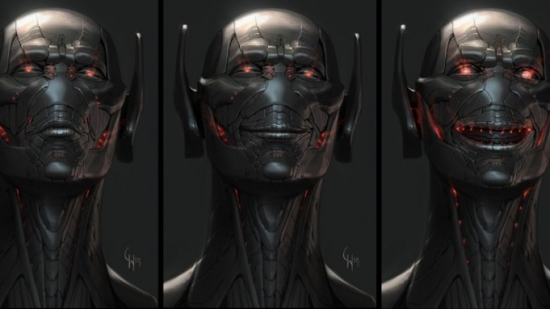
Of course, the design process for Wen consisted of far more than simply experimenting with the comic book version of Ultron and then just going in a different direction. Wen and his team had to find lots of new angles, and explore tons of different ideas — including a much more human-looking version of the mad robot villain, which is on display in the three side-by-side images above.
To explain his approach in these three concept art images, Wen referred back to the first trailers for Age of Ultron, which played a creepy version of "I Got No Strings," the famous Disney movie song.
"He's more of an evil Pinocchio. He's like, 'I want to be alive. I want to be a real boy.' Ultron wants to be a real person," recalled Wen. "How do you get that across in his expressions? We knew we needed to have a face that can have subtle expression."
The final cinematic version of Ultron would land somewhere in between this batch of images and the more comic book-accurate "vibranium crazy" design.
Elegantly inhuman
Ultimately, it's pretty tough to translate such a comic book design like Ultron's to the movies, buck teeth or not. The term "artificial intelligence" is almost an insult, since it implies that any such intelligence isn't actually real at all. Needless to say, Ultron's quest to destroy the Avengers and take over the world in Age of Ultron isn't just a villain being villainous. It's the act of someone affronted by the notion that anything about his intelligence could be artificial, and his need to prove he's smarter than everyone in the world — especially Tony Stark.
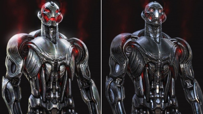
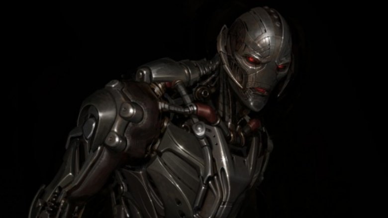
The image above, while slightly different from the look we we saw in the film, clearly communicates the character's intelligence and lurking menace.
"I really liked an elegant version of Ultron," said Wen. "I did some that I felt like were going more towards that, but then, he also needed to really show sort of an instant power from the first read. We kind of had something in between. Somewhat elegant but also showed enough presence and power."
That sums up the balance Wen struck in the end: a blend of power and presence that made for one of the most unforgettable comic book villains to hit the silver screen. Thanos and his fancy glove may be all the rage these days, but don't forget that Ultron was nearly too much for the Avengers to handle... and he didn't have a fancy magic glove he could use to snap himself to victory, either.
You can follow Charlie Wen on Instagram, Twitter, and Facebook.
