The Dark Knight: Early Designs Of Heath Ledger's Joker Are Even Scarier
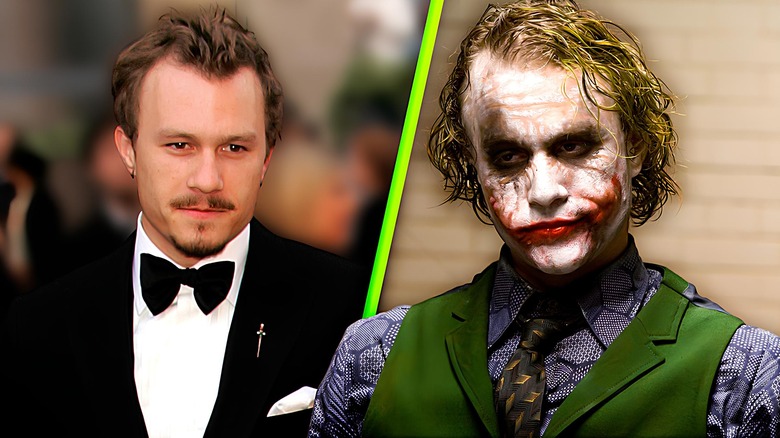
One of the biggest reasons that "The Dark Knight" became the international box office hit it did is the sky-high level of hype surrounding Heath Ledger's unexpectedly great performance as the Joker. Both terrifying and funny, Ledger's take on the villain landed him only the second posthumous Oscar for acting ever handed out following his tragic death in early 2008.
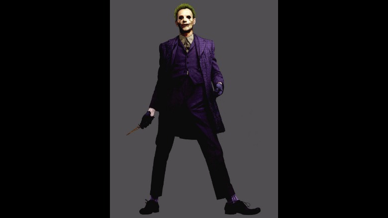
Amazingly, there was a chance that Ledger's Joker could have been even more terrifying. Rob Bliss worked as a concept artist on "The Dark Knight," and his original design for the Joker, posted on ArtStation, is even creepier than how the character ended up looking in the more grounded approach to the 2008 film.
The design, seen above, features the Joker in his classic purple suit, similar to how he appeared in "The Dark Knight," but otherwise, the character is much scarier. Wielding a bronze switchblade, this sunken-eyed Joker makes it feel like you don't want to know what he's seen.
His dirty white collared shirt is stained dark to show that the notoriously dapper character is beyond cleaning his clothes at this point. The excessive facial scarring and short, spiky green hair complete the look, leading to a villain design that definitely leaves an impact.
How different is this from the Joker we got?
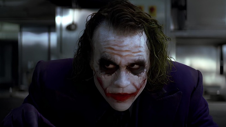
Many elements of Rob Bliss' Joker design made their way into the final version of the character we see in "The Dark Knight." For instance, though the Joker's facial scarring isn't as severe in the Christopher Nolan sequel, it is noticeable and becomes a pivotal part of the character's menace, with now-iconic lines like "Wanna know how I got these scars?"
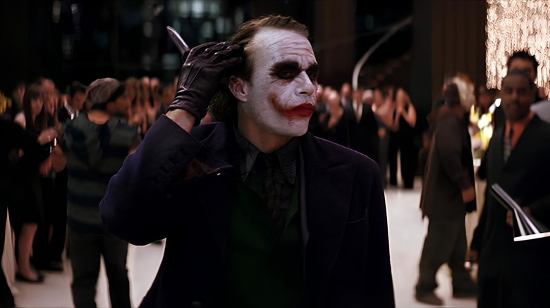
Of course, the purple suit and jacket also made it into "The Dark Knight," but the jacket was made longer, and it looks like his shirt collar isn't quite so dingy. That could just be a coloring difference between the concept art and the final product, but they do look a little different in their presentation.
Though the sunken eyes and dark makeup remain a part of the design in "The Dark Knight," again, they're a bit less severe. In Bliss's design, the Joker looks like he's witnessed eldritch horrors or survived a horrific massacre of some kind. Though the final version is still plenty dark, he does not have the horror-level black eyes that he had initially.
What do fans think of the original Joker design?
The switchblade remains part of the character but is back to a standard metal grey, and the purple gloves from Bliss' design are black instead. Finally, we can see that Rob Bliss' design lacks the big red lipstick grin of the final version and that it seems to have a thicker coat of the Joker's powder-white makeup than Heath Ledger's cracked and peeling visage.
Fans peeped the design after it was posted on X (formerly Twitter), and to say that the reactions were enthusiastic would be an understatement. "Remember what they took from us," wrote @C4ssiow. User @Awgegambino agreed, writing, "This is sick omg." User @lastmonsterkid was more specific, writing, "I like the spiky, Johnny Rotten hair much better than the longer hair in the final design." Here, the user is referring to the infamous frontman of the '70s punk band The Sex Pistols.
Not everyone was sold on the concept art, however. "If Joker looked like that, he would have been just as bad-looking as Jared Leto's version," wrote @kbvm69. Meanwhile, @NerdPaulNYC pointed out how the "unkempt hair," "imperfect makeup and mismatched, rundown clothes" made the final version of "The Dark Knight" the superior take. While we'll never know how different the character might have felt in "The Dark Knight" with the original design from Bliss, at least a few fans are imagining it in the final product after seeing this concept art.


