CGI Moments That Have Aged Terribly
With the exceptions of Paul Rudd and that hilarious joke where someone does an Oprah voice and says "you get a (blank)," nothing in the entertainment industry is evergreen. Stars fade, plots become predictable, and all that once was new turns funky and hard to watch. This is especially true of special effects: Things move fast. Not long ago, it took a period of several years to perfect the wire work necessary to make Superman fly. Now, in a period of just a few weeks, we can seamlessly replace his mustache with a bad dream Joss Whedon had about a flesh-colored slug one time.
The fact of the matter is, plenty of special effects don't stand the test of time. This is doubly true of CGI, a field inundated with equal parts wide-eyed ambition, spectacularly over-the-top budget necessities, and the unparalleled potential to wind up coming off as a trash can fire. But don't take our word for it — let's turn to history for some receipts. Here's a not-so-fond look back at some CGI moments that have aged terribly.
Young Sherlock Holmes
In 1985, cinema found itself in the midst of a lot of changes. Rocky IV proved that American gumption would always win over Soviet Dolph Lundgrens. Back to the Future was bringing attention to diverse issues ranging from Oedipus complexes to the pronunciation of "gigawatts." And maybe most impressively, computer-generated imagery was taking a magnificent leap forward in a way that, overall, sort of flew under the radar.
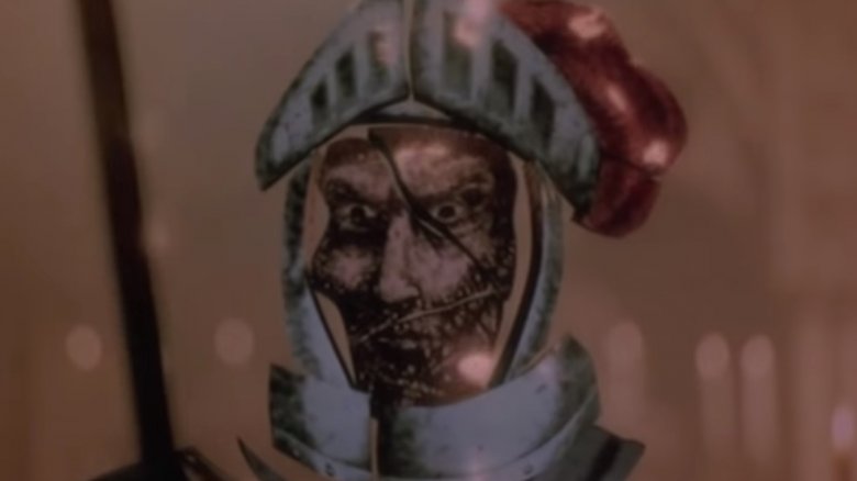
The movie was Young Sherlock Holmes. Today, it's a throwback to a time when zany reimaginings of the Arthur Conan Doyle catalogue were the exception instead of the rule, but at the time it wasn't much more than a box office flop with mediocre reviews. From a historical perspective, though, it gave us a look at what was to come in the form of cinema's first photorealistic computer-generated character. The Glass Knight, a surreal, otherworldly monster mash, graveyard smashes his way out of a church's stained glass window and terrifies a priest. He's only onscreen for about 30 seconds, and the effect took future Toy Story visionary John Lasseter and his team six months to create. Revolutionary? Yes. Does it hold up? Not in a big way. As impressive as the technical achievement was at the time, today it comes off as less T-1000 and more Ivan Ooze when he turned into a Beast Wars action figure at the end of the Power Rangers movie.
Final Fantasy: The Spirits Within
There may come a day when animated characters are entirely indiscernible from living, breathing humans. That day is not today, and it definitely wasn't the same year that Shrek came out. Darned if the makers of Final Fantasy: The Spirits Within were going to let that stop them, though.
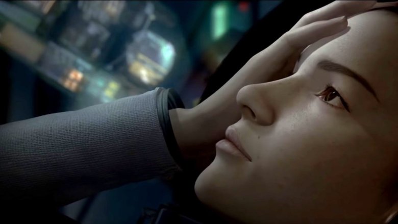
It was 2001. Final Fantasy creator Hironobu Sakaguchi and the minds at Columbia Pictures were under the impression that audiences were champing at the bit for a Final Fantasy adaptation that didn't have much of anything to do with the games. Enter The Spirits Within, an astonishing visual achievement that took 200 artists over four years to finish. At the center of the film was Aki Ross, a "digital actress" that Square Pictures hoped to use across different movies and projects in the following years. She was painstakingly rendered, possessing 60,000 hairs that were each individually animated. The filmmakers went so far as to assure moviegoers that it was okay to be fooled by Aki's deceptively human appearance. She was, after all, almost impossible to distinguish from an actual person.
Today, what was supposed to be a revolution in photorealistic CGI has been immortalized as the easiest thing to point to when you're explaining the Uncanny Valley. The movie flopped so hard that it took Square Pictures down with it, and after all of that work, the characters now look like they'd be more at home standing in front of a Fallout 4 dialogue tree than headlining a $137 million summer release.
Babylon 5
Sci-fi was kind of a mixed bag on television in the '90s. On one hand, you've got thoughtful classics like Deep Space 9. On the other, you've got shows like Babylon 5, the ideas for which were pretty definitely stolen by thoughtful classics like Deep Space 9.
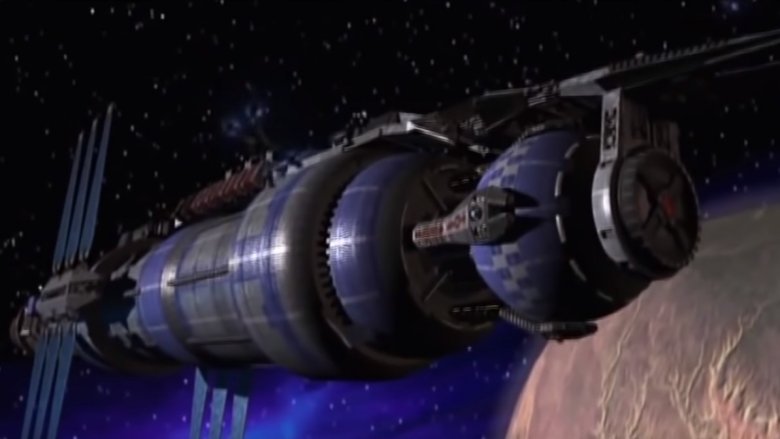
Created by J. Michael Straczynski, Babylon 5 told the story of a diverse group of aliens living on a space station at the center of heaps of outer space drama. One of the series' most standout features was its use of CGI to create shots of space, the ships, and background scenery. See, it was made in the mid-'90s, and the generally accepted wisdom was that it'd be cheaper to build a bunch of model starships out of plastic and use movie magic to make them look big than it would be to try and pull off this computer animation sorcery that the young people were yammering about.
The results have aged about as poorly as you might expect, given the show's age and budget limitations. So much of science fiction is based around a willing extension of disbelief, and it isn't easy to offer that to a show when it keeps throwing out the level of graphics you'd expect from a Windows 97 point-and-click adventure game.
The Matrix Reloaded
If you're reading this, congratulations on finding the first-ever piece of internet writing that has something negative to say about the Matrix sequels. You must feel like a real pioneer. Welcome to a brave new world where the Wachowskis are held accountable for making genre-defining movies that were only fun some of the time.
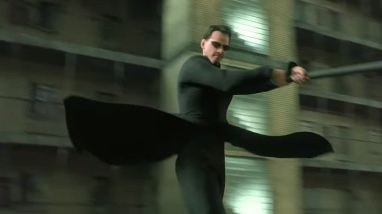
Look, finding flaws in the Matrix movies is like shooting fish in a low-security aquarium, but if there was one thing we were supposed to be able to count on them for, it was wildly immersive visuals. The first installment in the series gave us bullet time, code vision, and the 360-degree kick and slow-motion dodge scenes that everybody and their mom and their mom's friend Karen who drinks too much spent the next two decades parodying. Surely, somewhere nestled in four and a half hours of sequels, we'd get something as iconic.
Nope. What we ended up with instead was a grudge match between Keanu and a few hundred Elronds that's definitively hard on the eyes. Transitions between live action and animation have all the creamy smoothness of a small town pothole. Somebody must have offered to stay late and paint some details into Neo's face, but their boss didn't want to seem overbearing and told them to go home to their family. This left us with a cartoon protagonist whose skin had all the natural luster of a Stretch Armstrong doll that was left lying prone in the sun too long.
The Matrix Revolutions
Hope, they say, springs eternal — and while skepticism over the third part in the trilogy reigned supreme after the release of The Matrix Reloaded, some fans, true to the complex message of the franchise, had faith in a bright tomorrow despite overwhelming odds. Insert sad trombone.
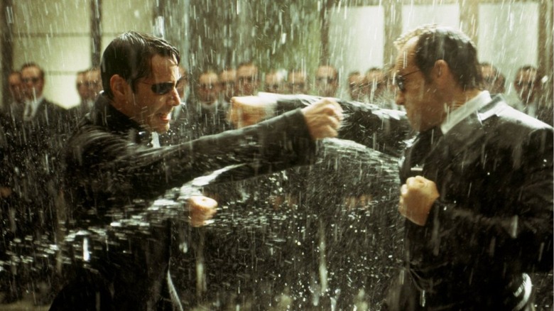
The last of the Matrix movies brought us the climactic final fight between Neo and Agent Smith. The two totes OP digital goliaths were set to duke it out in a no-holds-barred battle royale, and expectations were high, especially after a dialogue-heavy second and third outing. What might have been a more on-brand home for, say, a Man of Steel-style, skyscraper-toppling midair donnybrook wound up clunky and, frankly, pretty goofy.
The worst offending shot probably comes when Neo serves up a knuckle sandwich that catches Smith right in the gob, triggering what looks like the third or fourth most expensive fan recreation of Mike Tyson's Punch Out ever. In retrospect, maybe this was a visual callback to the scene when the office building gets all ripply in the first Matrix movie, but it seems more likely that everyone involved with the series was pretty wiped out and didn't have the energy to tell the animators that they'd turned Hugo Weaving's face into an abused jellyfish.
Spider-Man 2
Remember back when A-lister Marvel superhero movies were still a gamble to make and not the closest thing a studio could get to a printing press that makes money? Sam Raimi remembers. Despite having been given a massive stack of cash with which to present Spider-Man's first live-action theatrical adventure, there were some things his team just couldn't pull off with the budgetary and technological restrictions of the time. That's part of what made it so exciting when Spider-Man 2 rolled around. Sony handed the production essentially a blank check, and CGI had improved enough that the team felt confident creating fight scenes that involved flesh and blood characters, as opposed to the plastic-looking, Motocross-helmeted Goblin from the last movie.
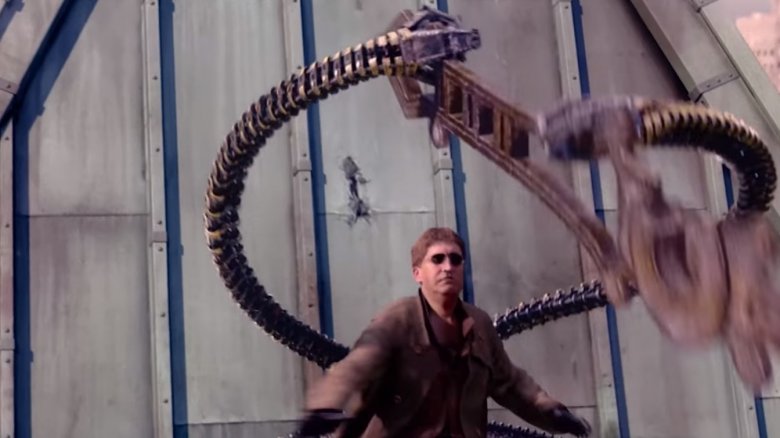
It was sort of impressive. The sweeping shots and frantic cuts in most of the fight sequences help disguise the fact that you're looking at a cartoon from the same era as Luigi's Mansion. But if you keep your eyes focused on Alfred Molina's Doc Ock, he gets mighty upsetting to look at. Pay extra close attention to his coat and hair. It's just... it's just weird. Their reach exceeded their giant metal tentacle grasp.
Spider-Man 3
Despite the CGI seams in the fight sequences, Spider-Man 2 made a ton of money, so Sony wanted a sequel — preferably one that set up plenty of other stories and maybe served as a backdoor introduction to characters who could be spun off into their own franchises. A freight train accident worth of studio interference later, we had Spider-Man 3, a middling meme factory that doubled as an inadvertent job offer for Andrew Garfield.
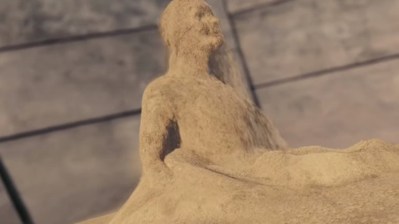
Fans and critics decried every aspect of the threequel, from the acting to the writing to basically everything about Venom, but one sequence actually got a lot of praise. When Thomas Haden Church's Sandman first wakes up from a bad case of the fateful scientific accidents, we get a beautifully tragic series of shots featuring the hundred-grit villain trying to reconstruct himself and hold a picture of his daughter. The visual effects team sunk countless hours into the scene, individually animating millions of grains of sand to give character to what should've been a mound of small rocks. It was truly a remarkable achievement. But does it stand the test of time today?
In a word, no. It was obviously a passion project, and one of the few sections of the movie that people poured their emotions into, but it's hard to watch in the context of subsequent advancements. The music is beautiful, and the feels are there, but visually it's janky as all get out.
X-Men Origins: Wolverine
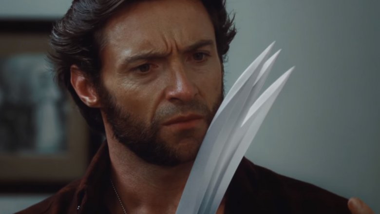
Lo, the mother of all big-budget CGI catastrophes: Wolverine's claws in Fox's 2009 X-Men prequel X-Men Origins: Wolverine, the movie whose lopsided title put a glint in young Zack Snyder's eye and taught him to dream of Batman v'ing Superman.
In a scene that will live in infamy, Hugh Jackman, recently having had his bones reupholstered, takes a quiet moment to check out his sick new knife hands in the bathroom of a kindly older couple. Ejecting his nigh-unbreakable blades from their fleshy sheaths, the audience is stunned when, in a twist, he doesn't have Wolverine's classic claws, but rather six cel-shaded mistakes jutting from his knuckles. Remember Metal Mario from Super Smash Bros.? They were made out of him. But worse.
This is a special addition to the list, in that it didn't just age terribly like whatever the opposite of a fine wine is. It started out bad, looking like a cruel practical joke being played by a mischievous AMC projectionist. From day one, this scene has had the aesthetic appeal of a very smart gorilla's attempt to draw using MS Paint. It's not that the effect doesn't hold up, it's that even though you remember it being bad, you're never prepared for just how bad it is when you see it again. It's like the scene foresees your low expectations and somehow manages to limbo further under them.
Harry Potter and the Sorcerer's Stone
It's been years since the Harry Potter movies brought the wizarding world to kids who were too lazy to read and sent studios on a feverish search to find the next YA franchise with the potential to make oodles of dough. It took a decade to complete eight movies based on seven books, and by the time the story was finished, it was the third highest-grossing film series in history, bringing in nearly $8 billion.
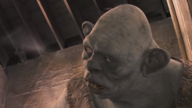
That said, it can be easy to forget that the first film came out in 2001, and that CGI from that era comes off as less than magical compared to modern effects. In particular, the scene when Harry, Ron and Hermione lay the beat down on a troll looks an awful lot like a wet burp these days. The fully computer-generated monster now looks like rough concept art, and it's weird looking at it and thinking "this is part of one of the most successful film series of all time." He has all the design subtlety of a Syfy original movie.
Tron: Legacy
Giant studios tend to treat cutting-edge computer animation the same way Raoul Duke treated his narcotics collection: the tendency is to push it as far as you can. In 2010, Disney went on sort of an ether binge with Tron: Legacy.
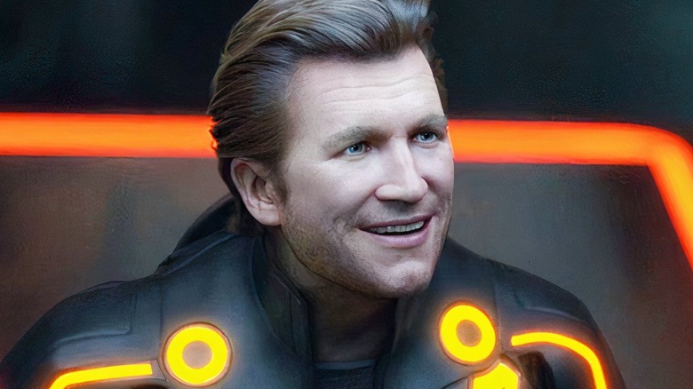
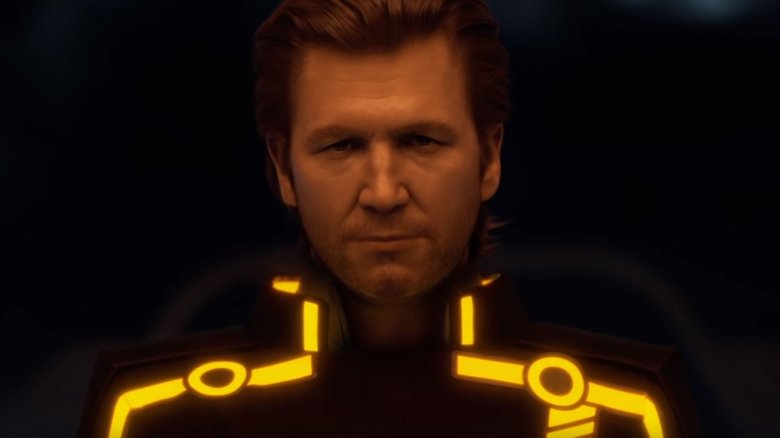
The idea was to use existing footage of Jeff Bridges from earlier roles as a guide to creating a digital, de-aged version of his face. By animating young Bridges over old Bridges, Disney could finally claim dominion over time itself and take the first step towards total universal domination.
And you know what? Sometimes it worked. During the film's darker scenes and shots in which the character was motionlessly contemplative, the effect was, well, effective. But then Bridges would go and do something wild like move or smile, and the whole effect dove straight past the Uncanny Valley and into the Uncanny Marianas Trench. Bummer of dudely bummers, it just keeps looking worse as time goes on, especially now that we have the Marvel movies constantly flaunting their ability to seamlessly turn back the clock on people like Michael Douglas and Kurt Russell.
Star Wars: Episode IV – A New Hope
Here's one of the most beautiful things about art: even if you change, it stays the same. That means that you can see a painting or hear a song, then revisit it years later and have a completely different experience. In a way, it's the closest thing to having a home you can always go back to; something constant and familiar that means different things to you throughout your life.
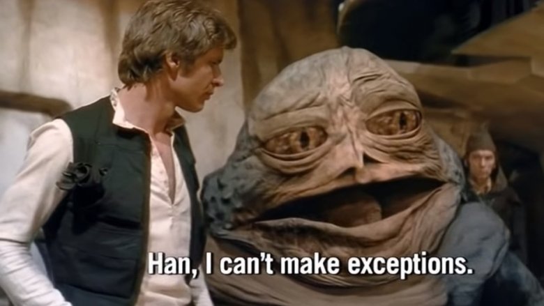
Unless we're talking about the original Star Wars trilogy, in which case you'd better hope you saved your old Laserdiscs. It's close to impossible to find the original cuts of episodes four through six, due to George Lucas' decision to go back and fiddle with them in the '90s. He inserted more aliens and robots — and, crime of crimes, made Han take the second shot in a gunfight.
The grimmest addition to A New Hope came when he remastered existing footage of Han Solo talking to Jabba the Hutt. When the scene was shot, Jabba had been written as looking like a man rather than a ten-foot space slug. "No matter," said Lucas, and he painted over the original actor with what looks like a leftover Hutt sprite from Episode I: Pod Race for the Nintendo 64.
Indiana Jones and the Loss of All Subtlety
Imagine that you own the rights to one of the most beloved characters of the last century. It's pretty much guaranteed money if you can come up with another installment, but there's a problem. It's been a minute since the last movie, and filmmaking has changed in the years since audiences last saw the character. What do you do? Do you go back to the time and effort to create the heavy practical effects that gave your original series its unique look? Or do you sort of screw up Indiana Jones forever?
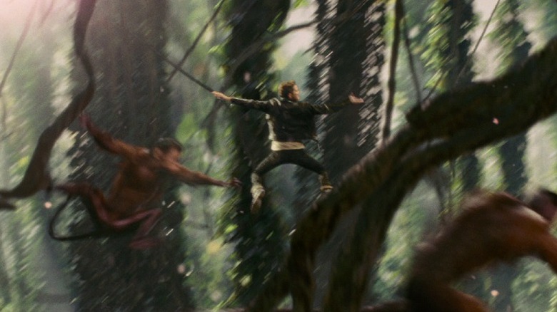
For the makers of Kingdom of the Crystal Skull, the answer was "pretty much the second one, but maybe with good intentions." The effects team on the movie was adamant that their use of CGI was going to be unnoticeable and blend seamlessly, creating a loving allusion to classic adventure cinema. Long story short: we got a biker dude swinging on vines with the monkeys from Jumanji instead.
