Why The Batman: Caped Crusader Designs Look So Weird
Batman has made the jump to animation numerous times, with some series ranking higher than others. From the ever-iconic "Batman: The Animated Series" to its futuristic successor, "Batman Beyond," as well as other adaptations like "Batman: The Brave and the Bold" and "The Batman," the Dark Knight has become a staple of the cartoon realm. Now, "Batman: The Caped Crusader" is on the way, ideally to add to the character's animated success story. However, Entertainment Weekly received an exclusive first look at the series, and the design aesthetics are a bit different. Some might even find the world and characters downright weird.
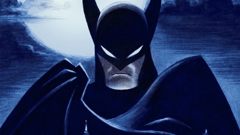
As it turns out, there's a very good reason for these unexpected design choices. According to Bruce Timm, series co-creator and one of the masterminds behind "Batman: The Animated Series," he and his team wanted to evoke a 1940s-esque look. "[Character designer James Tucker] and I are both really big fans of movies from that era, so we decided to really lean into that in terms of the clothes, the cars, the architecture, and the level of technology," Timm explained to EW. Thus, it makes sense that Batman himself evokes his first comic appearance — "Detective Comics" #27 — from 1939, and his environment leans in an old-school direction.
Naturally, some of Batman's rogues were also redesigned and reimagined to fit the unique and potentially more violent "Caped Crusader," with good reasons behind each alteration.
What's the story behind Harley Quinn, Catwoman, and Clayface's designs?
In Entertainment Weekly's "Batman: The Caped Crusader" sneak peek, fans get a look at new takes on longtime DC villains. First and foremost is Harley Quinn, who looks vastly different from her previous incarnations. She's stoic and dons a yellow-and-green circus outfit — a far cry from the wacky black-and-red-clad Harley from such projects as "Batman: The Animated Series." Though Bruce Timm didn't explain her new look, he did touch on her new personality. "When she's Dr. Quinzel, she's a little bit more whimsical and fun, and then when she's Harley Quinn, she's scary," he said, explaining that the "Caped Crusader" team wanted to take the character in a unique direction for the show to make this version stand out.
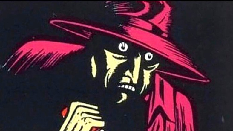
Next up is Catwoman, who looks like she'd be right at home in a World War II-inspired "DC Bombshells" comic. Like with Batman, the rationale for this change is simple: Timm liked the old comic design. He said "We wanted to do something different. So we thought, well, let's go all the way back to the beginning. I love the original look that she had in the '40s. It's purple!" One of Batman's most tragic villains, Clayface — real name Basil Karlo — also looks unusual compared to his modern DC appearance, looking less like a mound of monstrous clay and more like a mysterious serial killer. This hearkens back to his Golden Age comic book appearances, right down to his hat and coat.
It'll be interesting to see what Batman's fellow heroes and other villains look like in the "Batman: The Caped Crusader" design style when it arrives on Amazon Prime Video on August 1.