Edge Of Tomorrow: The Alternate Designs For The Aliens Were Completely Different
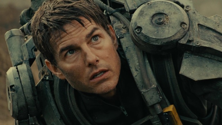
Adapted from "All You Need Is Kill," a Japanese light novel written by Hiroshi Sakurazaka and illustrated by Yoshitoshi Abe, director Doug Liman's underrated "Edge of Tomorrow" chronicles humanity's war against an invading species of powerful aliens known as "mimics." War effort spokesman Major William Cage (Tom Cruise) is unwillingly yanked from his PR position and thrust right into the middle of the battlefield despite his lack of experience, and becomes stuck in a time loop that keeps taking him back to the start of a particularly crucial battle just as he dies in it — which just might be the key to defeating the mimics.
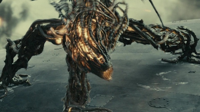
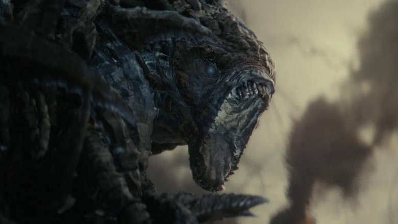
Despite being a rarity — a Tom Cruise movie that flopped – the film was renowned by critics for the creativity and intelligence of its writing, editing, and world-building, ultimately developing a large fanbase whose dreams of "Edge of Tomorrow 2" might still be alive. Of particular note was the way "Edge of Tomorrow" brought the mimics to life; their outlandish, terrifying tentacular design makes them different from any other sci-fi movie alien, even before the time loop comes into play.
As revealed by the film's concept art and interviews with VFX artists, that memorable design took a lot of drafts and tinkering to get 100% right. There are at least a few parallel universes out there in which Liman and the art and VFX teams ultimately went with different concepts — and in which "Edge of Tomorrow" probably became a totally different film as a result.
An early design was a lot more human-like
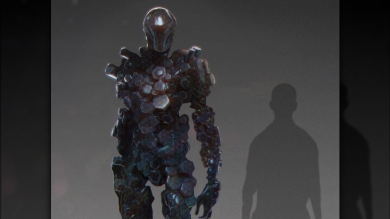
We know what the aliens in "Edge of Tomorrow" might have looked like thanks to a gallery of concept art pieces made available by the film's production designer, Oliver Scholl, on his website back in 2014. The first impression that can be gleaned from the gallery is that the tentative designs were amazingly varied; there were about six or seven completely different directions that the film's invaders could have gone in. What's perhaps even more stunning than the number of strange and bewildering shapes imagined by the concept artists, though, is that at least one early draft of the mimics was pretty darn normal — by alien standards, anyway.
The gallery featured a design that, instead of the amorphous forms and mechanics that marked later iterations (including the one that made it to the film), was strikingly humanoid. Essentially, this version of the mimics would have looked more or less like a human being in metallic armor, complete with hands and opposing thumbs, but only a couple of feet taller. The kicker to this design, of course, is that the metallic-looking coating in question wouldn't be actual armor — it would just have been the creatures' actual organic material.
Interestingly, despite the human similarity of their general frame, these would-be mimics apparently wouldn't have had eyes or a mouth or facial features of any sort — which is pretty much the only way in which the finished film's aliens are more human-like than them.
The aliens could have had glass bodies
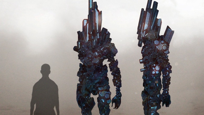
Another interesting design was posted by concept artist Christopher Brändström on his ArtStation page. This design would have followed a similar logic to the early concept mentioned above: Aliens with humanoid figures, yet made up of a unique material that seemed to render their entire bodies into some sort of built-in armor.
There are two big differences in the design on Brändström's page. The first is that, instead of human-like busts with a clearly-delimited set of shoulders, neck, and head, the area above their torsos would have looked more like a big crystalline mass stretching several feet upward and outward from the back of what would be their heads. The second and arguably more crucial difference is that, anticipating a key decision made in the final forms' design, the mimics designed by Brändström would have been made of a dark, glass-like material — similar to the aforementioned design in shape, but noticeably different in the way it would have reflected and refracted light.
While the timeline of the designs is unclear, we know that the move towards glass bodies was a very deliberate choice on the filmmakers' part. Visual effects supervisor Daniel Kramer told FX Guide in 2014 that Doug Liman wanted the aliens to have sharp bodies that didn't look too terrestrial. "So we came up with obsidian as the material that it would look like — basically a glass that could cut," Kramer said.
Conventionally big and hulking wasn't quite cutting it
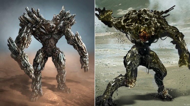
A major aspect of the aliens in "Edge of Tomorrow," naturally, is that they had to be extremely intimidating — foes formidable enough to keep humanity in a state of near-defeat, requiring some sort of expedient workaround like, say, a time loop. When it came to boosting the mimics' scariness factor, one early idea the concept artists played with was to give them thick limbs, large shoulders, and a stocky, beefy build.
The drafts of that idea certainly make a strong impression. One, signed by concept artist and storyboard designer Tani Kunitake, gives the mimics a set of gigantic arms reminiscent of tree trunks, with sharp, rocky structures protruding from their shoulders and rounding out their imposing V-shaped torsos. Another, by artist Ed Natividad, visualizes the mimics as a golem-like dark mass of metallic flesh, with no discernible head but equipped with massive arms and legs capable of agile movement. Both of those designs veer in a more standard "monster" direction, masterfully executed so as to make the aliens look like powerful fighting machines.
Yet the idea to make the mimics conventionally big and hulking in a still-humanoid manner was ultimately abandoned, because the war effort against such creatures would ultimately have come down to brawn — which, as compatible as it might have been with Emily Blunt's efforts to get ripped to play Rita Vrataski, didn't really fit the concept of opponents too unpredictable and mighty to defeat without multiple attempts.
The mimics were once blobs
At some point during the design process, a decision was made to push the mimics towards a more radical level of bodily abstraction. Again, we don't know the timeline of the concept art, but a series of pieces by sculptor and creature designer Ivan Manzella — who recently designed "Star Wars" fan favorite Babu Frik, one of the cutest creatures in "The Rise of Skywalker" — took inspiration from invertebrate wildlife to imagine an almost ethereal, if still decidedly terrifying, version of the mimics.
One particular piece of art rendered the mimics as, essentially, glowing blobs of mysterious alien matter, with long arms and legs and what appeared to be spikes coming out of their backs. This iteration of the mimics was colored in two different versions, one with a translucent gray exterior and light orange highlights inspired by grubs, and another with red and blue shades akin to those of a glowing deep-sea shrimp.
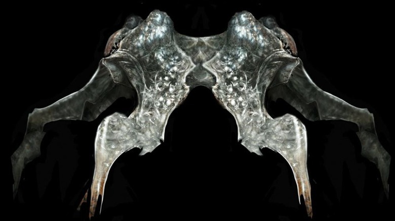
Another visual by Manzella (pictured above) painted the mimics as walking Rorschach tests, with symmetrical bodies made up of elongated thoraxes and four pointy, articulated legs — araneidan in general architecture, but too bizarre and unearthly to be truly spider-like. Those variations on the blob theme point to the art team's eventual realization that, in order to be truly overwhelming and hard to defeat, the mimics needed to look completely different from any kind of Earth life, give or take a few specks of animal inspiration.
There was a tall and thin design at one point
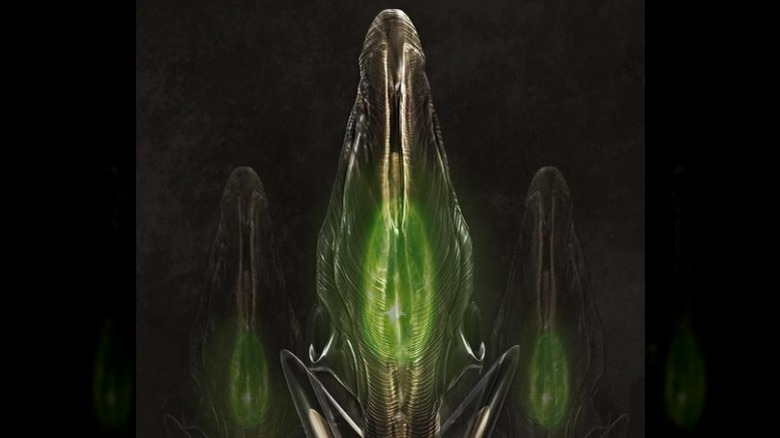
Another piece of concept art by Ivan Manzella showcases a version of the mimics so completely removed not only from the version we see in the movie, but from any other version among the ones shared by Oliver Scholl, that it bears a mention for its sheer uniqueness. It is unclear at what point during the conceptualization of the mimics Manzella came up with this particular design, but to look at it now is to see an open window into a completely different "Edge of Tomorrow."
This version of the mimics would not have been humanoid, to say the least. It would not have been brawny and hulking and golem-like, either. And it certainly wouldn't be as formless and abstract as a blob — there's definitely a form there. The best word to describe this particular design would perhaps be "yonic." (If you don't know what that means, look it up, but be advised it might turn up some NSFW content — essentially, it's the opposite of "phallic.") These aliens would have had completely singular shapes, with amphibian legs ending on bizarre bisected structures that may not exactly qualify as "feet," and bodies resembling elongated tunics.
Arguably Manzella's most out-there design, this one is a testament to how different the mimics could have looked while still fulfilling Doug Liman's core vision of maximally alien and uncanny creatures — the better to get the "otherworldly eldritch horrors" plot hook across convincingly.
Primitive abstraction was the way to go
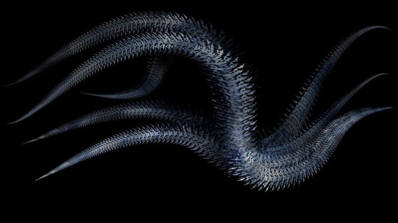
Although none of the concept art shared by Oliver Scholl corresponds exactly to the final form of the mimics that we see in "Edge of Tomorrow," some of the pieces do look closer to the general aesthetics and mechanics of the aliens in the film. Specifically, there are a couple of pieces — neither of them featuring visible signatures or attributed to any particular artist — that incorporate the key design element of the mimics' definitive iteration: tentacles.
One very interesting design that was still many tweaks removed from the final version visualizes the mimics with chilling simplicity. This version of the aliens, based on what we see in the art, would have been extremely minimalist: Just a bunch of thick tentacles with sharp spikes covering them in their entirety, and some kind of fluorescent glow emanating from them. The concept art in question could almost be said to offer more of a vibe than any kind of detailed anatomical diagram; it's unclear if these mimics would indeed have lacked facial features and prehensile appendages, or if the artist simply didn't think those features needed to be included to fulfill the purposes of this particular piece.
Either way, this concept got closer to the fundamentally bizarre physical nature of the mimics by harkening back to primitive Earth lifeforms, drawing inspiration from how abstract they look to human eyes accustomed to more sophisticated animals.
The tentacles were instrumental to the mimics' bodies
On the other hand, "unsophisticated" is just about the last word that could be used to describe the mimics as we came to know them in "Edge of Tomorrow." As a matter of fact, their design is so sophisticated as to be mind-boggling — you might not even notice just how anatomically complex they are at first blush.
They move so fast and with such unbound, chaotic energy that it's sometimes hard to tell what part of them is moving, exactly. The reason for that, of course, is that they are made up of more individual moving parts than can be counted, each capable of a range of movement almost too wide to fathom. In other words, the moment in which the filmmakers truly hit upon the winning design for the mimics was when they decided to go with dozens of tentacles moving together.
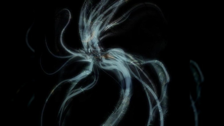
In that sense, out of all the concept art pieces posted by Oliver Scholl to the gallery on his site, the one that's most clearly a direct precursor to the "Edge of Tomorrow" aliens is the fibrous anemone-esque thing with countless tentacles sprouting out from a central mass. It's not quite 1:1 to what we ended up seeing in the film, but it almost gets there — more than any other artwork, it gives off a sense of total freedom, like the alien could take any shape and move in any direction of its choosing.
The mimics had to be deeply strange to be plausible
Taken as a whole, the wide variety of concept art pieces — covering a range of possibilities extending from relative humanoid normality to elemental abstractionism — show that the mission of designing the mimics was anything but simple. There are many reasons why their creation was so artistically daunting, and they're explored in a video essay from the VFX-focused YouTube channel CGY.
In the video, it is explained that the mimics' design demands flowed directly from their role in the narrative. To fit the concept of William Cage understanding their behavior only by going up against them again and again and again, the mimics needed to be, above all, unpredictable. They needed to have bodies so alien as to not map to any creature on Earth, and movement so fast and aggressive as to defy comprehension without the "cheat" of multiple time loops, while still having assailable corporeality in order to be eventually defeated. To put it another way, they needed to be extremely tough — but, crucially, not unbeatable — video game bosses.
That level of strangeness was achieved by making the mimics big masses of obsidian-covered tentacles that moved individually, but still in sync with each other — a movement unlike that of any known terrestrial Earth animal. It was the best way the filmmakers found to make the aliens plausibly incomprehensible, so that Cage's efforts to gradually figure out their physicality would seem convincingly arduous.
They couldn't be completely bizarre, though
The CGY video essay also explains that the movement of the mimics was largely inspired by a video from animation and visual design firm SR Partners, which "Edge of Tomorrow" VFX supervisor Jonathan Fawkner has identified as "Resonance / Deus Ex Machina." Fawkner has stated that the video, with its rapidly expanding and pulsating prisms, "came to embody the random and terrifying kinetics of the Mimics" (via Framestore).
As random and terrifying as the mimics needed to be, however, they couldn't be so bizarre as to completely rule out human comprehension. There had to be something in their design to ground them, something for the brains of viewers to grasp onto. This very specific nuance — the need for the aliens to be as weird as possible yet just familiar enough to mesh together with the film's realistic action — informed the decision to bundle all the tentacles together into some kind of coherent and tight-knit body. Even more crucially, it informed the decision to give the aliens recognizable facial features, including eyes, a mouth, and even a scary-looking set of teeth.
Therefore, the ultimate design of the mimics was the result of a compromise between two narrative functions: Number one, they needed to dumbfound Cage and the other human soldiers. Number two, they still needed to move in a way that gave material weight to the battle sequences — it couldn't just be a war against giant spaghetti.
There had to be a center of movement
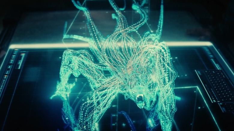
One challenge presented by the "independent tentacles" design was the fact that it went against one of the basic tenets of CGI character animation: The centrality of "rigs," or articulated skeletons to which all of the characters' body parts and corresponding movements are tethered. A body made up of countless noodle-like limbs moving separately would require the creation of an exponentially large number of rigs replacing each other for every movement of every tentacle — a nigh-impossible animation challenge.
To bundle the tentacles into a more cohesive bodily unit while also making them easier and less unruly to animate, VFX supervisor Daniel Kramer instructed a technical animator to devise a plug-in. The idea was to position all the tentacles around a center curve; the plug-in would link the tentacles' movement to the curve, thereby allowing it to guide all the tentacles' movement simultaneously. "I wanted 20 tentacles intertwined, twisted, contracted together, to writhe against each other. The plug-in knew the radius of every tentacle. If one on the inside grew or slipped, the tentacles above it moved in reaction," Kramer told Below the Line.
That measure turned out to be providential: since the animators "couldn't actually animate each individual tentacle," according to Kramer, the plug-in gave them fine control over the mimics' movement, allowing them to add to the many small details in "Edge of Tomorrow." And lo, the mimics we know were born.
The manga's aliens looked wholly unlike the movie's
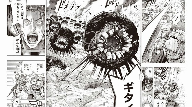
In addition to the many would-be iterations of the mimics in "Edge of Tomorrow," the same characters were once visualized in a wholly different way by Yoshitoshi Abe and Takeshi Obata — the original light novel and manga adaptation illustrators, respectively, of "All You Need Is Kill." Released by Shueisha in the Weekly Young Jump seinen manga magazine between January and May 2014, the manga version of the inspiration behind "Edge of Tomorrow" got an English-language release the same year through Viz Media.
Like most manga, "All You Need Is Kill" is in black and white, which only enhances the morbid beauty and unique shapes of Abe's character designs as rendered in Obata's busy, abrasive, densely-shaded style. In this version of the story, the mimics also have tentacles, but are otherwise radically different from their movie counterparts — and from any of those counterparts' earlier drafts.
Abe and Obata imagine the mimics as, essentially, giant black spheres, with pointy tentacles at the bottom, round mouths that take up nearly the entire front of their bodies, and humongous teeth shaped like blocks. There's something almost charismatic about those mimics and their big hungry heads, yet they're every bit as terrifying in their own way as the film's aliens. Had Doug Liman and company taken after the manga, the alien action of "Edge of Tomorrow" could have gone in a completely different direction — which goes to show how decisive character design is to filmmaking.
