The 25 Best Movie Posters In The History Of Cinema, Ranked
They say you can't judge a book by its cover, but what about judging a movie by its poster? A great poster doesn't necessarily mean a great film, but sometimes a well-crafted movie poster can be appreciated in its own right. Maybe the poster tells a self-contained story, or maybe it just has a top-notch design. Maybe it's loaded with complex layers of symbolism, or maybe it's so simple it cuts straight to the heart of the movie. Or maybe it just looks badass. (Badassery has been known to sell movie tickets.)
Below, we've compiled the 25 best movie posters in the history of cinema, posters so good that it hardly matters if the movie is any good (though almost all of these films are classics). We've selected these posters based on a number of factors (such as how effectively they represent their respective movies, how memorable they are, and how much they have influenced cinema), but there's one thing each of them has in common — they are all iconic.
25. The poster for The Truman Show showcases a neat visual trick
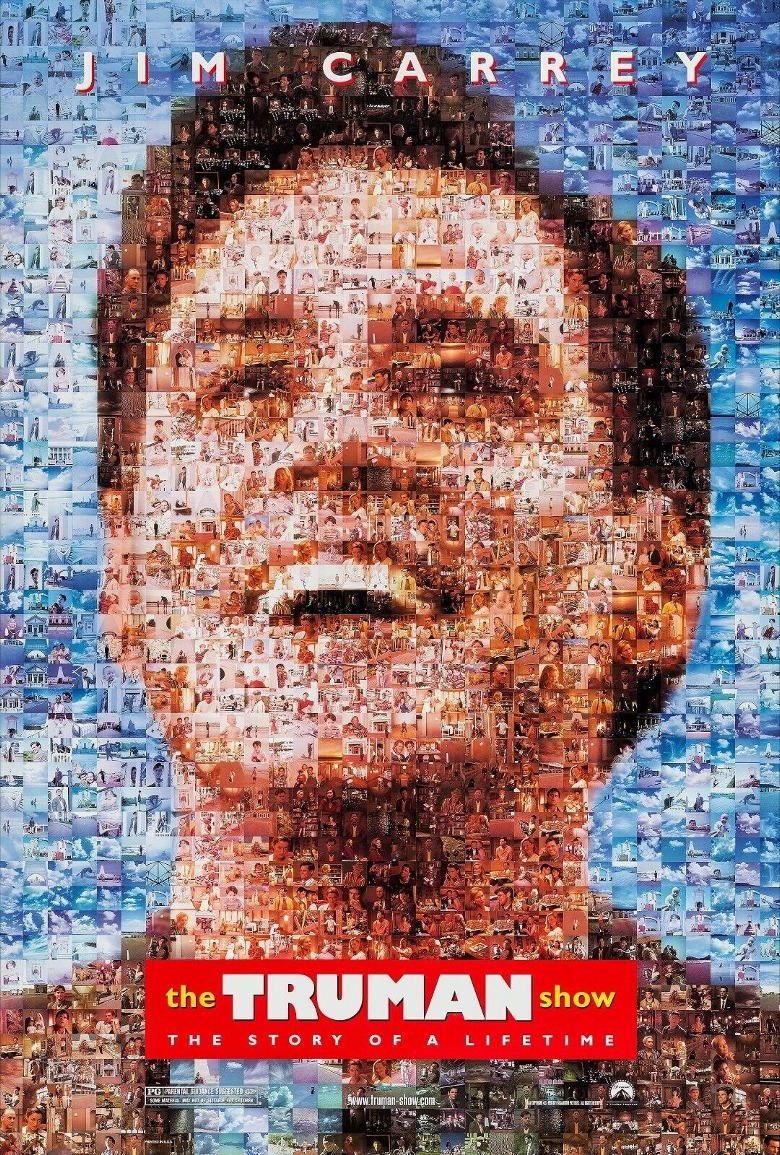
The poster for "The Truman Show" features — who else? — the titular character, Truman Burbank (Jim Carrey). But if you look closer, you'll notice that Truman's face is actually made up of hundreds of smaller images, each showing characters and scenes from the movie.
If you consider the film's plot, this stylistic choice makes perfect sense. Since Truman's entire life is being broadcasted on the big screen, it makes sense that his image on the poster is made up of a bunch of tiny screens. As a nice symbolic touch, this poster evokes a question awfully similar to the question Truman asks himself in the movie: If he is nothing more than what you see on the screens, then who is he?
24. American Beauty's poster is a real beauty
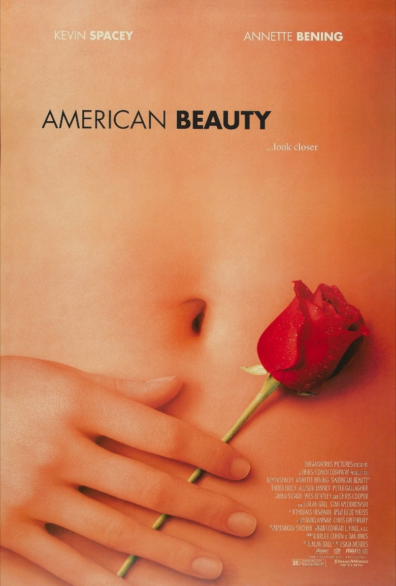
The poster for "American Beauty" is meant to evoke the movie's most famous scene (not to mention one of cinema's most stunning still shots): a fantasy sequence where Lester (Kevin Spacey) imagines the teenage Angela (Mena Suvari) lying on a bed of rose petals. On this movie poster, the girl's torso fills the entire frame, leaving the rest to our imaginations. The image is strange and provocative, ensuring moviegoers won't easily forget it. The movie's tagline ("Look closer") is equally eye-catching, and we think it's safe to say most viewers will take that advice.
Of course, perhaps it would spoil the mystique of this iconic one-sheet if we pointed out that the hand and the stomach on the poster actually belong to two different models – neither of whom actually plays Angela in the film.
23. Forrest Gump's poster invites us to sit down
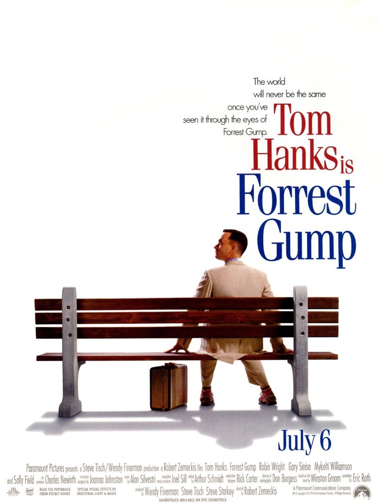
Like its titular hero, the movie poster for "Forrest Gump" is sweet and simple. It depicts Forrest Gump (Tom Hanks) sitting on a park bench, gazing upward at something offscreen. The bench, of course, is featured in the movie's most iconic scenes.
"Forrest Gump" is one of the most famous movie posters to take advantage of white space. Here, the film's star only takes up a small portion of the frame — the rest is filled with a blank, solid-color background. A lesser poster would have been tempted to fill that space with something, but not "Forrest Gump," because its designers knew that less is more. Other movies soon began to use this same technique. Films such as "Saving Mr. Banks," "Little Miss Sunshine," and "Meet the Parents" all have posters that mimic the same style.
22. The poster for The Graduate teases viewers in many ways
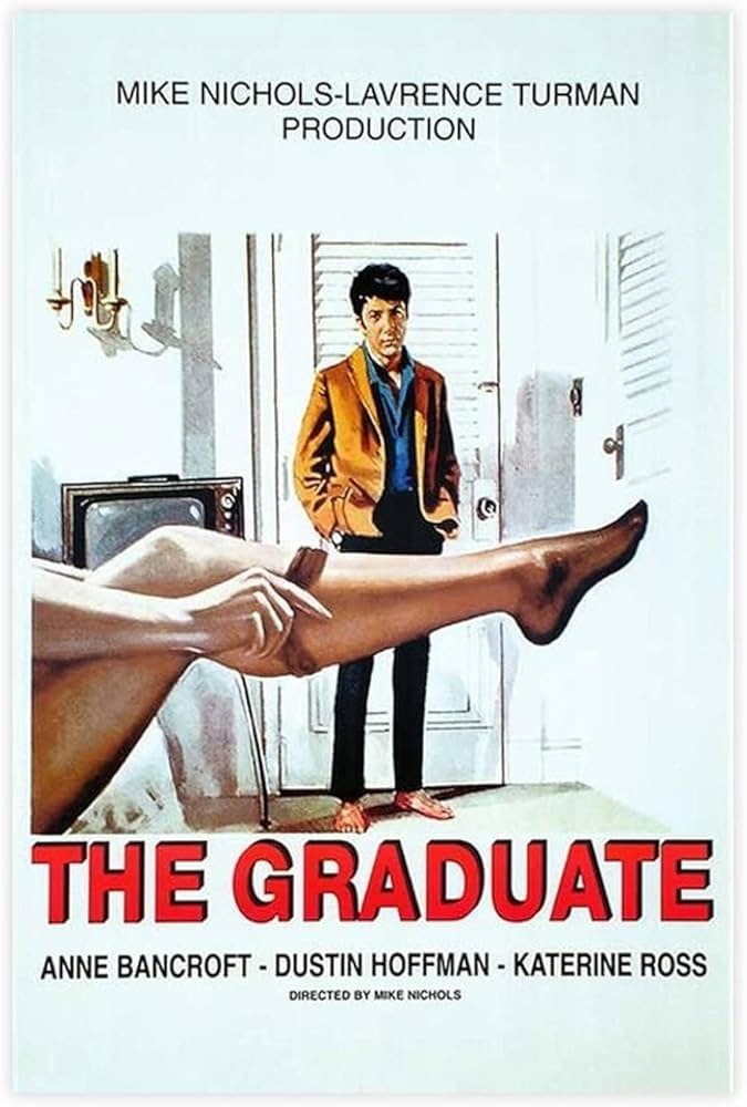
The poster for "The Graduate" wastes no time in establishing the uncomfortable affair at the center of its story. It shows the 21-year-old Ben (Dustin Hoffman) gazing at the leg of the much older Mrs. Robinson (Anne Bancroft) as she slides off her stocking. His expression is not lovestruck so much as stupefied and maybe a little bored.
Not only is the poster alluring in an erotic way, but it also teases moviegoers in a less literal sense. The framing of the poster (with Mrs. Robinson's leg filling the entire foreground and Ben standing at a distance) immediately hints at the power imbalance in their relationship. (Whether it is Mrs. Robinson taking advantage of Ben or vice versa is open to interpretation.)
21. The Amadeus poster is cloaked in mystery
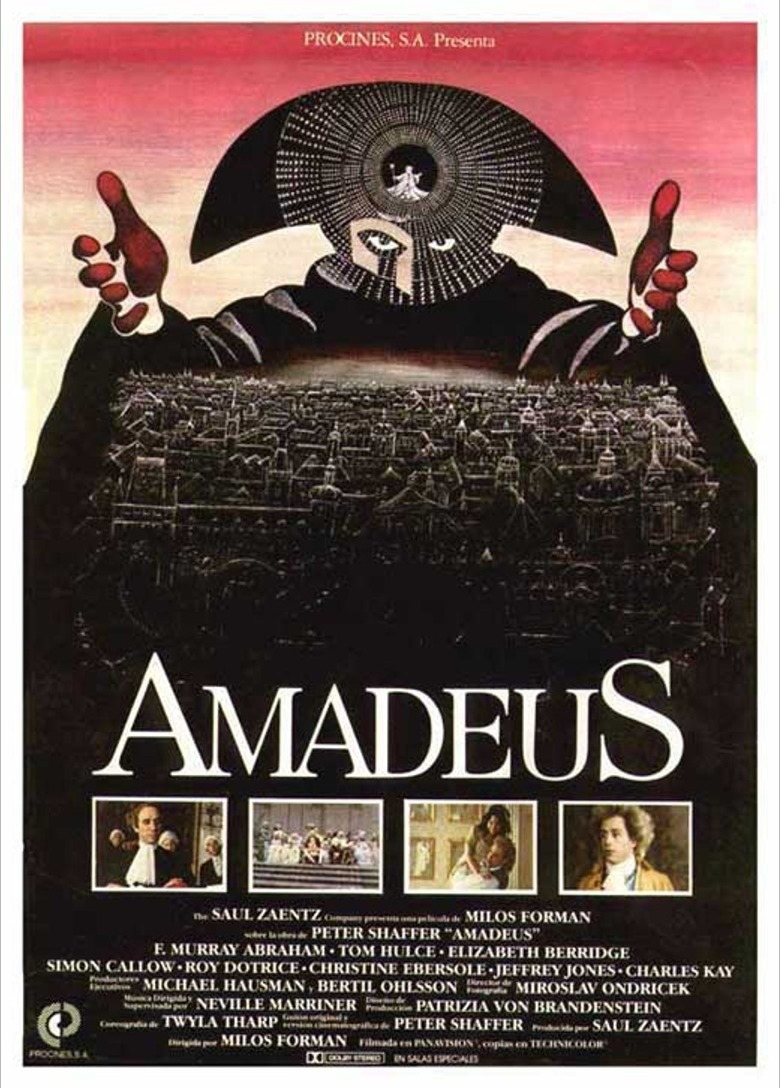
The movie poster for "Amadeus" looks more like it should belong to a Gothic horror story instead of a powdered-wig period piece about Mozart (Tom Hulce). But it's for precisely this reason that the poster is so powerful. Its dark color palette and esoteric symbols show right away that "Amadeus" will not be a typical historical biopic, instead promising something more dark and moody.
The identity of the masked figure on the poster is tantalizingly ambiguous. It could be either Mozart's father (Roy Dotrice), who wore a mask like that to a party, or Salieri (F. Murray Abraham), who wore the same mask to spook Mozart. His outstretched arms could be those of a god-like being casting a spell over the city beneath him — or they could simply be a conductor leading an orchestra. The poster implies that the two may not be all that different.
20. West Side Story's poster is designed to look like graffiti
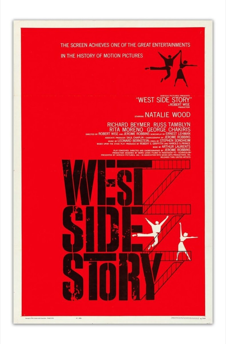
It's not easy to distill down an entire movie into a single, stylized design, but (like many of the best movie posters) the 1961 poster for "West Side Story" does exactly that. The silhouettes of two lovers on a fire escape will be instantly recognizable to anyone who has already seen the musical on the stage. Plus, the blood-red background hints at the coming violence, reminding audiences that this is not your typical movie musical.
Best of all, the font is designed to look as though it's been stenciled and spray-painted onto a brick wall — which is fitting for a movie that kicks off with a character painting graffiti. The look is so iconic that some of the posters for the 2021 remake use a similar font, because "West Side Story" just wouldn't be the same without it.
19. The Lion King poster reigns supreme
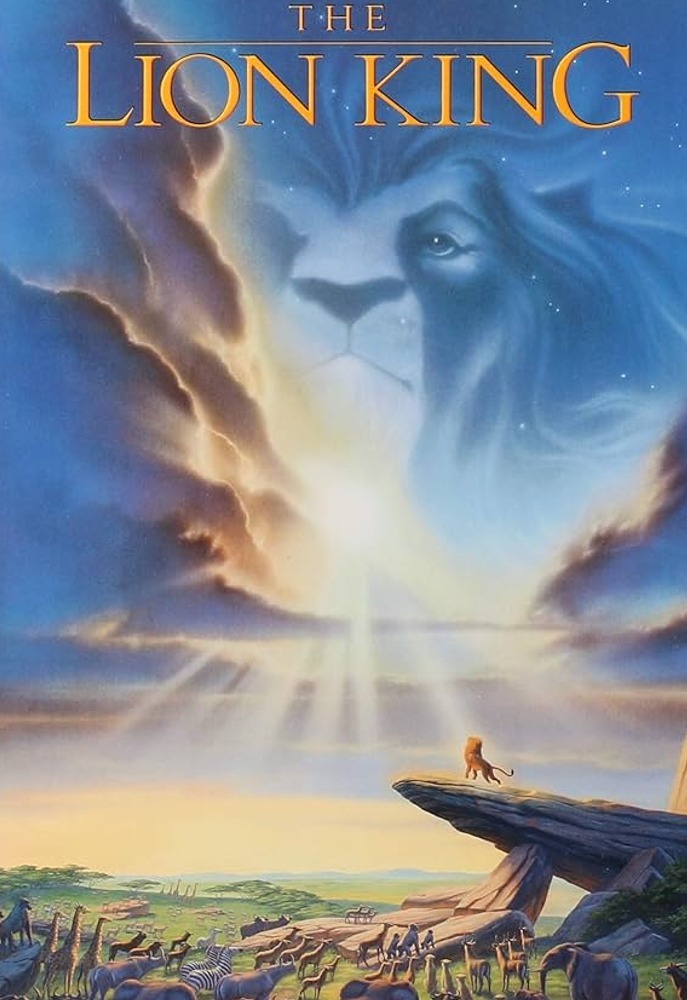
The poster for "The Lion King" is so breathtaking it deserves to be framed and hung on a wall. Unlike many animated movie posters at the time, which featured the central characters but didn't put much consideration into the background, the "Lion King" poster takes a step back to look at the bigger picture.
The main character is just a tiny blip on the screen, which allows viewers to better appreciate the film's gorgeous African setting (and how Simba is just one small part of the "Circle of Life"). The poster contains all the elements that made the movie timeless and epic: the majestic Pride Rock, the herds of animals gathering to pay their respects to the king, and, of course, Mufasa's face in the clouds.
18. The poster for Rosemary's Baby hints at evil
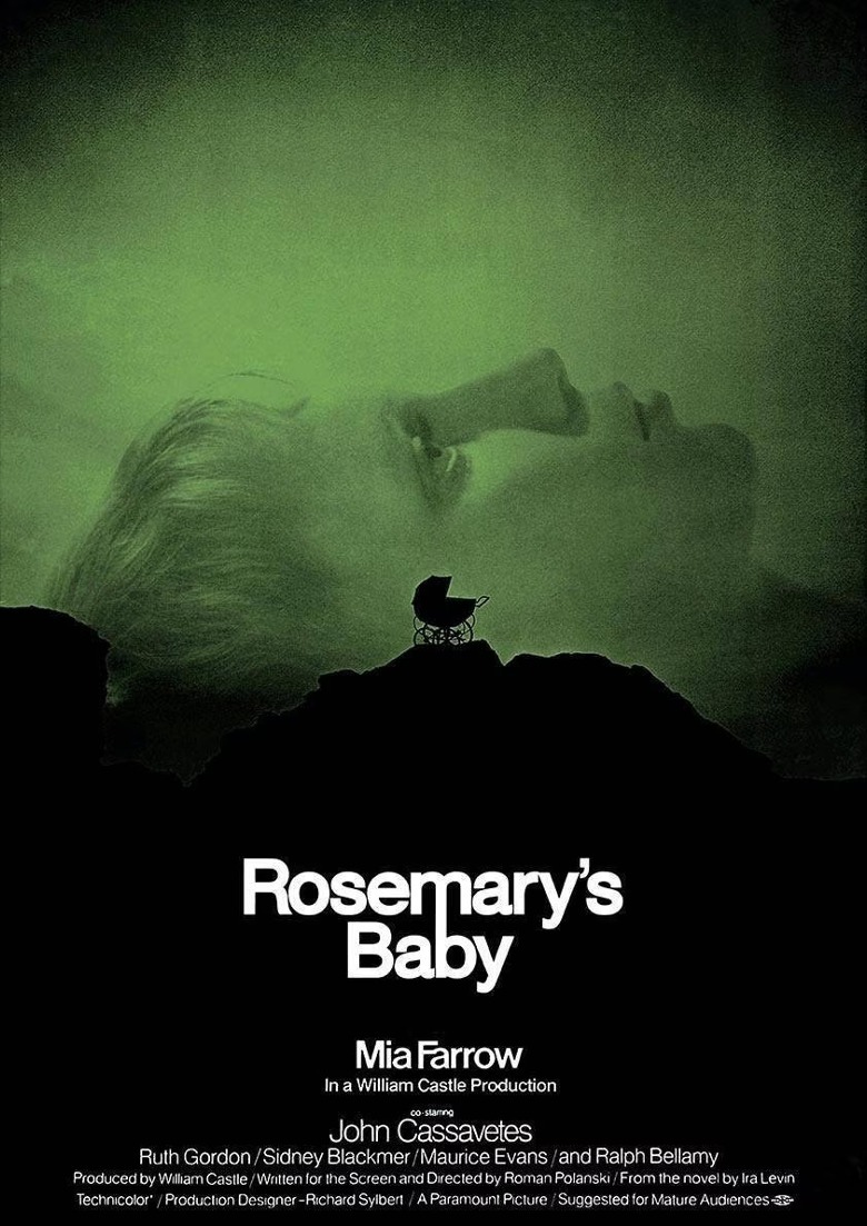
The scene depicted on the poster for "Rosemary's Baby" does not appear anywhere in the film, yet it sums up the movie so perfectly. It shows the heroine's face superimposed with the silhouette of a baby carriage on what appears to be a steep hillside or jagged rock face.
Aside from feeling extremely wrong — who would push their baby up such a precarious incline in the first place? — this unsettling image immediately leaves viewers on edge, knowing that the baby carriage could start rolling away at any second. The design is so eerie that, naturally, the movie "Apartment 7A" (a stealth prequel to this horror classic) had to use a poster that paid homage to the original.
17. The Anatomy of a Murder poster keeps things simple
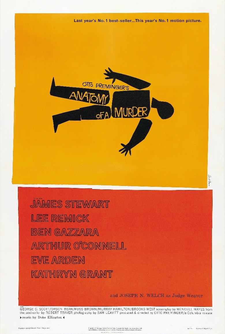
The marketing campaign for "Anatomy of a Murder" was creative, using a trailer in which the cast and crew of the movie are sworn into court and then director Otto Preminger announces that the people in the audience will be the jury. But perhaps the most clever technique used to promote this movie was its poster, created by Saul Bass. The design is understated and spartan; it depicts the outline of a body on the ground, so simple that it could have been made from paper cutouts.
Simple as it may be, the poster gets the message across, telling viewers that this is a movie about a murder and that it will not mince words. This no-frills approach to making a movie poster would set a high bar for years to come.
16. Blade Runner's poster defined cyberpunk
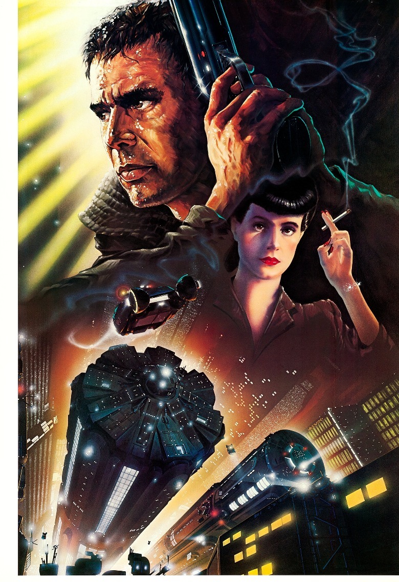
The poster for "Blade Runner" (arguably one of the best sci-fi movies of all time) boasts some incredible detail, from the hazy glow of the city lights to the sweat glistening on Harrison Ford's face. Rather than simply marketing "Blade Runner" as a sci-fi and calling it a day, this poster showcases the film's unique intersection of genres.
The flying cars signal that "Blade Runner" is indeed sci-fi, yet some subtle touches indicate that it's also film noir — like the whiff of smoke curling from the cigarette, which could have come straight from a poster for a classic 1940s noir movie. The unusual blend of cinematic styles captured on this poster would come to define the cyberpunk genre, which in turn inspired countless movies that wouldn't exist if "Blade Runner" never happened.
15. The poster for Avatar inspires awe
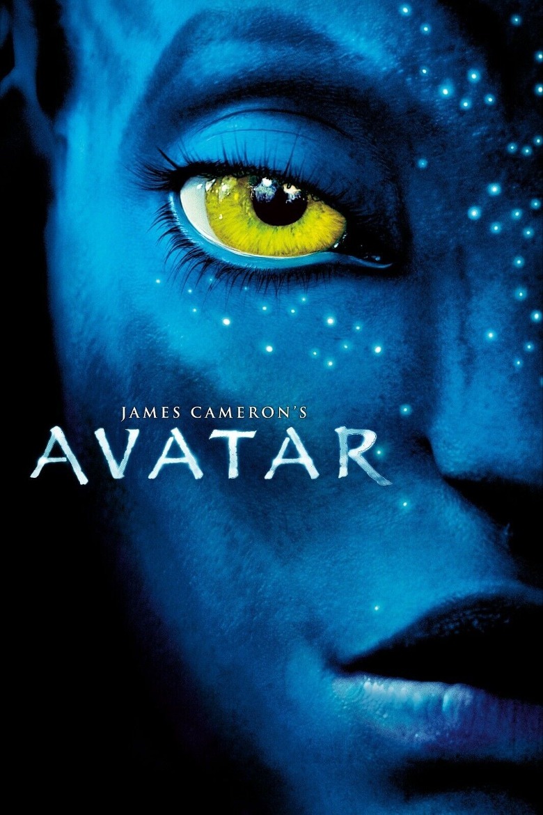
Depending on which version of the "Avatar" poster you are looking at, you probably won't see the names of any movie stars. This is because "Avatar" doesn't need to list any A-listers to spark interest. The image alone (along with the name of the director behind "Titanic") is more than enough to sell it.
The poster for "Avatar" needs only two colors: a brilliant blue and an electrifying yellow. The face of Neytiri (Zoe Saldaña) fills the entire one-sheet, and she stares into your soul. She is just alien enough to intrigue us, yet just human enough for us to see ourselves in her. (And this was no easy feat, since James Cameron said that the greatest challenge in "Avatar" was making the Na'vi feel like real people.) Few movie posters will take your breath away like this one.
14. The poster for Platoon seems all too real
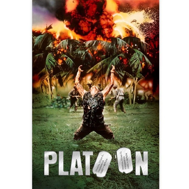
The poster for "Platoon" is actually inspired by a real-life photo taken during the Vietnam War, which is fitting for a movie that's known for its unflinching realism. The poster captures one of the movie's most memorable scenes, in which we see Sergeant Elias (Willem Dafoe) stranded in enemy territory, his arms outstretched to an offscreen chopper, pleading for his fellow soldiers' rescue — or else throwing up his arms in surrender. Behind him, the treetops erupt in flames. The poster leaves audiences with no illusions about the brutality of war.
Even though this poster contains a major spoiler for the movie (it leaves little doubt of Sergeant Elias' fate), knowing about this story beat will arguably intrigue audiences even more. Thanks to its iconic image and the clever use of dogtags in the film's title, the movie poster for "Platoon" secures its place in the history books.
13. Vertigo's poster will make you dizzy
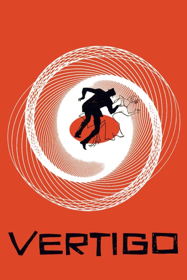
Alfred Hitchcock's "Vertigo" boasts yet another amazing poster designed by Saul Bass. It shows a man and a woman falling into a swirling vortex. (Observant viewers will also notice the shape of the woman's bun is also a spiral.)
The filmmakers couldn't have chosen a better symbol to use on the poster. For one, the spiral creates an optical illusion of sorts and gives you the sensation of falling (hence, vertigo). What's more, the shape matches the downward spiral of obsession, the way Scottie (James Stewart) can't stop thinking about Madeleine (Kim Novak) after her death and sinks deeper and deeper into this fixation — until it ends, yet again, in death. The design on the poster is quite literally the shape of the movie's story.
12. The Halloween poster is terrifying
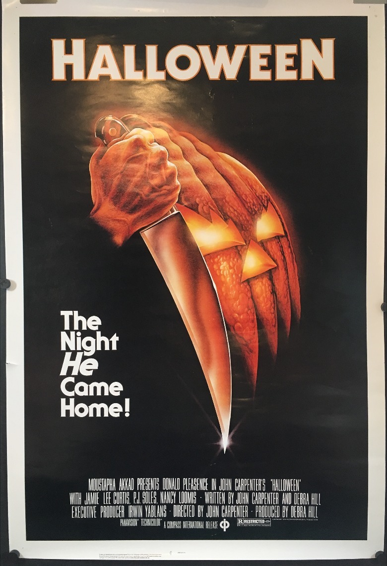
You know a horror movie poster is effective if it manages to make a pumpkin seem positively terrifying. The 1978 poster for "Halloween" is almost entirely black, save for the eerie glow of a pumpkin and a knife slashing through the darkness. Not only is it considered the best poster in the "Halloween" franchise, it's also one of the best horror movie posters, period.
Artist Bob Gleason, who designed this poster, clearly understood that the less you show off your slasher on the marketing materials, the more frightened your audience will be whenever the killer strikes. The only glimpse we get of Michael Myers is his hand, clenched in a fist so tight his veins are visibly bulging. These details tell us all we need to know.
11. Coraline's poster lures you into its trap
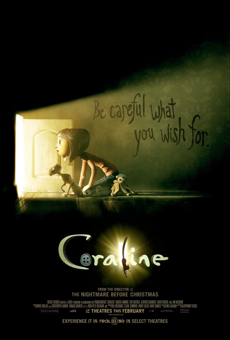
In the poster for "Coraline," a tiny, child-sized door beckons. It's enough to make any moviegoer curious about what lies beyond it, even as the rest of the poster screams "Turn back!" The eerie green glow, the creepy doll on the floor, and the tagline of "Be careful what you wish for," all send the message that it must be a trap.
Even the wallpaper, which has sinister insects hidden among the vine designs, calls to mind the spider-like Other Mother (Teri Hatcher) and her penchant for luring children into her web. This ominous poster is brilliant because it matches the rest of the movie, which drops subtle hints throughout that something is not quite right (including one big clue from the beginning of "Coraline" that you probably missed).
10. Metropolis boasts the most valuable poster of all time
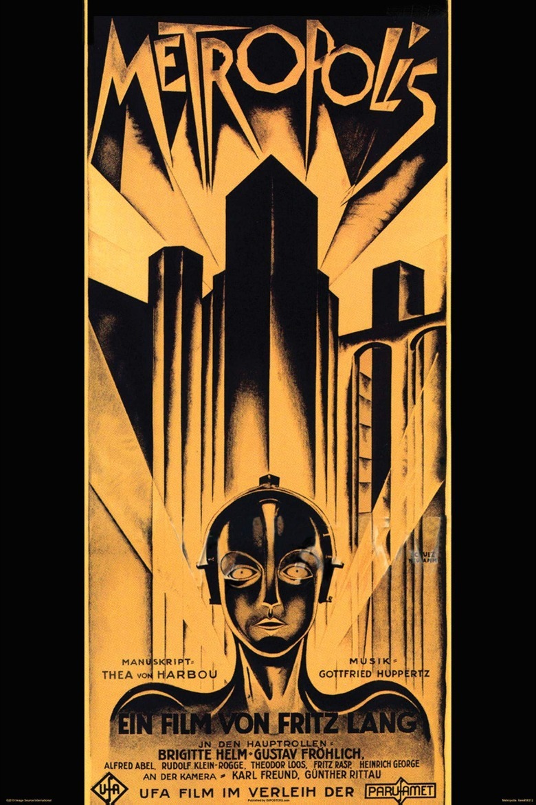
One of the most memorable silent films of all time has an equally memorable poster. This one-sheet for "Metropolis" is a triumph of art deco style and German Expressionism. The towering buildings evoke both the futuristic and the ancient (with a bridge that resembles a Roman aqueduct). Spotlights slice across the poster, and, in a clever touch, the film's title is designed to look as if the letters are formed by their beams. Of course, the film's iconic robot is front and center, looking as strange and uncanny as she did back in 1927.
"Metropolis" holds the record for the most expensive movie poster ever. An original copy of this poster sold for $690,000 in 2005, and we can see why somebody would pay a pretty penny to own this beautiful piece of film art.
9. The Godfather poster makes you an offer you can't refuse
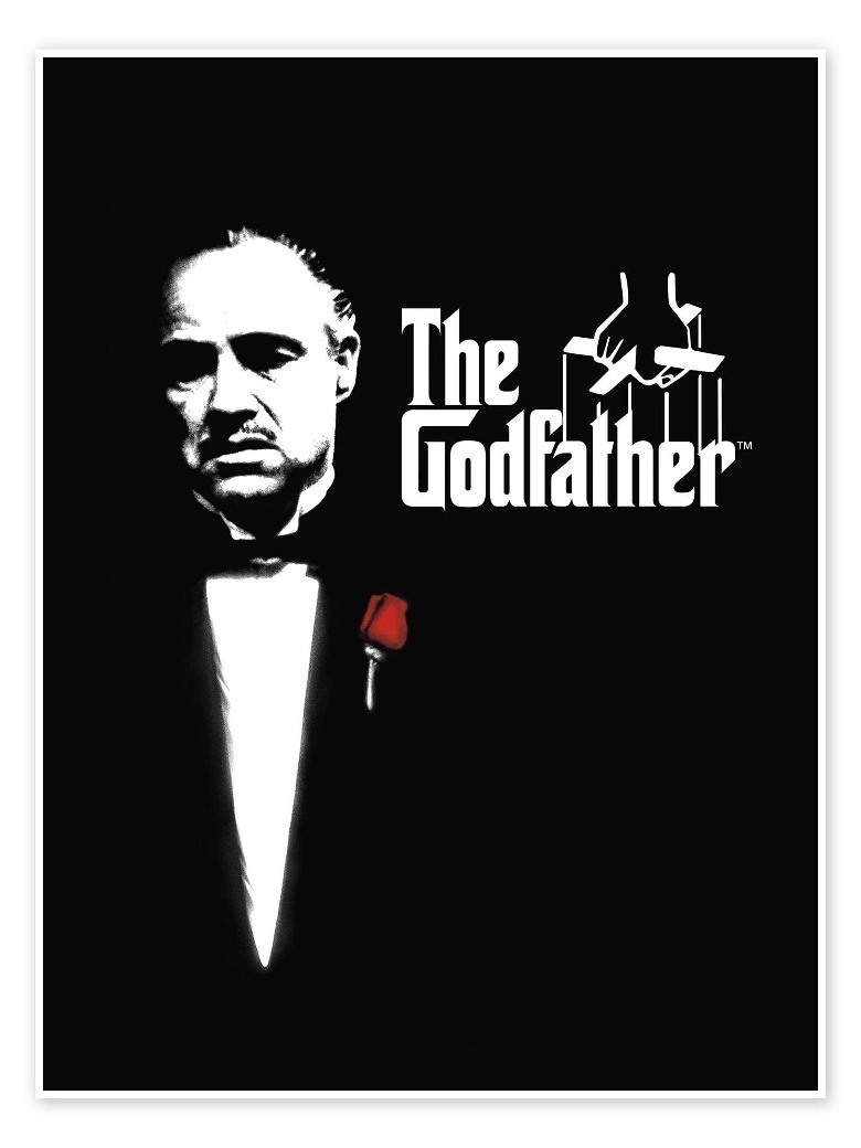
Marlon Brando has never looked so good in black and white than in the poster for "The Godfather," where the only color in the entire image is the rose over Brando's heart. Everything about this poster sends the message that Brando's Vito Corleone is the boss. Vito's suit is so dapper and his face so stern that he radiates authority.
Likewise, the marionette-string logo signals that Vito is the ultimate puppetmaster. Even the letter "G," whose lines extend almost all the way over to the letter "D," puts extra emphasis on the first three letters of the title, to underscore the "God" part of "Godfather." This logo, which originally appeared on the cover of Mario Puzo's book "The Godfather," was so iconic that the filmmakers simply had to use it to promote the movie.
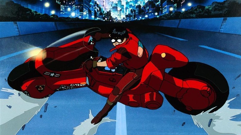
8. The Akira poster takes you for a ride
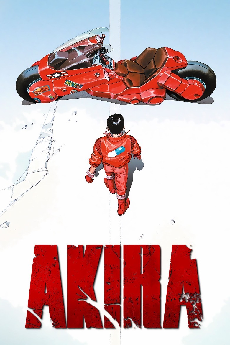
In 1988 the film "Akira" launched with a bang, making Western audiences pay attention to the anime scene for the first time. And what would make a better entry point to Japanese animation for Western viewers than this poster?
The broadside for "Akira" shows Kaneda (Mitsuo Iwata) striding across the cracked pavement, about to straddle his motorbike. The blood-red bike against the stark white background makes for a striking image. The way the poster is composed, it practically invites moviegoers to climb on the bike with Kaneda. The poster has inspired countless parodies (including one with Mario preparing to board his Mario Kart), and every one of them looks badass — but, of course, not as badass as the original.
7. The Mean Streets poster is classy
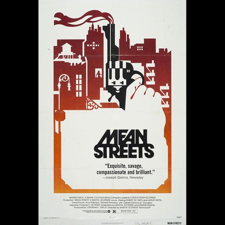
"Mean Streets" may not be Martin Scorsese's best-rated movie, but it certainly boasts the best poster. The one-sheet for "Mean Streets" transforms the New York City skyline into a single, uniform shape. It cleverly takes advantage of negative space to outline the finer details like fire escapes and water towers. Most intriguing is the silhouette of the woman in the window.
Of course, the centerpiece of this poster is the sleek and smoking gun. The silhouette of the gun becomes indistinguishable from the buildings around it, sending the subliminal message that the entire city is built on violence. This poster is elegant and brutal at the same time, which suits this movie perfectly.
6. The Exorcist poster is haunting
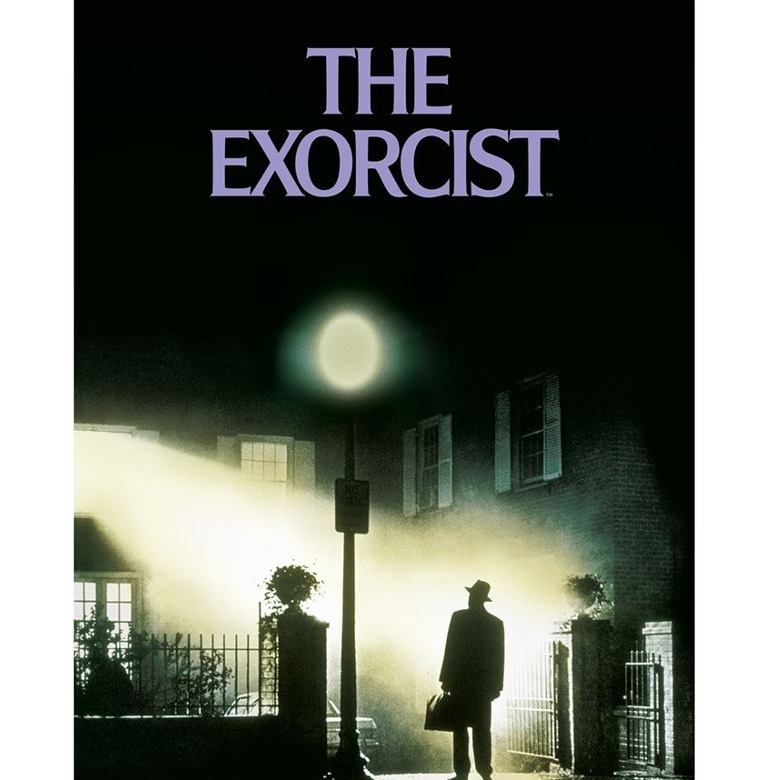
Few movie posters are as chilling as the image used to promote "The Exorcist." It shows Father Merrin (Max von Sydow) arriving at the house of the possessed child, standing at the gate while the light from the window illuminates the fog in an unnatural glow. Thanks to a few clever tricks of the light, the familiar suburban setting is rendered almost otherworldly. This poster leaves viewers with an uneasy feeling, as if they too are about to plunge into the unknown.
Plenty of movies and TV shows have given a tip of the hat to this scene. But none of these would have been possible if the original poster for "The Exorcist" hadn't ingrained this eerie image in our memories.
5. Pulp Fiction's poster pays homage to pulp novels
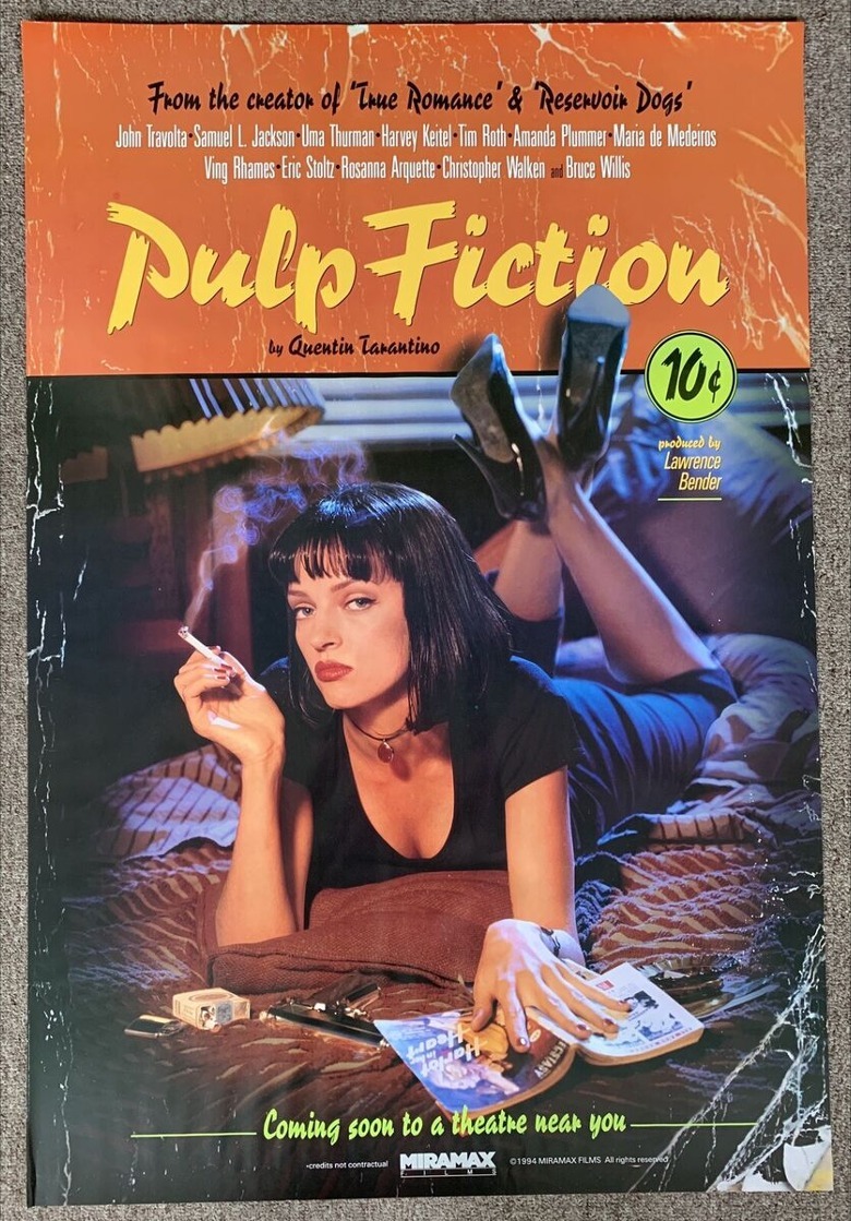
"Pulp Fiction" makes no effort to hide that it's a guilty pleasure. Instead, the poster flaunts it, promising viewers violence, and a stylishly good time. What's more, Mia Wallace (Uma Thurman) stares at you with such intensity that you can't help but be reeled in.
Since the film is meant to be a loving homage to the pulp genre, it makes perfect sense that the poster resembles the cover of an actual pulp novel. Great care is taken to make the poster look weather-beaten and dog-eared. In some versions of the poster, there is even a price tag marking it as 10 cents. This poster is the throwback to end all throwbacks; no other movie poster has quite the same retro charm.
4. Less is more in the poster for Alien
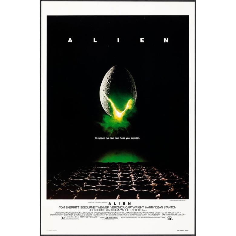
The poster for "Alien" boasts one of the most ominous taglines in the history of cinema: "In space, no one can hear you scream." Nothing else comes close to expressing the sheer terror of being confined in a small space with an unkillable monster. The design of the poster is stark and minimalistic, leaving much to the audience's imagination, because artists Philip Gips and Steve Frankfurt knew that less was more when it came to scaring the pants off moviegoers.
Ironically, the alien egg shown in the poster doesn't appear in the movie at all. However, this makes the image all the more powerful, because when audiences first watch the film, they will be going in blind – and will be even more horrified when the xenomorph rears its ugly head.
3. The poster for Star Wars: Episode IV – A New Hope is epic
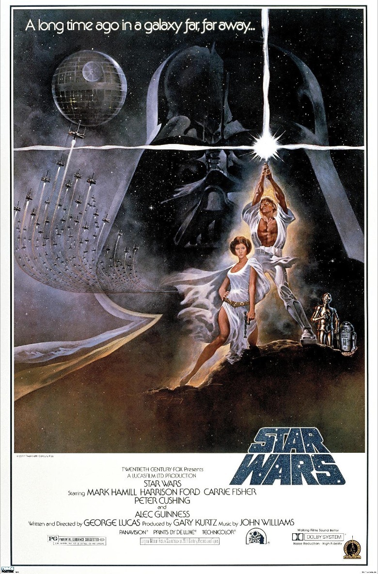
Folks, it doesn't get much better than this. From the dramatic poses of Luke (Mark Hamill) and Leia (Carrie Fisher) to the looming shape of the Death Star, everything about the poster for "Star Wars: Episode IV — A New Hope" screams "epic." The fleet of X-wings and the backdrop of the cosmos signal to moviegoers that the film will be massive in scale. Plus, observant fans will notice that the film's title is in the same typeface as the opening crawl of the movie.
Darth Vader's helmet takes up more than half the poster, but it blends in so well with the background that you could easily miss it. This design choice makes Vader seem ominous and almost omnipresent, and we can't think of a more terrifying way to introduce moviegoers to this unforgettable villain.
2. The Silence of the Lambs poster rewards multiple viewings
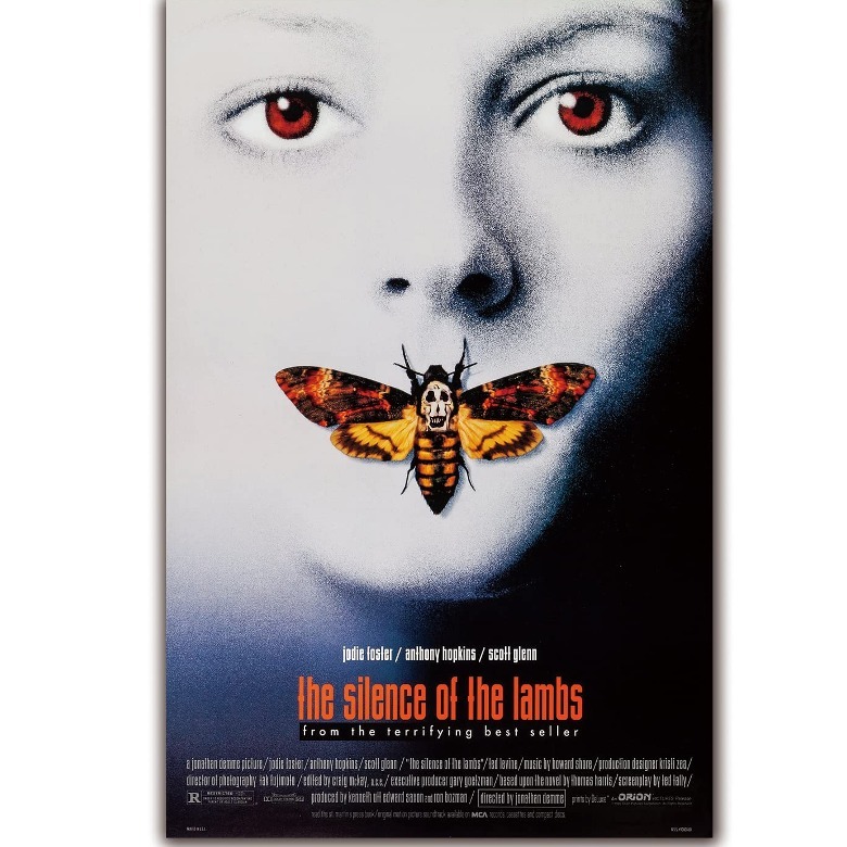
The poster for "The Silence of the Lambs" is striking, especially because the only real color on the poster comes from the body of the moth and Jodie Foster's eyes. The image of a moth covering the heroine's mouth is deeply evocative, calling to mind a woman being silenced (which proves to be a key motif in the movie). Never has there been a horror movie with a poster that is so unsettling.
There's more to this poster than meets the eye. Look closer, and you'll see that there's a skull on the moth's back. Look even closer, and you'll see that the skull shape is made from illustrations of naked bodies. This is meant to pay homage to the famous photograph of Salvador Dalí called "In Voluptas Mors," which also features bodies forming the shape of a skull. This ingenious poster offers plenty to reward eagle-eyed viewers.
1. The Jaws poster is a minimalistic masterpiece
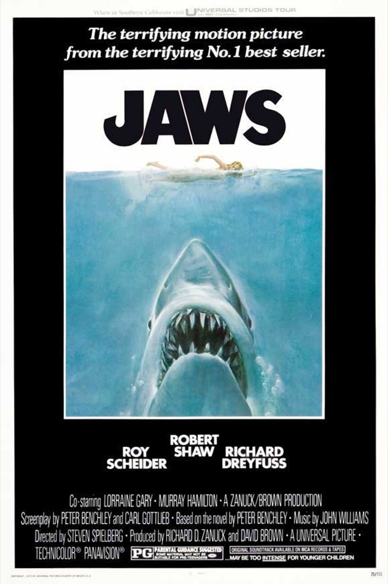
The greatest movie poster of all time is deceptively simple: it shows a shark, a swimmer, and nothing else. Yet therein lies its power. The poster for "Jaws" communicates the movie's premise in the most direct (and most visceral) way possible. It perfectly conveys the undercurrents of dread that blanket the entire movie, reminding viewers that the shark could strike at any time and the characters will be just as oblivious as the poor woman in the poster. "Jaws" gets bonus points as well for an ingenious logo whose first letter is reminiscent of a fish hook.
This iconic, jaw-dropping image spawned countless other imitators. Posters for "Deep Blue Sea," "Piranha 3D," and "The Meg" all owe it a debt. Of course, none of them have quite the same bite as this minimalistic masterpiece.