The Reason Names Are Reversed On Movie Posters
If you're anything like us, you've seen more movie posters than you could shake a million sticks at. When it comes to genre and tentpole films in particular, you've probably noticed that there are certain protocols that are nearly always followed; rules of the poster-designing trade which are intended to calibrate each one-sheet to grab as many eyeballs as possible, and to get each viewer interested in the movie being promoted.
It's easy to parse out the reasoning behind some of these rules (such as making sure that the lead actor is reasonably centered on the poster), while some have explanations that are a little more esoteric (like the modern tendency to douse every poster in the same shades of teal and orange, which are situated directly across from each other on the color wheel and therefore produce an eye-pleasing contrast). One apparent rule in particular, though, doesn't appear to make a damn bit of sense: listing the actors' names out of order, and often completely reversed, from how the actors themselves appear on the poster.
It's a question nearly as old as Hollywood itself, because this is in no way a recent thing; it's been going on for as long as movie studios have been sticking their actors' mugs on promotional materials, so much so that we the public seem to have collectively accepted it as just one of those weird things that probably has some explanation, even if we couldn't venture any guess as to what it might be. Well, we're here to shatter the mystery, because there is indeed a reason for this odd phenomenon. Two reasons, actually: the never-ending quest for big box office bucks, and the egos of famous actors.
Movie posters generally follow one of several very specific designs
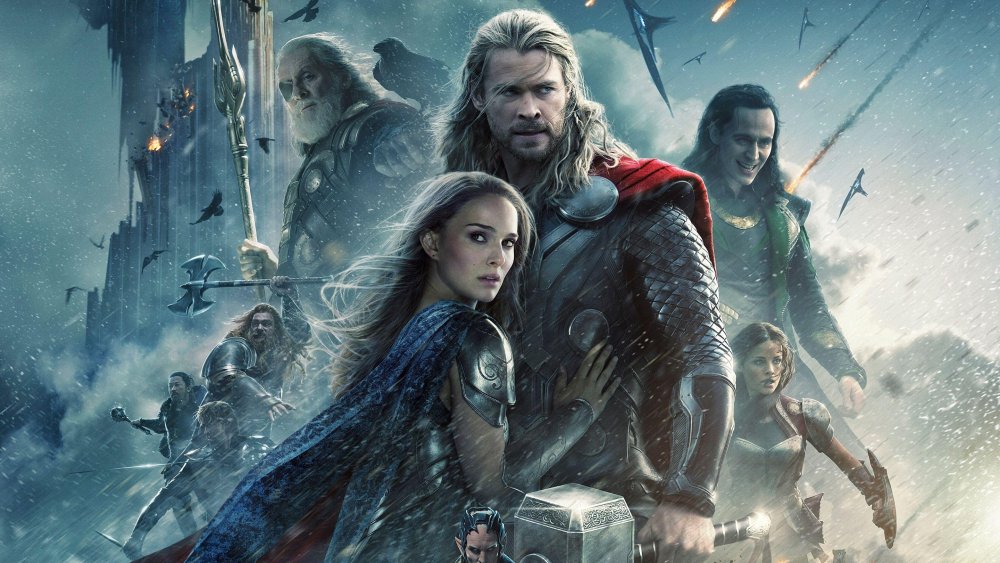
First of all, the way in which a film's cast appears on the poster is not at all random. It usually follows one of many incredibly specific templates — like the one often followed by films with large ensemble casts (the Star Wars and Marvel films are prime examples). There are pretty much four hard-and-fast rules, and they are as follows: the hero is centered and (usually) slightly to the right. The love interest is to the left of the hero, from the viewer's perspective. The villain (or a villainous/morally ambiguous character) will be looming over the hero's left shoulder, while a buddy or ally will occupy roughly the same position over the other shoulder.
There are probably about a billion different reasons a studio executive or poster artist could break down to explain why this is the way it is, but it boils down to one simple fact: it seems to work, and if there's one thing that's helpful to know about Hollywood studio executives, it's that they are very, very averse to deviating from what has been proven to work. As you may be aware, production and marketing costs for your average tentpole picture can run into the hundreds of millions of dollars, and this precisely calibrated approach to poster design is the result of truckloads of market research conducted with the aim of maximizing the heck out of that investment.
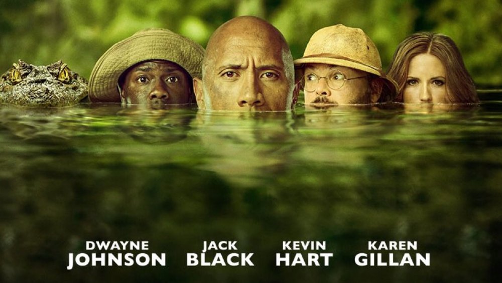
Okay, fine, you may be asking; why the heck are the actors' names always out of order, then? Do the people who design the things honestly not know the difference between Kevin Hart and Dwayne Johnson? Are they doing it on purpose, just to screw with us? Nope: this is where ego comes into play.
The order of the names on a poster is determined by billing
Obviously, there are several design templates for different types of movies, but regardless of the design, one thing remains constant. The names of stars on a poster are typically rendered either top-to-bottom or left-to-right, and are arranged in descending order of "billing" — that is, the "top billed" star, the biggest name and/or box office draw, appears first (either on top, or on the far left). Some stars even have top billing worked into their contracts, and it gets weird in certain cases where the ostensible star of the film isn't the biggest name in the cast.
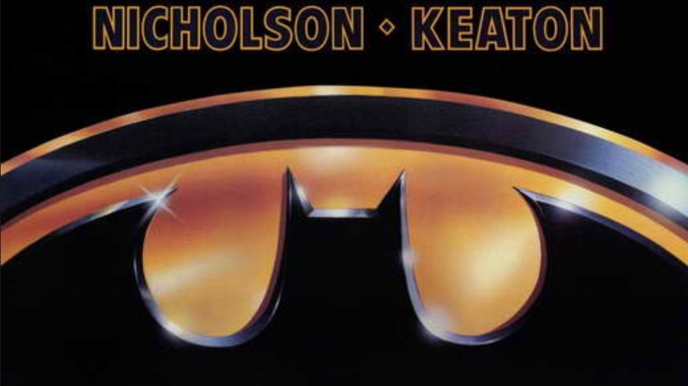
Famous examples of this abound, but the early superhero genre gives us two excellent examples: on the poster for 1978's Superman, Marlon Brando and Gene Hackman (both enormous stars) were billed above Christopher Reeve; and on the iconic, minimalist one-sheet for 1989's Batman, Jack Nicholson famously received top billing over "star" Michael Keaton.
There are lots of ins and outs to this convention (it can get extremely tricky with star-studded ensemble casts), but for our purposes, the simple fact is that the order of billing (as determined by the cast's egos and/or contracts) rarely lines up with the order in which the cast appears on the poster (as determined by the conventions of poster design). One final, fluke-ish point to make here: major stars appearing in relatively minor roles (like Samuel L. Jackson as Nick Fury in every other Marvel movie or so) will often receive an "and" before their name, and are always billed last. If this actor's character is an ally/buddy (which they often are), that means they'll usually appear on the one-sheet's far left, while their name will appear on the far right. Madness!
Will out-of-order names on movie posters ever be fixed?
If it seems like billing order is a ridiculous thing for world-famous actors to be fighting over, well, we're right there with you. After all, if Robert Downey, Jr.'s mug is front and center (and, er, maybe slightly to the right) on the poster, it's doubtful that moviegoers will get confused as to whether he is involved if his name doesn't appear in the exact spot prescribed by this decades-old convention.
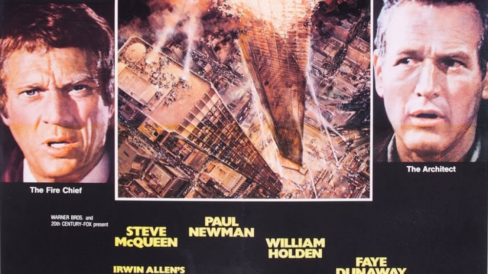
At this point, though, it's so thoroughly ingrained in the filmmaking business — as is the fine, bizarrely repetitive art of poster design — that it's not likely to change anytime soon. (Or, you know, ever.) Creative solutions to even the most contentious billing disputes were already arrived at a lifetime ago; take, to name just one example, the smash hit 1974 disaster film The Towering Inferno. To solve the problem of who would receive top billing between Steve McQueen and Paul Newman (who were pretty much dead-on equal in terms of star power at the time), producers simply requested that the poster's designers stagger the names so that McQueen's appeared furthest left on the one-sheet, while Newman's appeared closest to the top.
Silly, right? Well, whatever it takes to make your stars happy, and keep that dough rolling in. We're sorry to report that out-of-order names on movie posters will, in all likelihood, continue to drive you nuts for the foreseeable future; on the bright side, at least now you know why.


