Production Designer Curt Beech Opens Up About Amazon's Hunters - Exclusive Interview
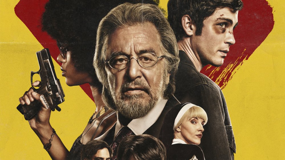
Amazon's Hunters walks a fine line. When it's following Al Pacino's Meyer Offerman and his band of rogue Nazi hunters, it's a pulpy, Tarantino-esque action show set in an over-the-top reimagining of New York City in the '70s. When it goes back in time Holocaust-era Poland, Hunters' surreal undertones become downright nightmarish. It's still not quite realistic, but there's no question that Hunters takes the material very, very seriously.
As Hunters' production designer, it was up to BlacKkKlansman veteran Curt Beech to make sure that both halves of the show looked consistent while maintaining their distinct tones. Throw in the challenges that come with sensitive historical moments like the Holocaust and you have a pretty monumental task.
Thankfully, Beech was up for it. Thanks in large part to Beech's work, Hunters doesn't look like anything else on TV. Around the time of the show's premiere, Beech sat down with Looper and to talk about what inspired Hunters' unique aesthetic, what it took to build Meyer's top-secret lair, and some of references hidden in the homes of the members of the Fourth Reich. Here's what he had to say.
What inspired Hunters' unique look
How did you get involved with Hunters?
I found out that the project was out there. It was a period piece, and I pitched to Nikki [Toscano] and David [Weil], the creators of the show. And I have to pitch for all my jobs, basically. So I put together a book, to try and capture the vibe of the period, and the style, and some of the bigger ideas that were in the piece.
And this was based only on the pilot. Typically, when I'm pitching stuff, I don't get ten episodes to read. I get one. So not knowing the arc of the characters and stuff, you'd just have to try and nail it as best you can. And they liked what I put together, and off we went.
The show has an exaggerated, grindhouse-type style. Was that in the original script, or did you bring that in as part of your pitch?
I don't really think of it as "grindhouse" nearly as much as I think of it as "graphic novel." And that's where we jumped off from, to try and give it a richness that felt like a graphic novel, but still felt like a real version of the '70s. And then when we went back and looked deeper into the '40s to try and capture something else in that aspect.
Did you look at any comics or graphic novels in particular?
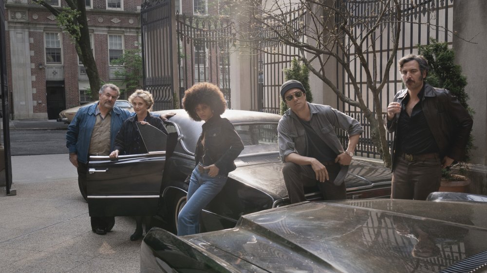
No. I definitely didn't study comic books to figure this out. What I studied was photography from the period, what things were really like in the 1970s in New York, and that's comic book enough because New York in the '70s was basically bankrupt. There were people dying on the street. Crime was extremely high, and there was danger around every corner. There were abandoned cars everywhere. They didn't pick the trash up. The city was a disaster. So, I really had to look no further than what was really happening in New York at the time.
I mean. we definitely made an effort to try and stay true to what was going on in the city, while still giving it a richness that heightens it a little bit, but this idea of damage, this theme of damage, is one of the things that we really leaned into visually. Especially in the exteriors, where everyone in the story is either damaging or damaged in some way. We wanted to find that visually as well.
Was it challenging to find a balance between the two time periods in the show? Because it's almost like you shot two different shows.
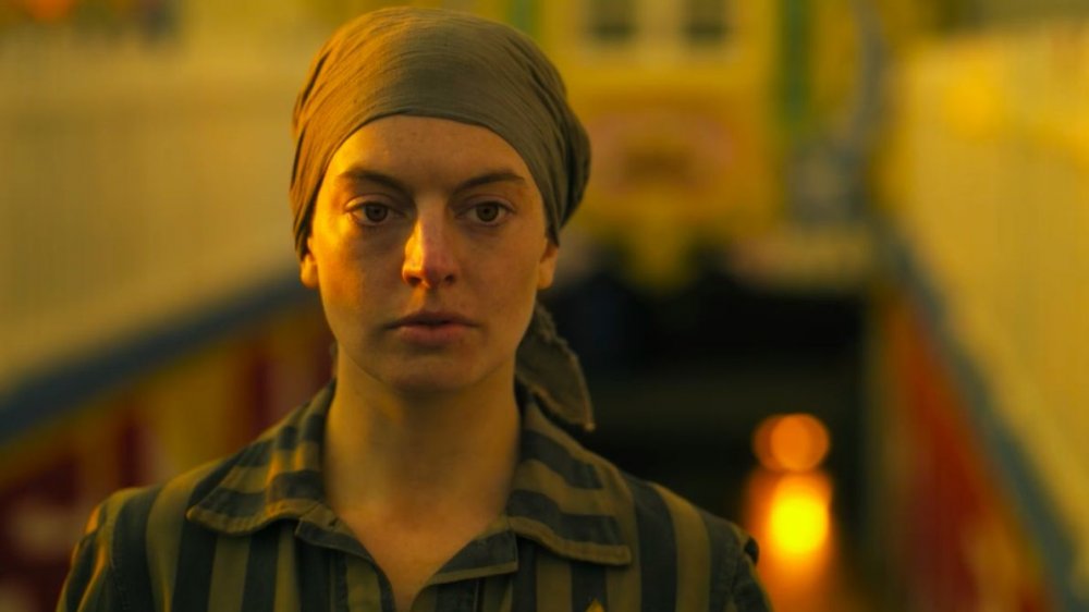
Yeah. I think that is the challenge of the show, and that's why I was drawn to it. We weren't trying to do the concentration camps documentary-style. We were not trying to capture it verbatim. We were trying to get the feeling of what it was like, and capture the mood and the tone.
The concentration camp that we wound up using stood in for all of the different concentration camps that are called out in the script. We couldn't build Auschwitz the way that Auschwitz really looks. We couldn't build for Birkenau, the other part of it. There were several camps that were called out. So, what we wound up doing was creating one that stood in for all of them.
That's the big challenge, to try and make it feel right without being slavish to how you design it and making sure that it looks like it actually looked. It's a tricky proposition because you owe it to the survivors and to the victims of the Holocaust to do something that is accurate, but in absence of being able to shoot at those locations, you have to do something else. So, we were obliged to try and figure out a way to get the ideas across without creating a documentary.
Recreating the Holocaust for Amazon's Hunters
What kind of research did you do for the concentration camp?
Oh, we looked at all of them. And got to know the building idiom. How they built these buildings. They had engineers come in and figure out the most efficient way to murder people. And you have to know that.
We went to the Jewish Heritage Museum here in New York as a group. We went to the museum and looked at the exhibition that was on about Auschwitz, and how it all kind of functioned as a camp, and what happened there specifically, and the stories that were written, and the accounts that were taken. We spent a lot of time there to try and understand.
I am not Jewish. There are a lot of things that I have done in my career that I have no relation to. I have to learn. That's what's so great about this job. I get to learn a little about a lot of things. Diving into this period and these people is fascinating and eye-opening for me, just as a human.
When it came time to build the concentration camp set, you did that in Budapest?
Yeah, there is a standing camp [set] in Budapest. It hadn't been [used] in quite some time, so it was in some disrepair. So, we went in and fixed it up. Which is strange to say, but it needed to look functional. We improved some of the buildings, and made them look like they were in use. And we shot it in a number of different ways to try and get some different looks out of it. It functioned like a back lot.
Hunters has been a little controversial, with the Auschwitz Museum issuing a statement about it. Did you expect the controversy?
I have to say, anytime you are portraying the Holocaust, there's going to be controversy. Even if you're putting together a documentary about it, there's going to be controversy. Feelings are very charged on all sides of it. And I completely understand that. So, I read it all. I know where they're coming from.
I thought, David comes from this from a place of — David Weil, the creator — comes at this from a place of authority. His grandparents were survivors and he knows what he's doing. He's not trying to offend anyone. He's very sensitive with the material. We talked about every decision that was made. There were things that they took out that didn't pass. So, everyone did their best to be sensitive and thoughtful.
But I understand. I mean, it's very serious material. Anytime you get close to it, there's going to be people who are upset. It brings up very strong feelings, and rightfully so. I think the point is to continue the discussion for everyone.
And I think parts of this show are a little over the top, and that, to David's point, is to try and get away from the actual stories of the people in the camps. I think it's important to remember that it is a television show. No effort was made to glorify the violence. I promise you that that was never an intention. That's why at the beginning of our discussion, I steered away from the "grindhouse." That word never came up in production. It's all about making a dramatic graphic-novel feeling epic show.
The truth about Hunters' craziest set
Were there any sets that were particularly fun or particularly tricky to build?
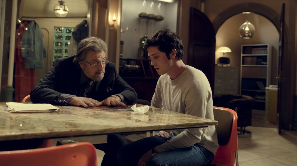
For me, the stuff that is built on stage is always the most fun to figure out, and the most challenging. And in this case, the standing sets on stage are the secret room in Meyer's house, which we referred to as the Batcave in production, and the Ark. Jonah's house interior was on stage. Mindy and Murray's apartment was on stage. And then we had a bunch of other smaller things that would come and go, like the bat mitzvah set, and a couple other apartments and things would come and go, but building the Batcave was the first big challenge.
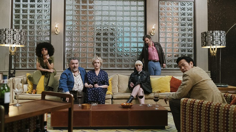
It was interesting, because it was written as a subterranean space, but when you are designing a subterranean space you lose time of day, which is something that we needed to try and maintain in this space. So, what we did instead was move it to the roof, and thinking what kind of structure would be on the roof, it became this fortified conservatory or greenhouse that would have been on the roof of Meyer's mansion. So, it's reinforced with concrete. The other material that we leaned into was glass block to try and allow light in, but it still feels secure because it's like brick. So, it served both purposes, and it allowed us to make a more flexible, usable space.
So, that was a challenge, and doing all the paperwork in there was massive. Our graphic designers just nailed it. Everything that's on the walls is legitimate and well thought out. There's a lot of it. There's so much research that went into to making sure that all the paperwork was correct, and made sense. Everything that people touched needed to feel authentic and real, and it really did when we were doing this. The pictures on the walls are a combination of real photos from the Nuremberg trials and reference. We took some of our own to use there also, just to make sure that we had it all correct.
There are a lot of hidden things in the show that no one on first glance will notice. There's a lot in the art that's on the walls everywhere. We put a lot of thought into that, into the furnishings, into how things look.
All of Meyer's art came from the degenerate art show that was in Berlin in the 1930s. Hitler had two art shows. He had the sanctioned art show for the Reich, and then he had a degenerate art show at the same time and like ten times the number of people went to the degenerate art show because it was so much better. The art was so much more interesting. But we use that heavily in Meyer's [house].
All the small details you missed about Hunters' Fourth Reich
You also had to design a look for what the Fourth Reich would look like, what Nazis would look like and what they'd be doing 30 years after the Nazis were effectively gone.
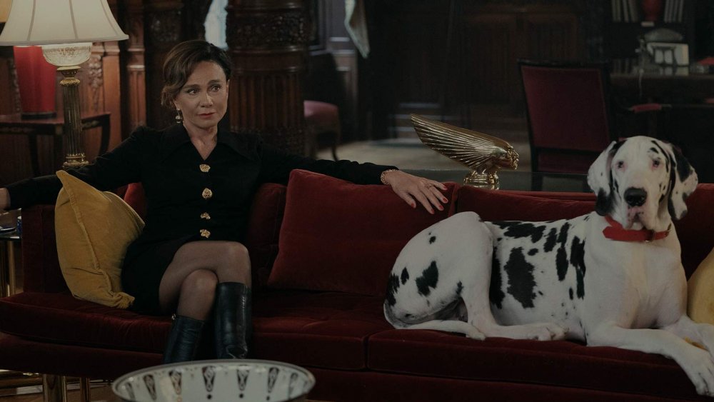
Yeah. What's always a little bit scary is you have to have resources. So, we assume that there's money behind this from some place. Their offices, and their factory, and their homes are quite nice and have some money behind them. That's scarier than people in back rooms. So, they had to elevate their status somewhat, infiltrating all the way to the top of the US government, and we needed to show that is possible through their environments, which had to be of a certain quality. So, we thought a lot about that.
The color theory of the show was an important aspect of the Fourth Reich. And everything else fell around it. Limiting the use of red. It's such an iconic Nazi color, but in this case they are not the only people with blood on their hands in this story. There's a rationing of red amongst all the characters. Because no one is innocent in this story. Everyone has some blood on their hands. So, red is doled out in different ways to different people.
And then all the other colors have different meanings as well. Yellow is innocence. Orange is energy. Gold is hubris. Two greens of different hues. One for secrecy, and one for militancy. And then blues for justice. So, this is the set of rules that we came up with color wise to try and maintain this look throughout the show.
Directors come and go on a series, so it's up to me as the designer to make sure that the rules are followed when the new director comes in. The showrunners also, but I feel a responsibility to how things look, to make sure that everyone follows the rules of the show. And that all came about just out of happenstance. I had this wallpaper that I wanted to use for Ruth. And Ruth is not without some blood on her hands, but I didn't want to overdo it with her. So there's this wallpaper with some red berries in it, right?
So, the painters came to me and they said, "Well, what color should we paint underneath? If you want this peeling off the walls, what colors should we put underneath her wallpaper?" And that got me thinking, well how did she start out? She did start out from a position of innocence, so I had them paint yellow underneath this wallpaper with some red in it. And then everything else fell into line from there. From that discussion with the painters. That's what's so fun about this process, is everyone collaborates on decisions that get made and that's how a look is created.
We hid other things in the art later on. The Nazis in the show have art from Hitler's own collection and also Hitler's own art. He was a frustrated artist in his early years. Didn't draw badly. He was fine. It just had no point of view. It was uninteresting art, but it's obviously interesting to those characters. They have his art in their spaces.
The difference between production design for TV and movies
You've done TV and you've done some pretty big feature films. What's the difference between the two mediums?
The difference is primarily one of time. Things move much faster on a television show. I think David Mamet has a quote that you should look up. I'm not going to get it 100% right, but basically doing a film or a pilot is like running a marathon. Doing a series is like running a marathon until you die. That's his quote. And it's very true.
Over ten episodes, you have eight or nine days to shoot an episode. While that episode is shooting, those are the eight or nine days that you get to prep for the next episode. The next episode may have 30 sets in it, and you have nine days to get ready for those other 30 sets. Some are recurring, some are bigger than others, but you have to know what's coming three episodes from now in order to get where you need to go, and have those sets ready for shooting.
In a film, any set can be put anywhere in the schedule. So you have some flexibility with how you arrange the shoot. I do get some say in how we shoot things, in what order we shoot things so that we have time to get things ready. In that nine-day period, you may only get a couple of days of grace on a TV show. On a film you get to manipulate that much more, but it does not work that way in a series of one hour episodic. It's just a different discipline. It just is the nature of the beast. You have to be decisive and you have to have a lot of help.
Is there one that you prefer?
I mean, as long as there's enough prep at the beginning — and this one did have enough prep at the beginning, where I had some time to think about things, and feed my brain, and do all the research, and get my ducks in a row — as long as there's enough time in prep, it's the same. I like both.
I like the challenge of episodic television. It's very hard, and it's not for everyone. I think it's a lot of fun. It's really hard, and I enjoy the difficulty of it. Features are like a breather. It's like, "Oh, we get a little bit of time to sit and think about this one set that we're going to put at the end of the schedule that might be eight, nine, ten weeks away." It's nice. They're a little more luxurious, features, but I like the pace.
