The Real Reason Ozark Looks So Dark
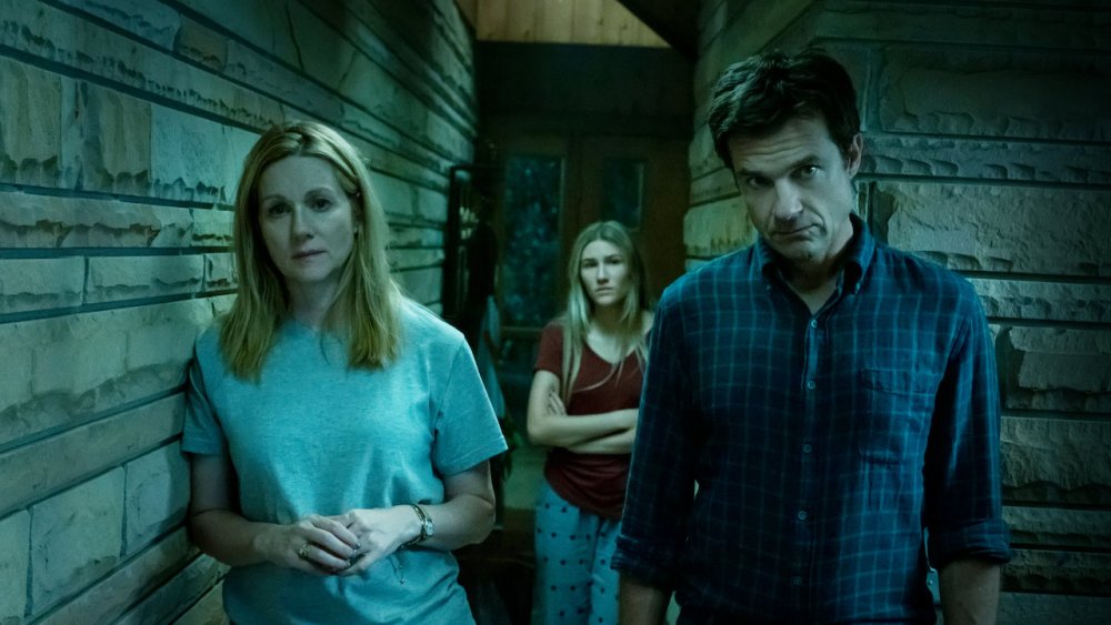
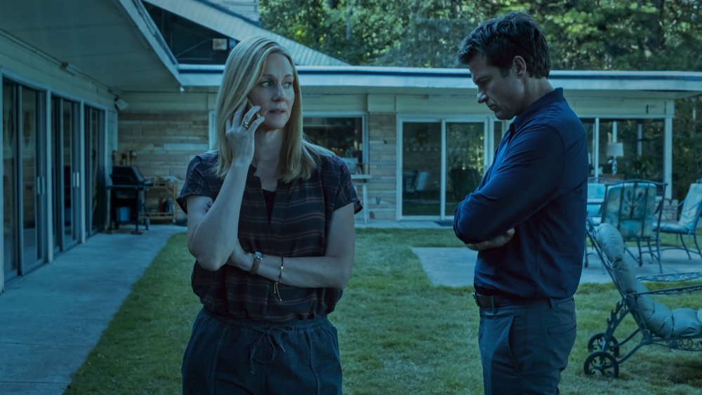
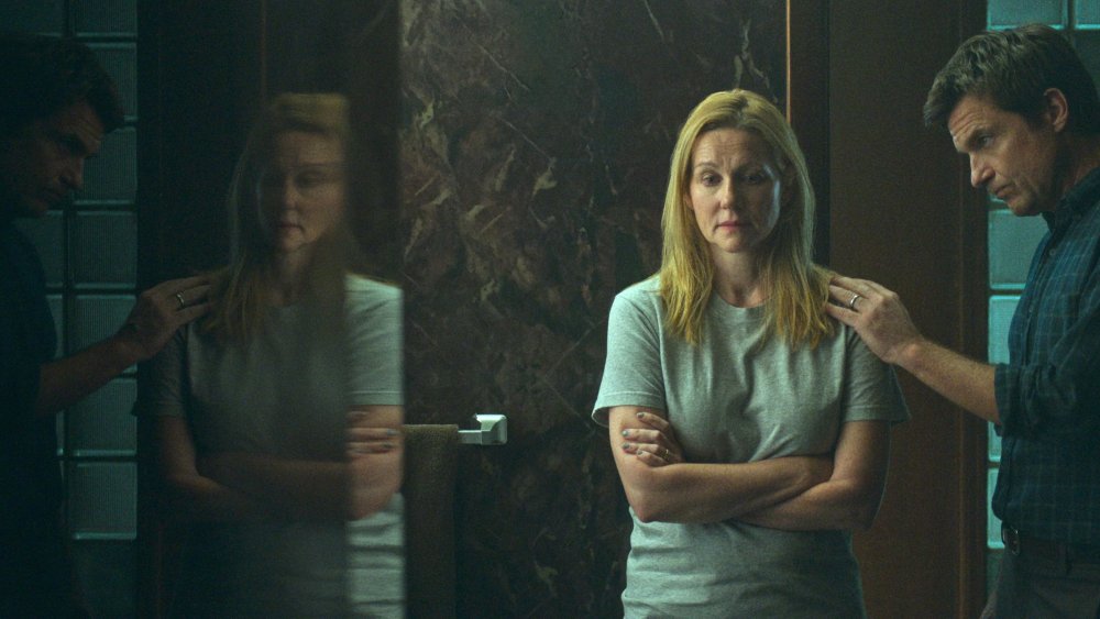
After three harrowing seasons of shady doings, violent misdeeds, and all manner of double dealings, it's safe to say that Netflix's white-knuckle crime drama Ozark is one of the darkest programs the streaming giant has ever produced. While the series' pitch-black narrative drives said darkness, fans of the series are quick to point out the visual elements of the show are just as bleak, so much so that viewers sometimes can't actually see what's going on.
Ozark follows the travails of Marty and Wendy Byrde (Jason Bateman and Laura Linney), a Chicago couple who move their family to the wilds of Missouri hoping to launder millions of dollars of drug cartel cash, and save their lives in the process. As the series has evolved, so too has Marty's and Wendy's involvement in cartel dealings, with Ozark's shocking season 3 finale taking the Byrdes deeper into the lion's den than ever before.
The stakes are only getting bigger, which means there won't be room for light in that perilous world moving forward. Asked about the dark look of the show in a 2018 interview with Decider, Director of Photography Ben Kutchins spoke candidly about Ozark's starkly muted visual palette. It turns out the darkness is very much by design.
Ozark's dark, blue-toned color palette speaks to its narrative
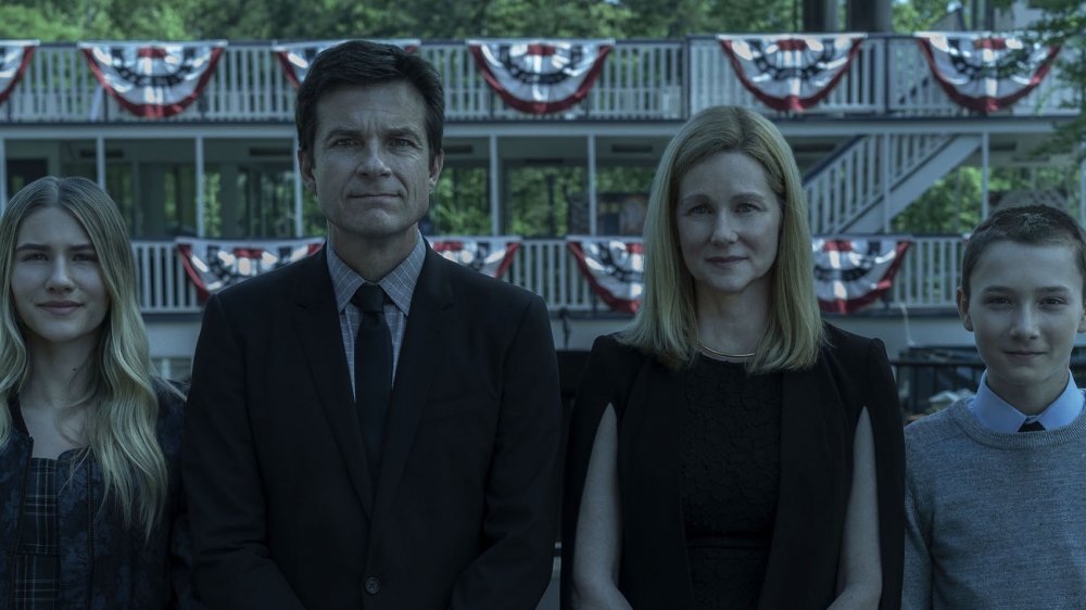
The reason Ozark is so dark is because dim light and blue-ish hues are meant to reflect the bleak emotional landscape and constant danger surrounding the Byrde family.
"We don't know if the Byrde family is going to make it through this, you know? And at every corner there's a new adversary and a new puzzle to be solved, there's a new riddle," Kutchins told Decider. "For me the really interesting thing that we lean into in making a show that's this dark is, like, what is in the shadows over there? Is there somebody lurking in the shadows? And what's beneath the surface of the lake? What's that thing that's just beneath the surface of the story that's terrifying the audience?"
Ozark takes inspiration from other visually and thematically dark media
True to that statement, the ceaseless wave of life-threatening adversaries and obstacles stalk in and out of the darkness on Ozark like bloodthirsty creatures of the night. It's only natural, then, that Jason Bateman and the Ozark creative team would want to imbue that world with as many shadows and dark corners as possible. Not surprisingly, Kutchins cited the works of David Fincher (know for using shadowy visuals and muted color palettes) and other modern crime flicks as key influences on Ozark's look in a 2018 interview with Deadline.
"[The goal was] something that really had a coolness, a cold color palette, and felt like it was shot on old Fuji film, like an old European movie," said Kutchins. "A lot of the references that we used were more modern. This Australian movie, Animal Kingdom, is one that we referenced a lot. We also talked a lot about David Fincher's movies and the way that he uses the camera."
Reflecting real life in the darkness of Ozark, and bringing light to the series
As it happens, the shadowy lighting of Ozark is also meant to convey a more accurate visual representation of the real world than many shows and movies usually seek.
"I'm trying to use as many practical sources as possible," Kutchins explained to Deadline. "I also don't personally love the type of photography where you go into a room and an unrealistic number of practicals are on; like, every light is on in the house. I don't think that that's the way we live our lives, going around and turning on every lamp in the house. That's become an aesthetic that I don't really understand."
He also detailed his approach to lighting Ozark, sharing, "I tend to light with the use of practicals as much as possible, without turning on an ungodly amount of them. That combined with, as much as possible, single-source lighting, creating one source that's the sun or is the strongest lamp in the room, and letting that fall off, and letting shadows come in where they can, really just relying on that one light to do most of the work." Kutchins further noted that he used "some very small LED sources to mold and shape light," because you can turn LEDs down "until they're almost off" in the way that other lights can't. "With LEDs, I've found that basically at their very lowest setting, they're wrapping enough light to just barely be able to see the actor's eyes," he stated.
While Kutchins shared that a lot of Ozark's signature look is achieved in-camera, he admitted it's also done through extensive color-correction in post-production. However Kutchins and Ozark's creatives are making it happen, there's little argument the series' brooding visuals achieve the desired effect, dramatically bolstering the relentless tension surrounding the Byrdes, even if we can't always tell what's happening on the screen.


