The Candid Truth About Spider-Man: Into The Spider-Verse's Stunning Aesthetic
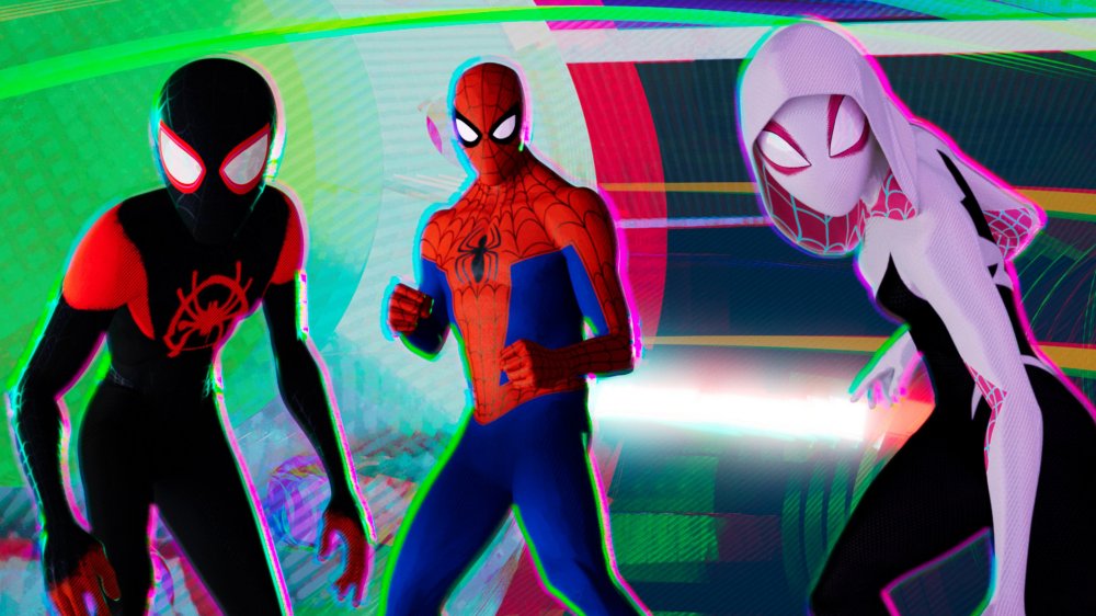
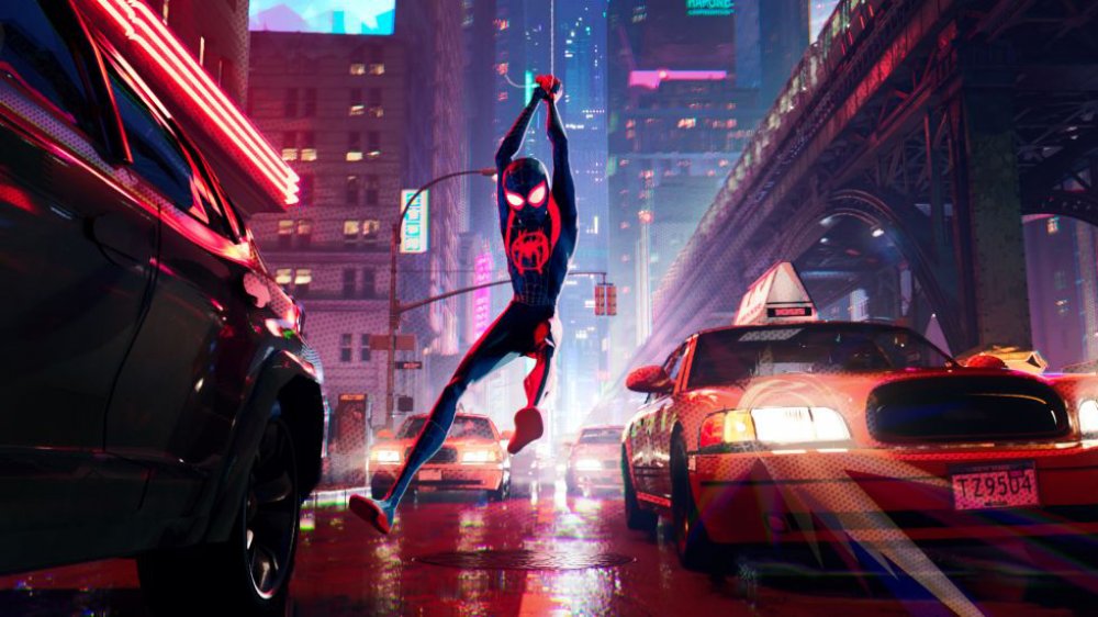
After years of trying to perfect a live-action Spider-Man movie, the animated Spider-Man: Into the Spider-Verse swung into theaters in 2018 and blew away both fans of the web-slinger and seasoned film critics — proving that animation can do so many things that live-action never could. There's a lot to love about the movie. Its characters are well-developed and impeccably voice acted, the story is engaging and heartfelt, and the visual style is absolutely stunning. Critic Oliver Jones, writing for Observer, praised the scope of the visual landscape for including "idioms and influences that run the gambit from Roy Lichtenstein and anime to drug-soaked psychedelia." He went on to note that, "like expert DJs mixing tracks at a house party, never once do [the directors] let the beat drop."
The creatives behind Spider-Man: Into the Spider-Verse were likely thrilled to read that praise (and the 2019 Academy Award for Best Animated Feature Film), because achieving the visual aesthetic of movie was no easy feat. During a live watch party of Into the Spider-Verse where co-director Peter Ramsey and co-producer Phil Lord (among others) answered fan questions on Twitter, the two took revealed exactly what went into developing and perfecting the world of Miles Morales (Shameik Moore) and company.
It took years of tweaking to achieve the visual aesthetic of Spider-Man: Into the Spider-Verse
Although they have a casual-cool vibe to them, the visuals of Spider-Man: Into the Spider-Verse didn't come together out of nowhere. In fact, it took the filmmakers years to nail down the aesthetic they were going for, and they didn't start out looking as good as they did in the movie's final cut.
When asked by a fan to go in-depth about the visual details, Ramsey tweeted that the aesthetic was only perfected after a long period of trial and error — and a willingness to feel totally silly. "A couple years of constant experimentation and being willing to look ridiculous," said Ramsey of the process he and his fellow creatives took to achieve the visual style. "We had a huge set of creative asks that [Sony Imageworks] was able to pull off with style."
Lord also shared his insight about what it took to craft Into the Spider-Verse's captivating visuals, admitting that it was an undertaking that came with a pretty big learning curve. He tweeted, "It was a long process but from Alberto Mielgo's [one of the visual consultants] first images to all the comics reference[s], we knew there was something there. But, like, no one had any idea how to make the actual *movie.* It took another couple of years to figure that out."
We feel confident speaking for fans of the film when we say that even though it took a long while to get the look just right, we're glad the team took their time. Here's hoping that the upcoming Spider-Man: Into the Spider-Verse sequel is just as much of a visual treat.

