Alex Ross Reveals What It's Really Like Working For Marvel And DC - Exclusive
Some comic book artists will always be associated with a specific publisher. Despite creating Darkseid and the rest of the New Gods for DC, Jack Kirby is still best known for co-creating Captain America, the Fantastic Four, the Hulk, the X-Men, and the bulk of the rest of the Marvel Universe. Sure, Neal Adams has a bunch of Marvel credits, but the work he did expanding the Batman mythos and revitalizing Oliver Queen in the pages of "Green Lantern/Green Arrow" will forever define his legacy.
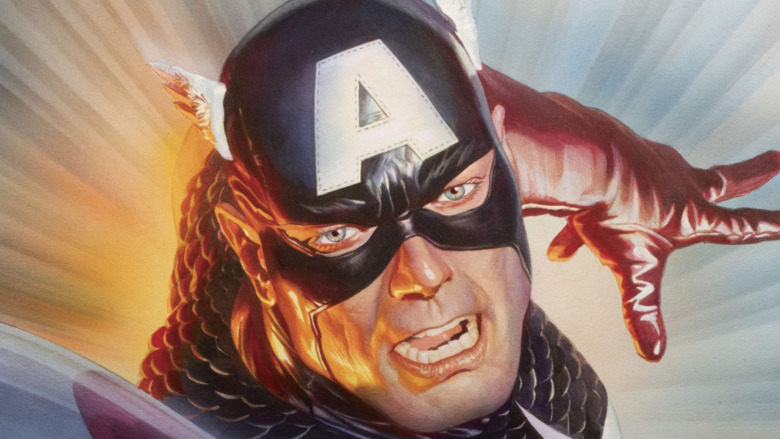
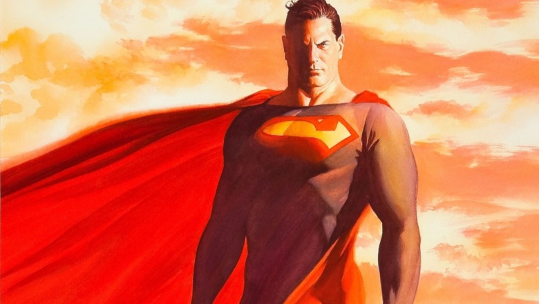
Alex Ross, on the other hand, transcends corporate labels. While Ross' breakout hit, 1993's "Marvels," was an in-depth exploration of Marvel's long and complex history, his next big story, "Kingdom Come," was a tribute to DC's pantheon of god-like heroes. Over the years, he's illustrated countless covers and posters for both companies. Ross is defined by his style, not any one set of characters.
In fact, while the title implies otherwise, "The Alex Ross Marvel Comics Poster Book" owes its existence to both publishers. As Ross explains in the book's introduction, when he was commissioned to create a mural for Marvel Comics' New York headquarters, Ross looked back to a series of posters he did for DC back in the '90s. Instead of creating one big composition featuring multiple characters, each one of those posters contained a stand-alone image of a single hero, allowing them to be arranged in any order. For the Marvel mural, Ross took the same approach — which, as a side effect, opened up the possibility of using the paintings for other projects, like this poster book.
And yet, while the overall goal was the same, the paintings weren't. The Marvel and DC rosters are very, very different, and during an exclusive interview with Looper, Ross explained exactly how he differentiates Marvel's characters from their Distinguished Competition.
Why motion is the key to differentiating between Marvel and DC, according to Alex Ross
As an illustrator, Ross says that movement is a big part of what sets Marvel's characters apart from DC's. "I think I've always looked for a kind of kinetic difference," he explains. "Like, you always feel a certain agitation and a visual restlessness with Marvel characters, because the design aesthetic of the creators of these characters, like Jack Kirby and Steve Ditko, is removed from the more stoic kind of art styles that define DC."
Part of that, Ross claims, has to do with time. While DC's superhero line has been going strong since the late '30s, Marvel as we know it didn't launch until the '60s. As a result, Marvel's characters feel contemporary and change with the times, while DC's heroes have more of a timeless quality. After all, by the time that the Marvel Universe began, DC's characters were already legends.
That's reflected in the art. "DC I think of as the 'shining city on the hill' art style. The characters are the golden icons of heroism," Ross elaborates. "Yet the Marvel characters are a twist on that, in effect. And there's a very thoughtful aspect of that you want to bring in."
Of course, practically speaking, the differences don't change Ross' signature style that much. "Artistically, how do I represent it? I put shade on one side of their body. It's no more complicated than that," Ross quips.
"The Alex Ross Marvel Comics Poster Book" is available now.

