Production Designer Kasra Farahani Pulls Back The Curtain On Loki's World - Exclusive Interview
Solid production design has long been a hallmark of Marvel movies, and the MCU properties on Disney+ have raised the bar even higher. "Loki" in particular has demonstrated a variety of complex set pieces, settings, and just about anything else that falls under the "design" banner. The production designer for "Loki" is Kasra Farahani, who has worked extensively with Marvel Studios in the past as a concept artist and art director. "Loki," however, marks the first time he's donned the role of "Production Designer" — and he's given good reason to get that role again someday.
Looper spoke with Farahani about three of the biggest settings we've seen: the TVA, Lamentis 1, and the Void. He told us about all the secrets of the Loki Palace, the contradictory feel of the TVA building, and how the train on Lamentis was inspired by a decoration that's probably at your grandma's house.
The TVA
Let's start with the location for the TVA, the Atlanta Marriott. Tell me a little bit more how you landed on that.
It was tricky because it's the only location that we used in the TVA, everything else is a set build. We were looking for something that would stylistically fit with the mid-century modern architecture that we were building for the TVA, and it was for the archives, which is not a big page count, but needed to make an impression. So John Portman, who was the architect that designed that Marriott, is a brilliant architect, and he had a couple of really beautiful buildings there in Atlanta, and this one really worked for us. And the atrium, when I saw it, immediately it occurred to me there was a perfect opportunity to put in these three massive timekeeper statues. Super scale, bigger than the statue of Liberty was sort of the idea, and the space really lends itself to that.
Because it's a beautiful, striking location that everybody picked up on immediately.
Yeah, it's very special.
So you mentioned something about mid-century, and I was going to ask about that. How did you land on this kind of '50s educational film, DMV vibe on all of this?
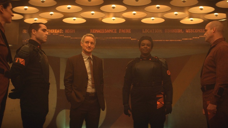
Yep. I think that's born of the source material. The source material of the TVA is very much this bureaucratic organization, and that in concert with what Michael Waldron, the show's creator and writer, had kind of written in the initial brief was like "Mad Men" meets "Blade Runner." So taking those two poles as the visual holes, they defined the spectrum. And on top of that, myself and our director were both independently thinking about Terry Gilliam's "Brazil," because it has the bureaucracy and also the anachronism, which is such a big part of this.
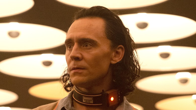
From all of that and thinking about how you reconcile these different influences, it kind of occurred to me that we would be taking a lot of different elements of mid-century modernism. There's the brutalism that there's so much of in the UK, and this Soviet influence version of mid-century moderns that you have in the eastern Europe, letting that cold version of that architecture define the massive imposing spaces, and then skinning it in the warmth and whimsy of American mid-century modernism so you've got this warm palette and fun patterns in these ominous monolithic spaces. So the goal was for the audience and for the characters entering the TVA not to know how to feel. Like, "Is this a nice place, or is this a place that wants to kill me?" to provoke that cognitive dissonance in their heads.
The Void
The most recent episode showed us the Void, which is just a beautifully designed set. What went into constructing the Void?
The void was an entire stage build, and so that was a massive interior terrain that we built that had seven different iterations. We would bring in different elements to make it feel different, sometimes overnight. So for example, the giant heads were one iteration of it. The drive-in movie theater was a different iteration of it, where Sylvie wakes up. There was a version of it with the engine of the space craft that they walk past. There was a version of it where Loki first wakes up with the bus shelter and all that.
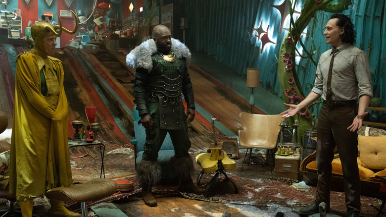
So those were all different. We designed a set that could be any one place of his terrain. And then on top of that, we built the Loki palace, where they ultimately ... The lair, if you will, of the Lokis, the idea behind that and the Void generally is that it's this hyper desolate place where you've been deleted from time, and you get to the TVA, and then you've been pruned even from the TVA that's sort of deleted twice, this is where you end up. So it was like a dumping ground of aberrant realities, and the Loki palace was one of those realities. Where it was this strange bowling alley that had been deleted at some point and next to it, there was maybe an alien reality. So you've got alien vines growing through the Loki palace, and on top of that, they dragged the Mall Santa throne from yet another reality and they brought it together. That set sort of represented the overall of spirit of the void, which was this salad bar of discarded realities, colliding into each other.
Are there any Easter eggs in the Void that you're really proud of putting in there?
Well, the entire Episode 5 is like an Easter egg, because of what I've said, it's aberrations from time, so they're deleted. Some of that originates from the script, some of it, the various collaborators propose, some of it is born in the art department. So it's a lot of different stops, but like, ThanosCopter is super fun, and something that's an Easter egg within the MCU, but then also when they get into the lair itself, the Polybius machine is a cool non-MCU Easter egg that Kevin Wright, our creative producer, suggested. That stuff's really fun, because it makes the world feel bigger, and it gives fans rewatchability and lore to discuss, so that's just fun to do.
Lamentis 1 and closing thoughts
I'm going to ask you about the train, where they're on Lamentis 1. I loved that whole train set. What was your inspiration behind that?
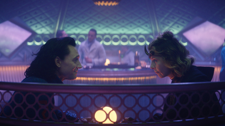
Basically the dining car of that was meant to demonstrate that it was only the privileged people that were being permitted onto this train. So while the whole of Lamentis is rough and tumble and industrial, that environment was meant to feel luxurious and opulent in a way. Kevin Feige had proposed at some point in one of our weekly business meetings that maybe an art deco influence would be a good idea for that. So we've sort of pursued that version of an alien art deco aesthetic. And also one way to make it feel even more alien was to suggest circular train cars. And so that's how we kind of arrived at that dining car look. And the other influence I was looking at were Faberge eggs. So it was like an art deco alien's Faberge egg.
I see that now, I totally see that! Which specific comics did you draw inspiration from, if you cited the comics at all?
Yeah, we did cite them, but I would say more so than us referencing the comics, it was the writers referencing the comics as they're compiling the scripts essentially. There's any number of things visually that you always look at the source material, whether it's from Asgard to the TVA itself, to what Lamentis 1 looks like in the comics, you always check it out and use it as a starting point. But I think the brief is always with Marvel to try to build upon the world, and to make the MCU bigger and expansive. So we use those things as starting points.
Is there anything that you really like that you're really proud of that you haven't seen people talk about or really notice yet?
I think Episode 6 is going to be that for sure. I don't know, people have been super kind about it. I would say I'm really proud of the TVA, I'm really proud of being able to ... we were very lucky that Autumn Durald, the cinematographer and I, our creative styles just meshed really well. For example, in the TVA, those environments are entirely practical built environments. So when you're looking up at the ceiling, as Autumn likes to do, she loves to shoot these really low shots, like that crazy grid of shafts of light at the time theater, that's real. And the massive oval light over the crowd monitoring, that's real. And so it helps to give the world the tactile, gritty feeling that fans are responding to, even if maybe they can't always put their finger on why. I think that it's special in this project that we got to build so much of the world.
"Loki" is streaming on Disney+.


