Hidden Secrets Buried In Popular Advertisements
Break out the tinfoil hat because your psyche is under the influence. Marketers love to court your subconscious. There are no shortage of commercials designed specifically to grab onto the lower part of your brain and never let go. Let's take a careful look, shall we?
FedEx
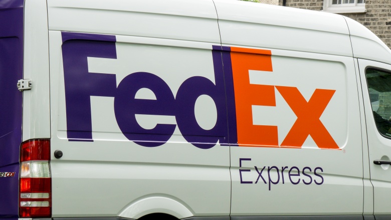
We'll start with an easy one. The FedEx logo is considered one of advertising's all-time greats. Its message is subtle, clean, and kinetic. The white space between the letters "E" and "X" forms a right-facing arrow. When you spot the logo on a truck, a plane, or a package, your brain associates the company with forward progress. "An arrow isn't even interesting to look at. It's only because of the subtlety that it's intriguing," said logo designer Lindon Leader in the "The Laws of Subtraction." Not noticing the arrow "doesn't in any way detract from the power of the mark," he said. "The arrow's just an added, novel bonus."
Monster Energy
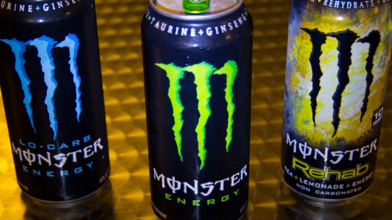
We know energy drinks are bad for our physical health, but what about our spiritual wellness? According to the righteous among us, Monster Energy wants your soul. The three vertical slash marks on Monster's logo closely resembles the Hebrew symbol "vav," which represents the no. 6. Triple sixes are considered the mark of the beast, as in the devil himself. Monster's slogan is "Unleash the beast." Coincidence? A Monster spokesperson told The Christian Post in 2014, "The M claw represents [the letter] M scratched on the can and doesn't represent anything else" and the company slogan is "just a saying...anybody could represent it the way they want to."
Tostitos
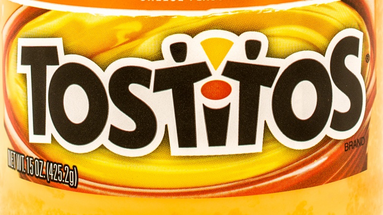
It's not a party without chips and dip, but how do you choose a brand when there's a whole aisle at the store devoted to salty wafers? Go for the bag that always shows you a good time. Look closely at that Tostitos logo. The two "T"s and the lowercase "i" in the middle of the word? That's two amigos sharing a bowl of salsa. Those faceless figures look happy, don't they? You can be happy too.
Kentucky Fried Chicken
Kentucky Fried Chicken loves to lure customers with secrets. First there was the "the colonel's secret recipe," a closely guarded combination of 11 herbs and spices devised by founder Harland Sanders in the 1940s. KFC has made hyping up this trade secret one of its best known marketing ploys, and even though recipe hackers claim to have cracked the code, the original, signed recipe remains locked in a vault at KFC headquarters.
In 2006, KFC launched another brilliant psychological operation by embedding subliminal coupons in its commercials, then intentionally leaking the secret to customers. The New York Times called it "jujitsu advertising," a way to fight back against the fast-forward button. To find the secret code, one had to use a DVR device or VCR (yes, folks were still using those in '06) to scroll through the commercial frame-by-frame in search of a coupon code that could then be entered into KFC's website to earn a free Buffalo Snacker. It sounds tedious, and it was, but millions went through with it, enticed as much by the trick as the treat. KFC continued the commercial hijinks in 2008 by hiding a dollar bill, in plain sight, in a clump of lettuce atop the 99 cent Snacker.
The Tour De France
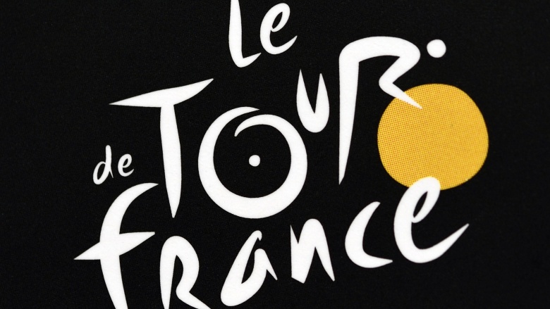
The logo for this celebrated cycling road race features a snappy font that doubles as a cyclist. The yellow letter "O" forms the bike's front tire, the letter "R" is the rider, and so on. The only thing we can't detect in this image is the performance enhancing drugs. Where's the needle hiding? Maybe it's an even more subliminal message...
Republicans
Speaking of subliminal messaging, Democrats accused Republicans of using mind tricks to promote George W. Bush's 2000 presidential campaign. In a G.O.P. commercial, the word "rats" appears in white capital letters on a black background as a narrator lambasts Democratic candidate Al Gore's health care proposals. The word flashes for only one-thirtieth of a second. Republicans denied any funny business. Bush called the footage "bizarre and weird," struggling to even pronounce the word "subliminal."
The ad's creator, Alex Castellanos, said "rats" was a glitch occurring before the word "bureaucrat" appeared in a sentence onscreen. But take note: Castellanos is still hard at work on campaign messaging and offering advice to presidential hopefuls. "Americans like optimistic brands," he told the New York Times in September 2015. "Nobody ever bought a product that made them feel worse."
Wendy's
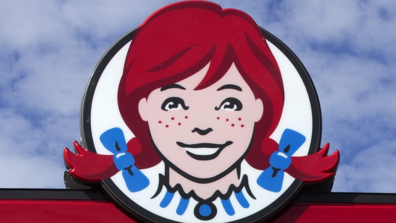
What makes us feel good? Salty fries and square patties, just like mom used to make (well, someone's mother probably made that). Take a close look at the Wendy's logo. Tucked away in the ruffles of that little ginger's collar is the word, "Mom." In a statement to the Huffington Post, Wendy's said the maternal message was "unintentional." Accident or no, we don't care. Everyone loves a frosty hug and greasy kiss from mom—unless you have mommy issues. Then keep reading. The next brand is for you.
Hooters
Hey, everyone! Look at the adorable owl with the big round eyes and perky pupils! That Hooters double entendre has remained in place for more than 30 years, but the famous owl did get a little work done in 2013. "We wanted to give 'Hootie' a facelift along with the stores," chief marketing officer Dave Henninger told USA Today. The "breastaurant" hopes the younger looking owl will attract more millennials.
Sprite
Perhaps no company has executed a brand relaunch quite like Sprite did with its 2006 "sublymonal" campaign. The lemon-lime soft drink saturated mass media with psychological tactics that began small, but quickly led customers down a rabbit hole of "lymon" branding.
It all started with a website targeting fans of the television series Lost. Viewers were exposed to a curious commercial for a fictional organization called the Hanso Foundation and a website: sublymonal.com. The site led to codes that unlocked exclusive content that led to more passwords for more content at more sites all circling back to the word "sublymonal." Soon after, "sublymonal" commercials began airing in theaters and on television. These self-proclaimed "DVR-Ready" ads encouraged viewers to investigate freeze frames for secret messages which, you guessed it, led to layers upon layers of bizarre new material.
And it didn't stop there. Sprite produced hypnotic billboards featuring a can of soda on a swinging pendulum, planted "lymon" shampoo in magazines, distributed "lymon" scented pillow inserts, and even outfitted public buses with psychedelic "lymon" hubcaps. The "sublymonal" sensory experience was a psy-ops smorgaboard that actually encouraged the audience to be hyper aware of its own manipulation. The wacky plan worked, and Sprite's popularity surged.
