Iconic Movie Posters That Actually Lied To Us
A movie poster has a lot of pressure on its shoulders. In a single 9x16 frame, it has to pitch itself to a prospective audience. It has to catch the eye, then clearly communicate its subject's plot in an enticing way that would make someone want to see the movie.
A poster lacks the luxury afforded to movie trailers of being able to summarize the story with flashy clips and an epic voiceover across three minutes of footage. A movie poster has mere seconds to get its audience onboard. The poster is a hugely important aspect of the film's marketing campaign, and could set the trajectory for the film's box-office performance in either direction.
But sometimes a movie poster doesn't accurately depict the film it advertises. While not always an oblivious mistake, this could be an intentional strategy for a number of reasons. Maybe the film is part of a blockbuster franchise shrouded in secrecy, and the studio wants to protect spoilers by misdirecting the audience. Perhaps the poster artist chose to implement metaphorical imagery within the poster that speaks to the themes of the movie rather than its literal plot, but in doing so misleads the audience.
For whatever reason, sometimes iconic movie posters lie to us. Here are a few favorites from across multiple decades of cinema.
The Bride of Frankenstein (1935)
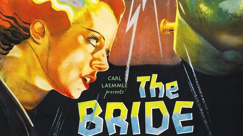
Whether you were able to identify the character or not, you've likely seen someone dressed up as the titular main character from "The Bride of Frankenstein" as a Halloween costume at one point or another. The long white gown and the tall black hair with a silver, lightning-shaped strand has become an iconic visual motif of the Halloween season, even nearly a century after the character's namesake film debuted.
For all the attention the Bride gets, however, she's only in the final five minutes of her own movie. You certainly wouldn't guess that from the title, and your expectations would again be misdirected by solely looking at the movie poster. The Bride is prominently featured in the poster artwork, taking up equal space alongside Frankenstein's monster.
While the Bride is the focal point of the film's story, she doesn't show up until the very end. A sequel to 1931's "Frankenstein," this 1935 follow-up shows Frankenstein's monster lamenting that he has no one with which to share his life. When a scientist brings to life a bride for the monster to love, she tragically rejects the monster as her mate. The poster, and the title of the movie itself, implies the Bride has a much more prominent role. Instead, it's a quick appearance.
The Wizard of Oz (1939)
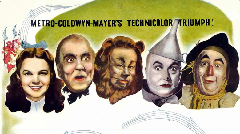
Nearly a century old, "The Wizard of Oz" is even older than that as a published book. It is within the public zeitgeist that the namesake Wizard in "The Wizard of Oz" is a sham, a con artist behind an emerald curtain rather than a genuine magic-maker. But to audiences in 1939, studio Metro-Goldwyn Mayer could left no hints of the Wizard's true nature in its movie poster artwork. It had to maintain the impression that this really was the "wonderful" Wizard of Oz, as the song "We're Off to See the Wizard" merrily claims among its lyrics.
The poster shows its main stars' faces as a banner across the top of its display: Dorothy, the Wizard, the Cowardly Lion, the Tin Man, and the Scarecrow. If one knows nothing about the movie and only sees the poster, they might infer the Wizard is as equal a friend to Dorothy as any of the other accompanying characters. If anything, the facial expressions of the Cowardly Lion and the Tin Man as depicted on the poster look much more dubious than the Wizard's jovial demeanor.
Airplane! (1980)
The 1980 comedy "Airplane!" is a farce of hyperbolic proportions, taking the serious tradition of airplane catastrophes as depicted by Hollywood and spinning the genre on its head. In a trailer, this comedic tone could be easily communicated. On paper, though, the plot could be easily mistaken for any of the disaster movies it was parodying. Therein lies the challenge of its movie poster... it was just that — paper.
How, in one visual, should the marketing team go about depicting the unique nature of "Airplane!" as a comedy? If their choices read poorly, the audience might assume, by nature of the plot, that the movie was a drama rather than a comedy. The solution was to use an illustration, somewhat of a political cartoon by nature, to embody the farcical heartbeat of the film rather than selecting images that actually showed anything from the film itself.
The illustration in question shows an airplane twisted into a knot at its center. While the movie might get far-fetched at times, at no point does an airplane literally get tied into a knot. Crazier things have happened in movies, however — 1980 was, after all, the same year the silver screen introduced audiences to an ancient green Jedi named Yoda — and prospective "Airplane!" moviegoers might have thought the film was even zanier than it really was, if going by the poster alone.
National Lampoon's Christmas Vacation (1989)
A lot goes wrong in the 1989 holiday classic "National Lampoon's Christmas Vacation." Chevy Chase as Clark Griswold attempts, time after time, to give his family the best Christmas ever. Things rarely go according to plan, and poor Clark's grand visions unravel into escapades involving a squirrel terrorizing the house and a SWAT team descending upon the family gathering.
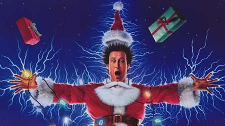
Something that never happens, though, is the scene that the film's poster shows as its featured image. Dressed as Santa Claus, Clark is comically elocuted by a string of holiday lights on a rooftop in the poster's artwork. Many sequences in "Christmas Vacation" come close to this visual, but none depict it literally. Clark struggles to get the lights on his house working, but he never gets sparked like the poster shows. In a different scene, a cat gets electrocuted, but that's inside. Later still, an explosion happens, sending a policeman and some Santa decorations flying through the air. But Clark dressed as Santa getting electrocuted by lights? That's not in the movie.
The poster does, however, succeed in capturing the spirit of the film, written by John Hughes with the same outlandish wit he'd already brought to prior "Vacation" films, and that he'd continue in the years to come as he'd pen "Home Alone." Even though the scene in the poster for "Christmas Vacation" never happens in the movie, it embodies the types of wacky misfortunes audiences can expect from the film.
Home Alone (1990)
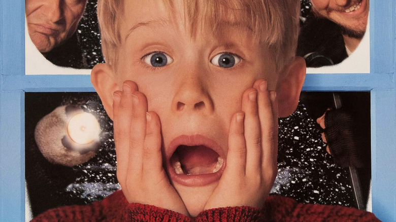
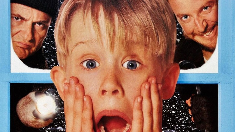
The poster for this 1990 holiday hit features Macaulay Culkin as Kevin McCallister doing the face gesture he made famous in the movie: looking into the camera and screaming, with both hands clasped against his face. The film's marketing team must have been able to predict the iconic likelihood of the image even before audiences saw the movie — or perhaps it was the inclusion of the image on the poster that contributed to its longevity in the first place. Either way, the poster skews the truth of the movie ever so slightly for the sake of marketing clarity.
The poster shows Kevin doing his signature hands-on-face scream, with Joe Pesci and Daniel Stern as Harry and Marv, aka the "Wet Bandits," peering in on Kevin from outside his home through a window. However, the moments from the film in which Kevin performs his iconic scream occur when he's completely by himself. After just finishing a shower, Kevin stands in the bathroom and applies his dad's aftershave. Liberally splashing it on with a swift slap to his face, Kevin is shocked by its harsh, brisk feel, and promptly screams.
The poster might meld together a few disparate scenes from the movie that never happen as directly as they appear on the advertisement, but all is fair when the trade-off is an iconic poster that's been beloved for decades.
Groundhog Day (1993)
In 1993's "Groundhog Day," Bill Murray plays a man who finds himself waking up every morning on the exact same day: February 2, aka Groundhog Day. The film follows the antics of Murray as he grapples with reliving the same day repeatedly while the rest of the world perceives it as fresh every time.
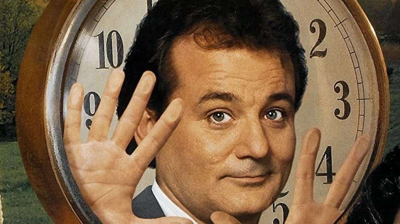
To help drive home this story, the movie poster shows Murray trapped inside a traditional alarm clock. The cadence of Murray in this image is odd given the context — his face, cracking a small smile, looks pleasant, contradicting the frustrated manner his character views the situation in the movie. Furthermore, Murray, of course, isn't literally trapped in a clock in the movie, but for as weird as some '90s movies were — i.e. Murray himself in "Space Jam," where he played basketball with aliens and "Looney Tunes" characters — the concept of Murray in a clock could have been a legitimate concept and no one would have been the wiser.
Apparently not confident enough in its own visual to communicate the plot without any other aid, the poster includes a tagline above the title. The text reads, "He's having the day of his life... over and over again." It appears that the concept of repeating the same day was tricky to convey in a single image, leaving the poster with a would-be clever metaphor that benefits from just a tad more context, just in case potential consumers need help figuring it out.
Lilo & Stitch (2002)
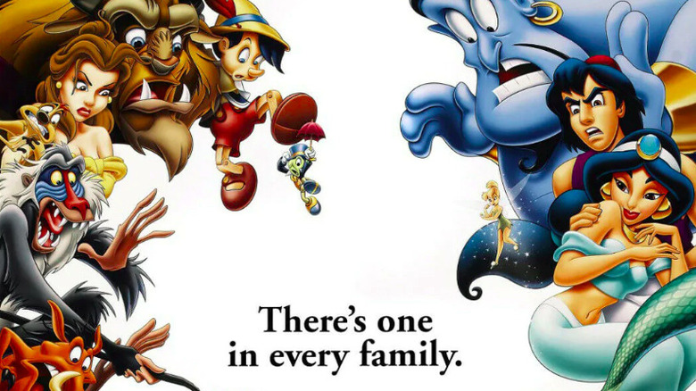
Experiment 626, aka Stitch, is genetically engineered to be a troublemaker. When it came time to market "Lilo & Stitch" in 2002, Walt Disney Animation Studios took a subversive approach. The film's four teaser trailers show Stitch mischievously interrupting famous scenes from classic Disney movies, wrecking havoc upon the likes of Ariel, Belle, Beast, Aladdin, Jasmine, and Rafiki during their iconic film moments.
Aligning with the film's clever marketing campaign, the poster for "Lilo & Stitch" depicted favorite Disney characters surrounding Stitch, suspicious of him. Copy on the poster reads, "There's one in every family."
Disney has long loved synergy, frequently taking advantage of opportunities to collide its beloved characters in expanded media. It's not uncommon to see characters from seemingly different universes rub shoulders with each other in merchandise, theme park productions, or the animated series "House of Mouse," which aired around the same time "Lilo & Stitch" debuted. The early marketing for "Lilo & Stitch" might have led younger viewers especially to believe the film would once again combine character worlds and include callbacks to Disney's earlier work. In reality, it was simply a witty promotional campaign for a movie that was about family, Hawaii, and Elvis.
Harry Potter and the Chamber of Secrets (2002)
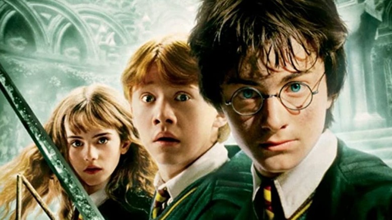
The inaugural entry into the "Harry Potter" movie franchise in 2001 turned its three leads — Daniel Radcliffe, Rupert Grint, and Emma Watson — into household stars of a generation. The poster for the second installment in the series, 2002's "Harry Potter and the Chamber of Secrets," prominently featured the young trio in action, even though it stretched the validity of the story in doing so.
The poster shows Harry, Ron, and Hermione standing valiantly, with Dobby the house-elf's head popping into the corner of the frame. Harry holds the Sword of Gryffindor, Ron grasps his broken wand, and Hermione clutches a textbook. While all of these elements exist within the movie at some point, they never occur at the same time.
The only point Harry ever holds the Sword of Gryffindor in the film is in the climax, when he pulls it from the Sorting Hat inside the actual Chamber of Secrets. Ron and Hermione aren't with him, Ron having been blockaded by falling rock earlier in the Chamber and Hermione altogether unconscious in the hospital wing. Dobby is also nowhere to be found when Harry wields the Sword. These are all semantics, of course, and fans of the series — especially those already familiar with the books — were likely just happy to see the Hogwarts students together on a poster with story elements they recognized and could get excited about.
The Muppets (2011)
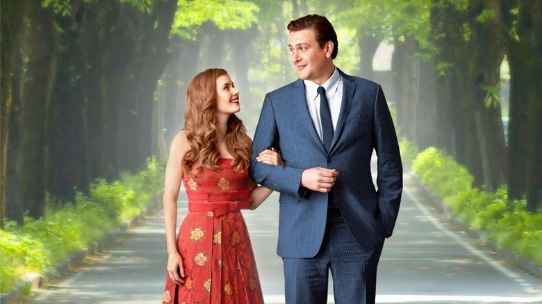
The biggest lie — by design — might be the first teaser poster for the James Bobin-directed 2011 film "The Muppets." The poster pretends to advertise a completely different movie. It shows Amy Adams and Jason Segel locked in each other's eyes as they romantically stroll down a road covered by two aisles of beautiful trees. The fake movie's title, "Green With Envy," is displayed prominently at the top of the poster.
While this prank poster doesn't outright say it's really a facade for a Muppet movie, there are a few hints. A pointed clue comes in the tagline: "Immediately, they felt something special." The keyword there is "felt," the physical material used to create many of the Muppet characters. The poster lists November 23 as its release date, the real release date for "The Muppets."
Disney marketed the poster hand-in-hand with a parody teaser trailer, which took the prank to its logical conclusion and gave itself away by the end. After beginning as what feels like a trailer for "Green With Envy" in the style of a romantic comedy, the teaser implodes as various Muppets begin to infiltrate its proceedings.
Star Wars: The Force Awakens (2015)
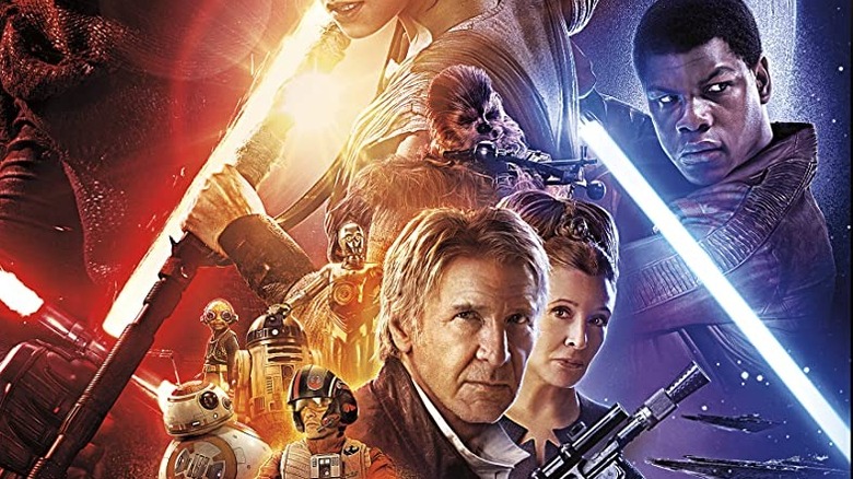
"Star Wars" is among Hollywood's most secretive franchises. Lucasfilm kept baby Yoda hidden from audiences until the adorable character made his debut in the 2019 pilot for "The Mandalorian." Prior to debuting "Obi-Wan Kenobi," the studio implied the 2022 limited series would involve a young Luke Skywalker, when in reality it was far more focused on Leia. In this same spirit, the poster for "Star Wars: The Force Awakens," the 2015 film that kickstarted Disney's new era of the franchise, intentionally misdirected audiences.
Mark Hamill's participation in the seventh episode of the Skywalker saga was no secret. It was public information that he would return to reprise his iconic role as Luke, alongside castmates Harrison Ford as Han Solo and Carrie Fisher as Leia. Perhaps since the cat was already out of the bag, Lucasfilm had a bit of fun in maintaining the real nature of Luke's role in the story. While Luke's face isn't on the poster, Mark Hamill's name is only the second one listed, after Ford, before anyone else's in the credits at the bottom of the advertisement. Typically top billing like that implies actors who play the protagonists, or the characters with the most screentime.
Of course, the opposite was true. Mark Hamill only appears at the very end of the film in a single scene, and doesn't even speak any dialogue. Even in spoiling his appearance, the studio still found a way to surprise the audience.
Avengers: Endgame (2019)
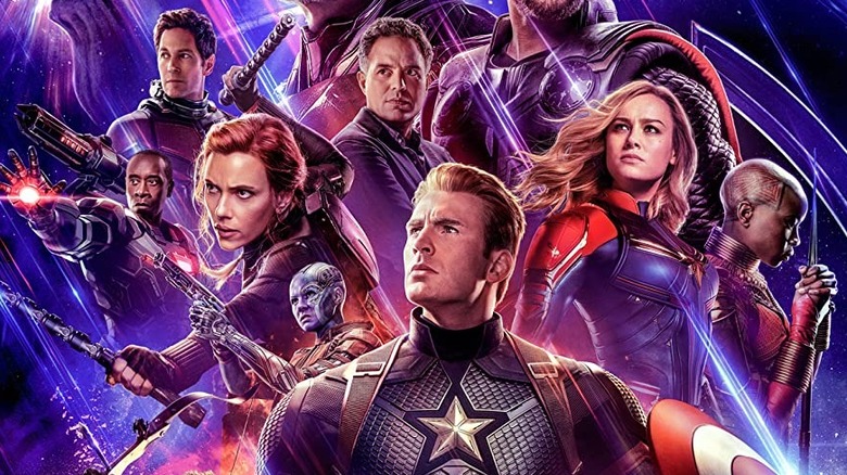
The conclusion of 2018's "Avengers: Infinity War" had the unthinkable happen: Thanos succeeded in collecting all six Infinity Stones and then snapped away half of all life in the universe. Given the known slate of future Marvel projects at the time, it was a safe bet that the perished heroes would return at some point during the follow-up, 2019's "Avengers: Endgame " — but nothing was guaranteed, and Marvel obviously didn't want to give anything away.
As such, the poster to the film follows suit with its trailers, essentially advertising a movie with a different plot than what actually wound up happening. The marketing depicted the surviving heroes assembling to kill Thanos... which happened in the first reel. The remainder of the film — including the time heist and oodles of Marvel characters making subsequent appearances — was kept hidden by official marketing.
Barb and Star Go To Vista Del Mar (2021)
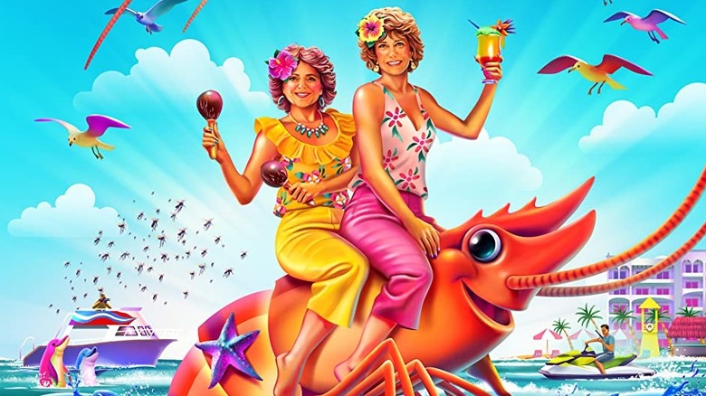
Hyperbolized to embody its jubilant tone and off-the-wall mindset, the poster for 2021's "Barb and Star Go To Vista Del Mar" is a fever dream come to life.
It depicts its two titular characters, portrayed with gusto by Kristen Wiig and Annie Mumolo (who also wrote the film together), riding atop a lobster in the middle of the ocean. Fully clothed with maracas and drinks in hand, Barb and Star smile toward the camera as all forms of marine life swim with joy underneath. At no point in the film do the pals romp about on the back of a lobster — although, with this film, they could have made a photo-real re-creation of this pic and it would've somehow felt plausible.
Additionally, in somewhat unclear phrasing, a tagline at the top of the poster reads, "This Valentine's Day weekend fall in love." Seeing as Barb and Star themselves are displayed prominently on the poster, no further context would imply that they are the subjects in question who fall in love with each other. In the story, however, they're best friends who have romantic pursuits with other people.
The Suicide Squad (2021)
After mixed reception for 2016's "Suicide Squad," DC wanted to take another swing at bringing the team of antiheroes to life in 2021, this time with director James Gunn at the helm. The new film, almost identically named "The Suicide Squad," introduces many new cast members in an effort to freshen up the tone.
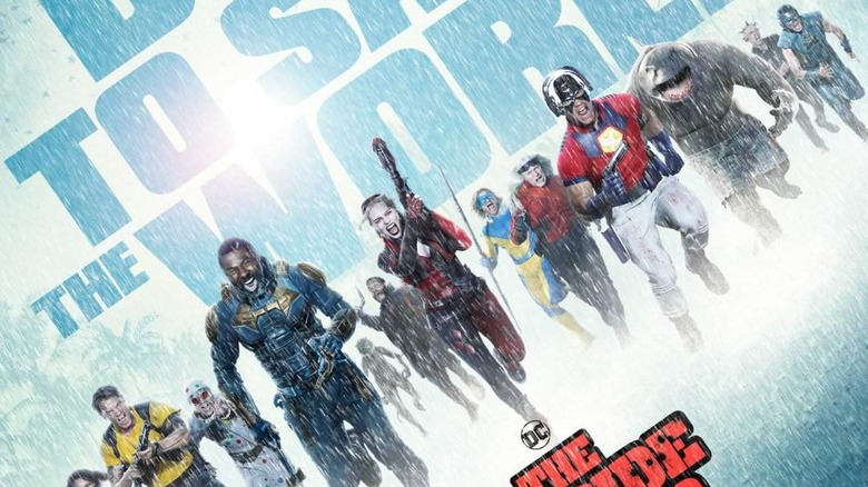
The movie's large ensemble is shown on its poster, charging through the rain and headed directly for the camera. Despite what the image on the poster clearly implies, the cast is in fact comprised of two completely separate teams of vigilantes, not one team working together. Making matters more inconsistent with the poster, one of these teams dies within the first several minutes of the movie, meaning many of the characters prominently displayed on the film's poster are barely in it.
Big, bold letters on the poster read, "They're dying to save the world," perhaps inadvertently hinting at the truth, while nonetheless visually misdirecting expectations.
