How Severance Has Been Playing Sly Mind Games On Audiences All Along
In February, the hit Apple TV+ drama "Severance" premiered to rave reviews from critics and viewers alike. A darkly satirical exploration of the modern workspace, the show centers on a core cast of office workers — Mark (Adam Scott), Helly (Britt Lower), Dylan (Zach Cherry), and Irving (John Turturro), who slowly begin to unravel the mysteries of their employer, a shadowy corporation called Lumon. During this time, they grapple with their decision to "sever" their consciousness, effectively separating their memories from life within the walls of Lumon and outside the walls of Lumon. As corporate "innies," the coworkers fight to establish their personal autonomy, no matter the stakes. Celebrated for its sharp writing and acting, the debut series garnered an impressive 14 Emmy nominations, including a coveted nomination for outstanding drama series.
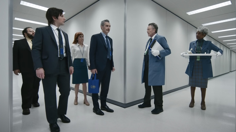
Prominently, a key facet of "Severance" includes its meticulous world-building, particularly when it comes to the labyrinthine design of Lumon's office space. As culture writer Sophie Gilbert observed, "Every visual detail seems primed to evoke a specific emotional response or loaded with significance for some later reveal" (via The Atlantic). Largely made up of sterile white walls and fluorescent lighting, the building itself noticeably boasts a significant collection of unexplored hallways and rooms, many of which the main cast struggles to make sense of while inside. This, in turn, appears to hint at the mysteries yet to be uncovered by Lumon's employees.
Notably, the production designer for the series recently shared details about how he created such a brain-twister of a set.
Production designer Jeremy Hindle wanted to play with viewers' brains
During an interview with The Hollywood Reporter, production designer Jeremy Hindle described his artistic collaboration with Ben Stiller, the director and executive producer of "Severance." While working on the interiors, Hindle revealed that he specifically constructed the hallways of Lumon to ever-so-slowly grow wider as employees traversed through the space. In a separate interview with Vanity Fair, Stiller noted that Hindle consciously designed a set of hallways that "actually led somewhere," which contributed to the disorienting, maze-like ambience.
With his eye for detail, Hindle also diligently worked to find the perfect shade of white for the office. "It's a very unnatural design. Every background in this room is interesting because it's asymmetric. It's like you're playing with their brains," he told THR.
In this way, Hindle and Stiller appeared to establish a space of contradictions — they wanted Lumon to incite feelings of both confinement and unsettling expansiveness. Moreover, Hindle sought to play with the viewers' emotions while designing the main office. He added, "[T]here's something really comfortable about the spaces. Even though it's creepy, you kind of want to be there."
Notably, many viewers have openly applauded the intricacies of the mind-bending set. Redditor u/RobustManifesto wrote, "Great photography and production design, really unsettling and draws you into the kafkaesque nightmare of the story." Other "Severance" fans similarly chimed in to share their admiration, including u/-Hastis-, who added, "[A] lot of the beauty comes from the great locations and art direction!"

